Believe it or not, posting a new blog on our site every day of the week is no small feat. Everyone here at the little white house writes, and the process doesn’t stop there. A few people here play a hand in making sure the blogs are finished, polished and ready to go each and every morning.
My part in this process is SEO. I dig for the right meta description and keyword to give our blogs the best chance of survival in the cruel and crowded world of search. But today isn’t about SEO, I know, huge bummer. What’s more exciting than titles, slugs and meta descriptions?
Nope, today we’re talking about the cherry on top of any good blog post or new web page. Images! Now this isn’t usually my comfort zone. I typically leave the visual stuff to the design team. But I have learned a thing or two along the way managing clients and executing content strategy with visuals.
I have learned a few things about managing a media library the hard way. Read on to avoid some of the common mistakes.
Tags and Alt Text
Okay I lied, we are going to talk a little bit about SEO. It’ll be over soon I promise. Tags and alternative text are often ignored or forgotten about when putting the finishing touches on your blog. These two opportunities for description go a long way for your overall search performance. They also give context for visually impaired audiences. I won’t go into full detail, Peter has it well-covered in this blog. Make sure you take a few minutes to not only do this step, but do it right. It doesn’t seem like much, but it will do wonders for your overall SEO strategy.
Size and Quality
This seems pretty obvious but I see an alarmingly high number of websites with poor-quality pictures. Worst is when the quality is terrible and the size doesn’t make any sense. This applies to both big and small images. When working with photos, it’s important to consider the content you’re using them with. This directly impacts the appropriate size for your viewers.
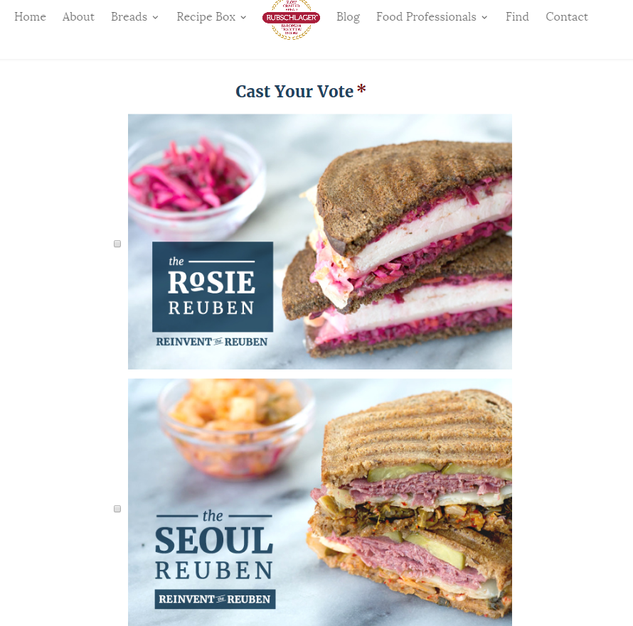
Just recently I launched a contest and I provided big, beautiful images for people to vote for their favorite sandwich. After a few days we noticed the page was getting plenty of views, but very few conversions. We decided to shrink down the images and show all four choices side by side. Yes, the big photos are beautiful and showed each sandwich well, but what we really need was for people to see all of the sandwiches side by side and compare them.

It’s easier to vote when the images are side by side
Size is important. Not just the size as it appears on your website, but the size of the file as well. A few months ago I ran into an issue with the amount of space I had available on a client’s site. This site wasn’t that old and there was no way I had close to the number of pages and content that would put me over the edge as far as I could remember. After trying to upload a photo, I asked Whitney for some help uploading an image. Turns out all along I had been uploading GIGANTIC photos. Way too big, like no need for it to be that big, comically large files.
Scale and reduce the size of images to lower the weight and space it takes up without sacrificing the quality of the image. Learn more about why and how you should be reducing your images before uploading them into your WordPress site.
Bonus Media Library Tip
Remember when I had all of those gigantic photos? Well, I had the pleasure of pulling them all down, resizing them and re-uploading. Only after I completed this painstaking process did I realize that now all of the blogs with the photos I had resized were empty. If you’re going to switch out your photos and resize them for the web, make sure you remember to replace the large images with the scaled images.
I’m sure the learning process is far from over when it comes to utilizing images in posts but images play an important role on your website and for your overall content strategy. Make sure your photos are contributing to your SEO goals with tags and titles and be aware of the size of the photo. Not too big or too small, aim for just right to make sure your site doesn’t get bogged down with gigantic photos or navigated away from for not looking professional.
More on the subject of images:
Roundpeg is an Indianapolis marketing strategy firm.
Editor’s Note: This blog may be a few years old, but the information is still quite valid! Proper image sizing imperative to achieving the best UX possible. To make your lives a little bit easier, here’s a little cheat sheet of image sizing best practices:
| 16:9 ASPECT RATIO | WxH (pixels) | 4:3 ASPECT RATIO | WxH (pixels) | |
| Full Width Header | 1920 x 1080 | Full Width Header | 1920 x 1440 | |
| 3/4 Page | 1440 x 810 | 3/4 Page | 1440 x 1080 | |
| 2/3 Page | 1280 x 720 | 2/3 Page | 1280 x 960 | |
| 1/2 Page | 960 x 540 | 1/2 Page | 960 x 720 | |
| 1/3 Page | 640 x 360 | 1/3 Page | 640 x 480 | |
| 1/4 Page | 480 x 270 | 1/4 Page | 480 x 360 | |
| 1/5 Page | 384 x 216 | 1/5 Page | 384 x 288 | |
| 1/6 Page | 320 x 180 | 1/6 Page | 320 x 240 |

