Create Awesome Landing Pages
Does the styling of your landing page really matter?
If you answered no. I’ll ask one more question. Do your leads matter?
The answer is YES if you want a sustainable business.
Landing pages are more important than you think. And if you’d ask me to properly layout a landing page a year ago, I would throw together some text and maybe an image, if you were lucky, and slap a bow on it and call it a landing page. Ta-Da.
2020 has been a roller coaster full of ups, downs, and flips that we WERE NOT ready for. But in the midst of all the chaos, I have been growing my skills and actually cranking out some landing pages that don’t stink. So I thought I’d share some tips and tricks that I’ve collected this year with some examples of older landing pages. So let’s get into it.
The close to perfect landing page.
Just kidding. Before we get into the examples, here are a few ways you can spruce up any old page:
1. A Great Headline
A simple yet tricky task if you are “tagline/quote challenged” like me. A headline is the first thing a visitor sees and is your chance to draw them in.
2. Large CTAs
It can be easy to forget how important your CTAs are. If your goal is to get a visitor to take action, then having your CTA higher on the page is a MUST.
3. Image Quality and Optimization
There is nothing worse than visiting a page full of blurs and pixels. That’s creating an uncomfortable situation for everyone. Graphics that are polished and presented well ensure that your page looks clean and professional.
4. Testimonials
Optional but a grand idea. If you have proof of your amazing products and services then share them. Other visitors will be more inclined to take action.
Keep it simple yet effective.
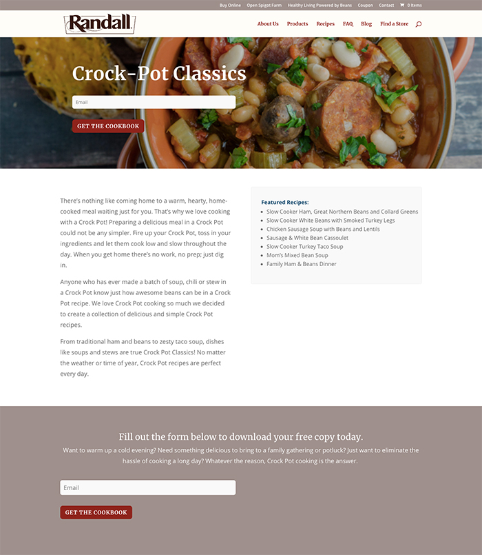
When you look at this page you see NO DISTRACTIONS. You come, read a little bit, get a little hungry, grab your download, and then leave! No one is holding you hostage here.
It is important to keep things short and sweet when creating a landing page. For example, this form ONLY asks for an email and not for your birthday or favorite childhood memory.
When people visit your site, you don’t want to intimidate them with unnecessary fields or text. Keep it classy.
Get sassy with it.
Getting creative with the look and feel of your landing page definitely gives you bonus points.
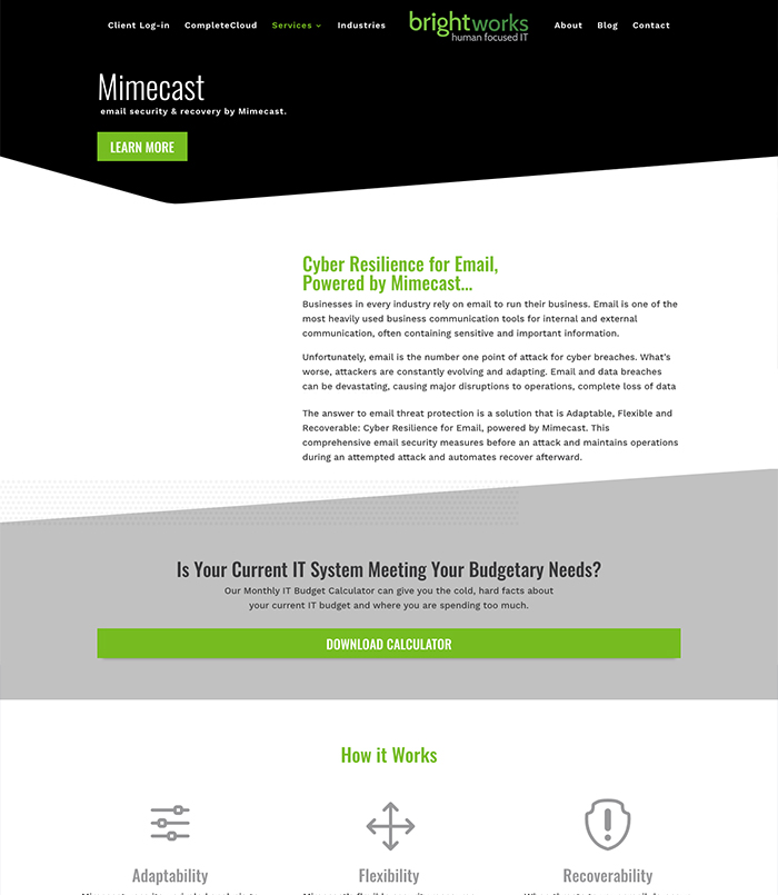
Here you can see a noticeable visual hierarchy. You have the option to immediately take action. Or if things are moving a little too fast, you can take a look around and get familiar by reading some important information.
You can break down this layout with a step by step guide. Title & CTA, intro text, download, and then more information about the product to give your visitor a little more convincing. Voilà!
CTAs are a BIG deal.
Typically, your home page is not a landing page but for smaller sites, you may have to shout for attention more often and alter the way you lay out all of your content if there isn’t much.
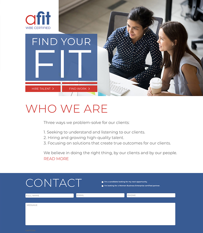
Someone is visiting your site for a reason no matter how they get there. It is crucial to give them the logical next steps. Afit is a great example that includes leading graphics and a bold design.
Keep in mind that this page has 2 CTAs. Depending on your situation, these will take you in two different directions. With this type of landing page you are able to move your visitors around your site to more information that is targeting them specifically.
Give them the facts.
There are many ways you can boost your site performance. It all depends on what you have to offer and laying it out in an attractive way can bring you results.
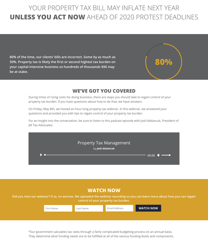
You should always give visitors a reason to make an exchange, say an email for a download or webinar class. A layout that includes data will likely out-perform your competitors that have zero data to back up their offers.
Numbers, statistics, and facts can be a good aide to get you the leads you need. Just make sure to keep it simple and not intimidating. Here, the use of only one number is enough to peak curiosity and keep your visitors on the page longer.
It doesn’t end after the build!
I can go on about landing pages forever, but we’re almost out of time. But thinking that you can gather your content and CTAs beautifully and poof there are leads, well “That ain’t gonna happen” – in Lorraine’s NY accent.
To ensure even a smidgen of success you have to actively promote. Options include:
- Social Media Posts (fave being LinkedIn for business)
- Online advertisements
- Internal linkage (links)
- Social Shares with a grabbing image and chance to use that catchy headline.
Now that you have a few tips in your back pocket, you can improve any existing landing pages and be more prepared for new ones. Good luck!
Want to learn how to create an awesome contact page?
With these tips & tricks you can help add some creativity while still being direct with your audience.
How long do people stay on a web pages?
20 seconds! That gives you only a small amount of time to sell your service or product and get your customer to the next step of trading information or contacting your business.
This content is brought to you by Roundpeg, an Indianapolis web design company.
