Create Awesome Contact Pages
Why Should You Care About Your Contact Page?
When someone navigates to your website, what is the goal? It may seem like an easy question, but more times than not customers can get lost on your site without taking action.
If your goal is to sell a service or get a user to download information, you need Calls to Action (CTAs). The goal of your CTAs is ultimately to get the user to your contact page or a landing page. Your form should be legible and easy to use. The last thing you want is to do is miss an opportunity because a submission failed due to a cumbersome or broken form on your contact page.
Boost Customer Relationships
Website viewers want what they came to your website to get, and they want it fast. As soon as they get to your contact information they should have everything they need. All links should be working and all fields should be beneficial to your brand. Each company is different and forms should be customized for their business needs.
One of the easiest ways to improve your relationship with customers is to become more accessible. If you require a customer to “submit” information you can not only increase conversion rates you will allow the customer to directly communicate with you at any time. By giving a customer the option to submit a comment/question and their info it can create a more personal relationship.
Spice Up Your Contact Forms
During my time at Roundpeg, I have made made it a goal of to get more creative when it comes to contact pages. Not only has it increased my skills in design, it allows our clients’ websites to have a uniquely tailored page experience with their customers. Since websites are becoming more graphic driven with layout and design, a plain and boring contact page just won’t cut it anymore.
There are so many different elements that you can add to your page to increase the enjoyment of filling out the same form over and over again. The last thing you want to have is a beautifully designed website and a “Blah” page. Take a look at the evolution of contact pages I created from when I first started at Roundpeg in January of 2019 to a more current look in July of 2019.
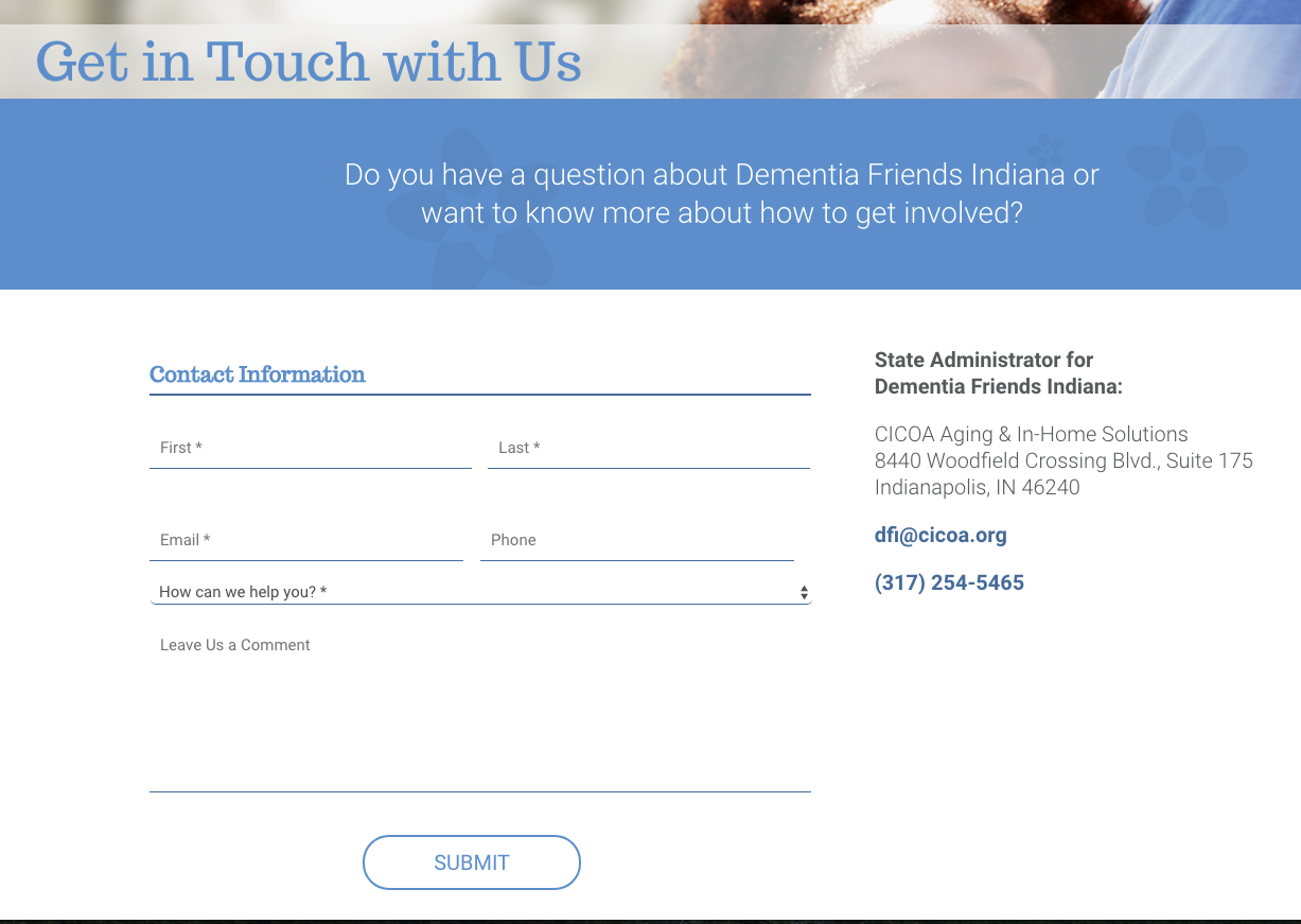
Dementia Friends Indiana
I loved creating this contact form for Dementia Friends because I thought of different ways to display input fields. I decided to use just bottom borders to keep the form nicely defined & consistent with the brand.
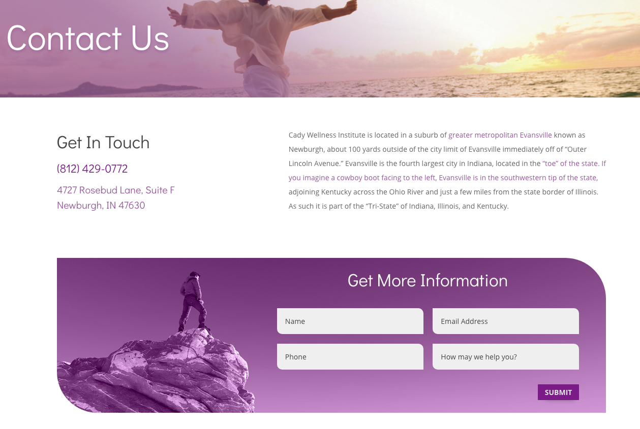
Cady Wellness Institute
I enjoy creating contact forms that use images and using unique shapes. The page for Cady Wellness is simple and straight to the point but also creative and enjoyable to use.
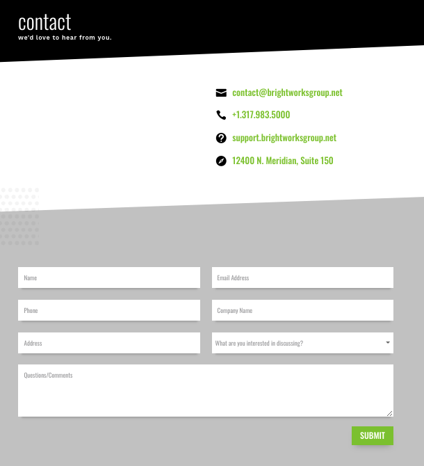
Brightworks
When designing your contact page it is important to keep the design consistent. With Brightworks, I was able to create different angles and utilize white space to make it simple yet effective.
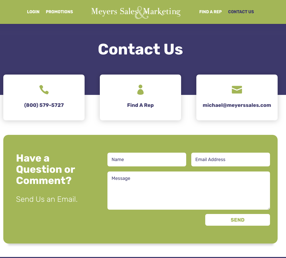
Meyers Sales & Marketing
Meyers Sales & Marketing is a perfect example of a form being both fun & interactive, while still having minimal info. You can achieve an aesthetically pleasing form by playing with visual elements & layout.
Final Thoughts
The contact page is the finish line of your site. You always want to avoid unnecessary information on your contact page. Just focus on your customer’s final steps on your site. The purpose of your contact page is to simply be direct. Provide the physical address as well as all social media links to increase the relationship even further.
got a project?
Whether you need a new website or some help with your social media we are ready to start the conversation.

Call to Action Do’s and Don’ts
There is such a thing as a bad call to action The goal of any page on a website, whether it's the...
Let’s Talk Web Navigation
The Web Navigation Bar (aka, the nav & primary menu) The web navigation bar is a custom-built...
Canning Cookies, Creating Cohorts: Google’s Advertising Shift, Explained
The devs over at Alphabet are not just trying to bolster their profit; they’re trying to make something that could be problematic better and more secure.
A Deep Dive into Web Scams
What exactly are web scams? Web scams are illegitimate internet websites used to deceive users...
