2019 Web Design Trends: A Year in Review
At the end of last year, we reviewed some of 2018’s hottest web design trends and predicted which were destined to stay for 2019. Did we take our own advice? Absolutely. Here’s a look at which trends made the cut at Roundpeg.
Design Trend: Minimalist Design
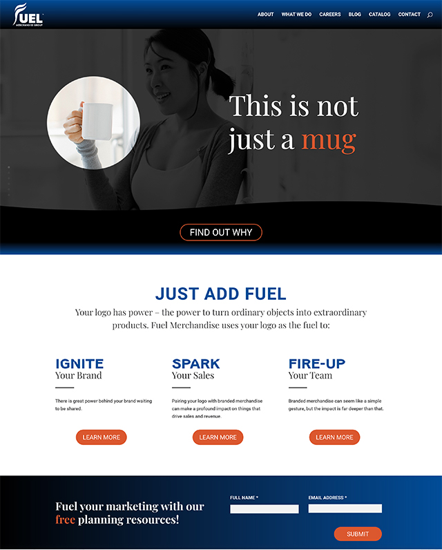
The web redesign we did for Fuel Merchandise was easily one of my favorite sites we developed in 2019. Though the design process faced a few extra bumps, the final product was definitely worth it.
This site is full of clean, white space with bold headlines. Instead of traditional product shots, we used product cutouts to keep the page from feeling too busy. Bold pops of blue are used sparingly to break up the page and highlight alternate information, such as stats and important calls to action.
Design Trend: Vertical Hierarchy
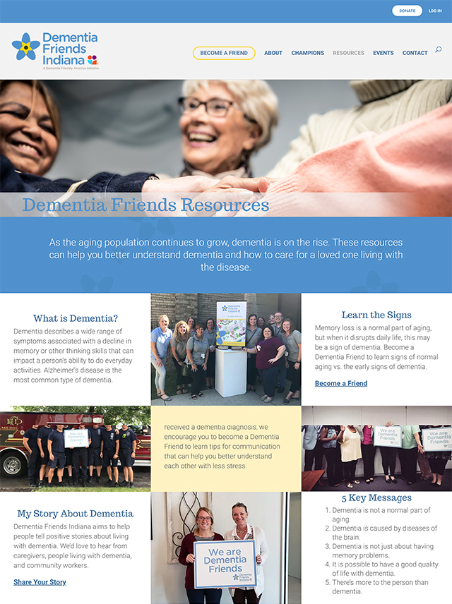
Everything can not be on top! That was the challenge as we designed the complex resource page for Dementia Friends.
Although a lot of information is visible when the site is viewed on a desktop, the rows of three consolidate into one long stack when the site is viewed on a mobile device.
Working with the client, we discussed priorities early on. That way their resources were listed in a specific order and told the same story no matter what device the user used to view the page.

Design Trend: Angles Everywhere
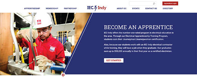
IEC – Indy’s new logo features strong angles and sharp diagonals that we wanted to convey in their new website’s design.
Instead of placing images in simple square boxes, we use sharp angles and bold colors to separate the images from the text.
Not only do these sharp angles reflect the logo, but they also drive the eye down the page.
Design Trend: Breaking the Grid
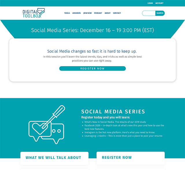
One of our biggest achievements this year was the launch of our new resource site, Digital Toolbox.
Not only was it a huge relief to have all of our resources organized under one roof, but the site itself provided a great opportunity to play with the latest features Divi has to offer.
Throughout the site we layered text boxes on top of each other to give the illusion that one element is pasted on top of another.
The most important calls to action are in the top most layers.
Design Trend: Everything Asymmetrical
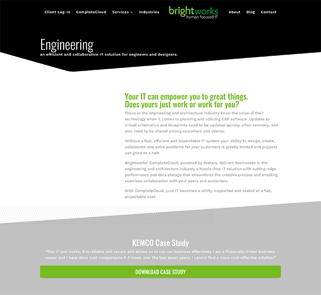
The new site for Brightworks was easily one of our most innovative sites in 2019. In fact, it was even featured in a spotlight post on Elegant Themes’ blog!
This robust site was difficult to place into just one category because it encompasses several modern design elements. It features asymmetrical text blocks and graphics, vertical headers, and even sharp angles dividing page sections.
The vertical headers (as seen on the homepage) create a sense of asymmetry without completely overbalancing the page. The site overall is very interesting to look at, which counterbalances the amount of quality content per page quite nicely.
Looking Forward to 2020
Now comes time to ask the big question on everyone’s mind: what comes next? According to Lorraine, we should expect to see a much larger (and needed) push for mobile-first web design. Bold blocks of color will also continue to trend, though we’re likely to see more asymmetry and grid breaking. Those of you who, like me, enjoy a bit of subtle movement will be happy to see parallax backgrounds and micro animations staying in the mix as well.
So, how did we do? And, more importantly, does your site make the cut? If you’re reading through this list and thinking to yourself, “wow, I wish my site had something like that,” give us a shout. We’d love to have a conversation to see what we can do for you!
