Some web design trends from 2016 are still going and still developing toward mainstream adoption. Some trends are really just fads. But some deserve to hold on. Here are 7 trends I want to see more of in 2017.
HTTPS For Every Single Website
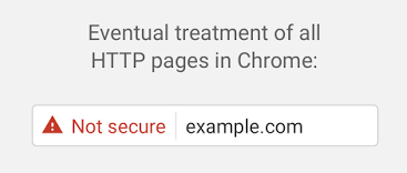
We’ve been feeling the rumbles of Google’s HTTPS Apocalypse since 2014. In 2016, those rumbles became full on thunder claps with the release of statements from Google revealing SEO rewards for websites that encrypt their web traffic and upcoming changes to Google Chrome that will visually mark websites that don’t. This is the image Google released to demonstrate how it will mark all non-encrypted sites:

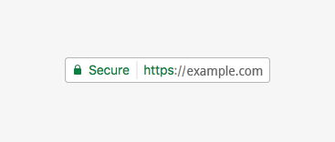
Nobody wants to get that red triangle. Instead, you want green, like this:

At this point, I’m calling SSL the website add-on you can’t afford to not get. SSL is the name of the encryption technology you get from your website host to enable HTTPS. Read up on how to get SSL for your website.
Use Web Design to Delight
Delight is something special. It’s that feeling when something is a surprise and that surprise something also happens to exceed your expectations. When you send a thank you note, you delight someone. Or when customers see your employees on TV for volunteering, they’re delighted. And when something works easier and better than customers expect, they’re delighted.
Intentionally creating delight for customers with your website improves their experience, which is always good. And consistent, quality experiences with your site means they stay longer and interact more. Google reads those signals to mean your site is a good place to send their customers from search results pages, ranking you higher.
Personally, I’m delighted by doughnuts, all of Dustin’s lines from Stranger Things and getting Amazon packages I forgot I’d ordered. But you can’t sprinkle those over your website. And there really isn’t a silver bullet for creating delight. But this guy’s formula for delight is a good read.
And did you know that delight is a core design philosophy at Intuit, makers of Quickbooks and Turbotax? Turns out delight isn’t just for kids.
Make More Videos
So, Vine just died. The mini-video social network couldn’t hack it in a world where every other network integrated its core idea. Snapchat expanded and stretched the concept in totally weird ways. Twitter (who owns Vine) basically baked easy video tools into Twitter. Same thing at Facebook. That doesn’t mean cute, short videos are gone. It actually means easy, amateur video hit the mainstream.
Your customers are watching more videos, in more ways, for more reasons. If you’ve written how-to blog posts for years, it’s time to enrich those articles with video versions that complement the text. If you’re announcing a new product or some other business news, think about making a video to go with your press release.
And if you’re not sure how video is going to work with your current website, talk to a marketing expert now. These elements only work together when your online communication efforts are integrated and working to support each other.
Duotones and Color Overlays
You might have seen advertisements from music streaming service Spotify and other tech companies that use a real photograph with different colors and color gradients on top. These vibrant, eyeball-grabbing ads have the benefit of being real pictures, not cartoons or drawings, but the color overlay makes it easier to use text on top of the picture.

When you can put text on a full-width image without worrying about needing copy space, you can fill the screen with gorgeous, high-impact visuals. Forget about cramped, boxy compartments. If you’re looking to freshen up your brand, ask your graphic designer to develop a house style for imagery that incorporates this look.
Web Designers and Web Developers Combine Jobs
The web development tools we use at Roundpeg keep improving in their ability to allow on-the-fly design decisions. Sometimes it’s even easier to produce a new design by simply using our development framework to start with rather than starting with Photoshop or Illustrator files. Not to mention that an deep knowledge of the framework is required to consult with the client and plan the new design anyway.
While Roundpeg’s web design team members already perform the developer/designer job in a combined fashion, many other companies and website teams will face the collapse of old silos and the fall of cubicle walls. Ask your next web designer to explain their design process. Look for a team with cross-disciplinary skills. Avoid teams holding on to the old division.
BIG Typography With Powerful Position Statements
All caps text signals SHOUTING and LOUD NOISES. Over-sized text is just for billboards. Do you still believe these things?
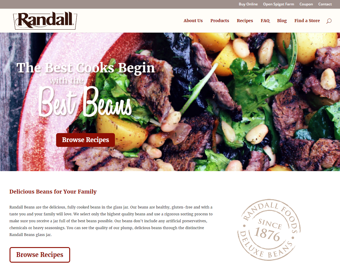
Over-sized text is required for billboards because those cars are going 70 mph or more on the highway and drivers barely have time to process that message. Our mindset surfing the internet isn’t so different. Especially as our computer screens expand and monopolize ever-more of our desk space.
That additional real-estate doesn’t mean you can jam in more small print. It means we’re experiencing the internet more like we experience movies and TV: on the big screen. Let’s treat our headlines like the stars they are, printed in great big letters for the audience.
Craft your own, unique, position statement to display in a powerful, prominent, position.
Responsive, constraint-based web designs
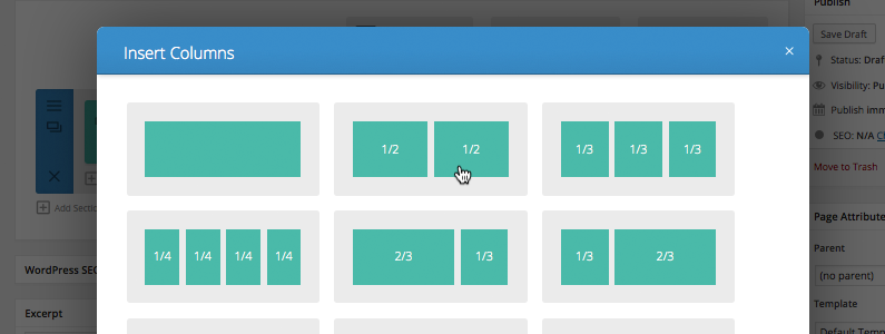
Constraint-based web design refuses to define strict heights and widths for design elements. Percentages and relative units of measure replace pixels. It’s the grown-up version of mobile responsive web design. It makes no assumptions about which device or screen size your customers look you up on. Constraint-based web design expands and contracts to fit every screen.

You shouldn’t have a “mobile version” of your website. You should have the same website, same content same everything. Designing with smart constraints like 25% and 75% that update to respond to different screens lets you show your best content in its best presentation for every screen.
Did you adopt any of these trends in 2016? Any you’re looking forward to implementing this year? Let me know in the comments!
Ready to apply some of these web design trends to your next project? Start with our kick off document.
[su_web_kickoff_guide]
