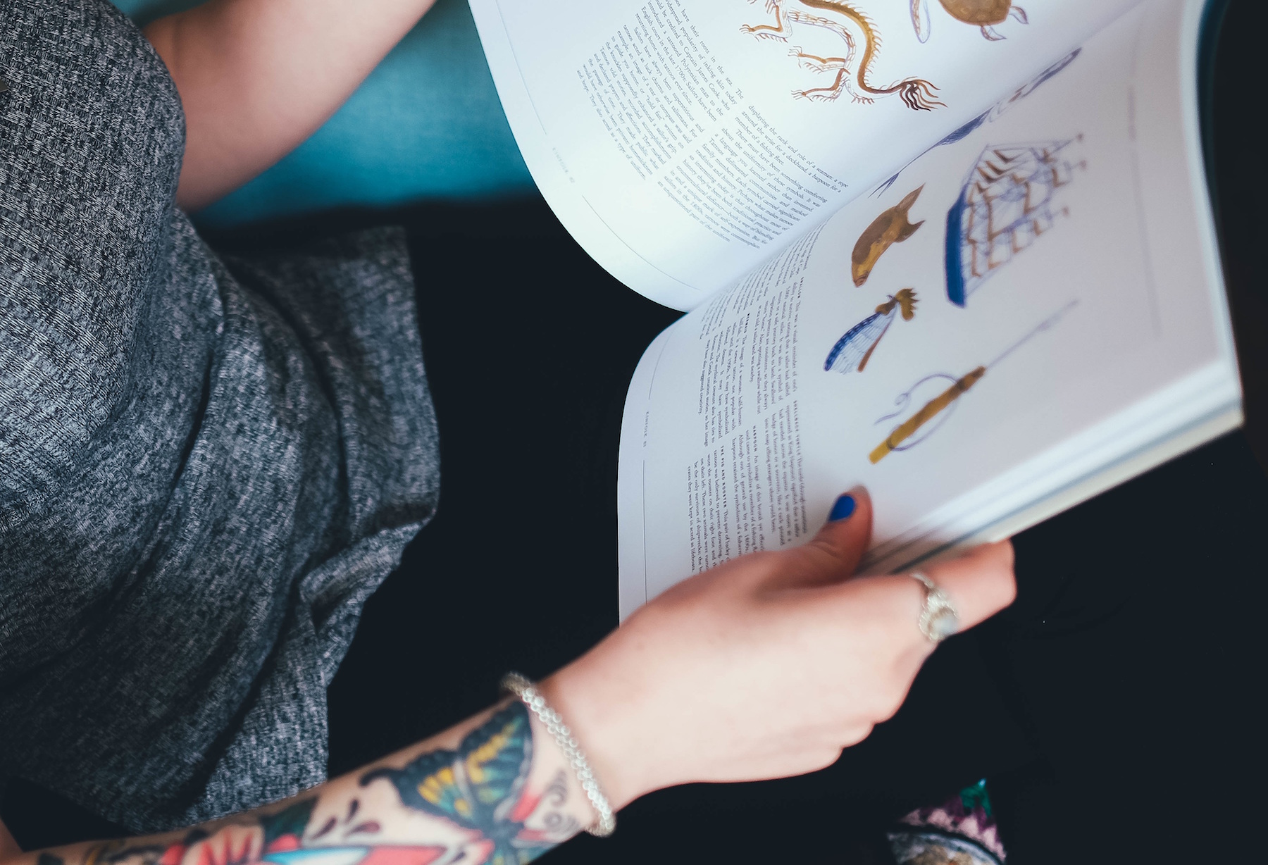
What do your blog posts look like? Overgrown Tweets or relics imported from Blogger? I’ve got a few of those. They’re just plain text, with no images and low interest. It doesn’t have to be this way!
What we (that’s you, me, we) write is important and useful to our audience. So, let’s make our posts look and feel as important, useful and great as they truly are.
What follows is a series of demos built with WordPress and the incredibly popular Divi Theme (also available as a plugin). Each section showcases a new visual idea you can only do with Divi Builder enabled on your post.
DISCLAIMER
Divi doesn’t come with instructions. Neither do my demos. These are included for demonstration and inspiration only. However, I’ve marked each one with a difficulty level.
Low difficulty means it’s a 5 minute affair. No skill required, just taste.
Medium difficulty means you’ll need photo editor software to adjust images. Or maybe I made lots of tweaks to the Advanced Customization tab.
Now, there aren’t any high difficulty demos included here. But high difficulty would indicate I had to add custom CSS or carefully Photoshop to achieve the effect. At that point, you definitely need a web developer to assist.
Ok, no more time-wasting. Let’s go!
Full Width Featured Image and Post Title
Medium Difficulty
Look above, check out this post’s title and the image below it. They’re gloriously huge. No concessions to low-res monitors or screen constraints here. When you have a great image, make it big. Visual content like great images and illustrations give your readers more to engage with and break up long sections with a quick visual break.
In fact, we recommend that each and every post you publish includes at least one high-resolution image. This image becomes part of the post’s preview when it’s shared on popular social media networks like Facebook and LinkedIn.
Make sure you’ve got a large, high resolution image before trying this one. Use the special Full Width Post Title module in Divi builder to set it up.
Seamless Transition to Full Width Image
Medium
This is my personal favorite. Scroll down just a bit and check out how awesome that bookshelf is, layered just below the last paragraph. I love it when you can unify text with an image background. This look makes your post feel more like a glossy magazine spread than a digital read. Your text is no longer a string of characters and paragraphs, but an integrated design element.
As always, you need a great, high resolution image to start with. But the critical part is choosing an image with a top or bottom area with a solid color along the entire edge. Use the eyedropper in Photoshop to sample the color and get the hex code. Then, create a section with your text in Divi Builder.
Set the section’s background color to the color code you just sampled. Add your picture so the solid color edge lines up flush with the section that has the matching background color. In this case, our post background is white and the top edge of our bookshelf image is the same shade of solid white.

Multi-column Layout with Image and Text
Low Difficulty
While I love all the fancy visual things you can make with Divi, the absolutely most useful part is the easy-to-use columns. Using the built-in tools, you can plan for images and text that line up perfectly and predictably every time.
This is especially useful when you need to use an image to illustrate your point, but you want it to float off to one side next to the text. Hey there Mr. Bookshelf Illustration! Lookin’ good.
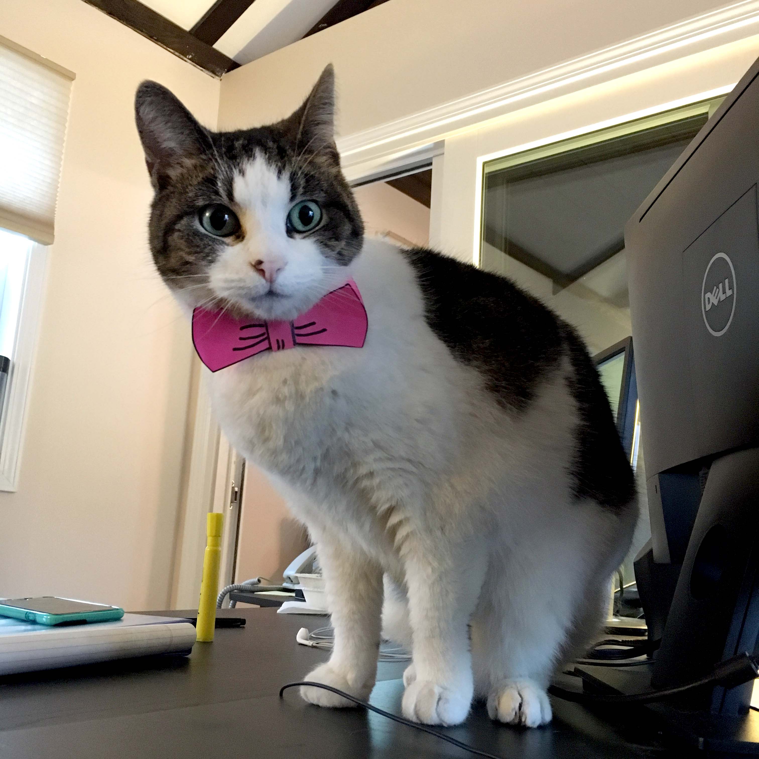
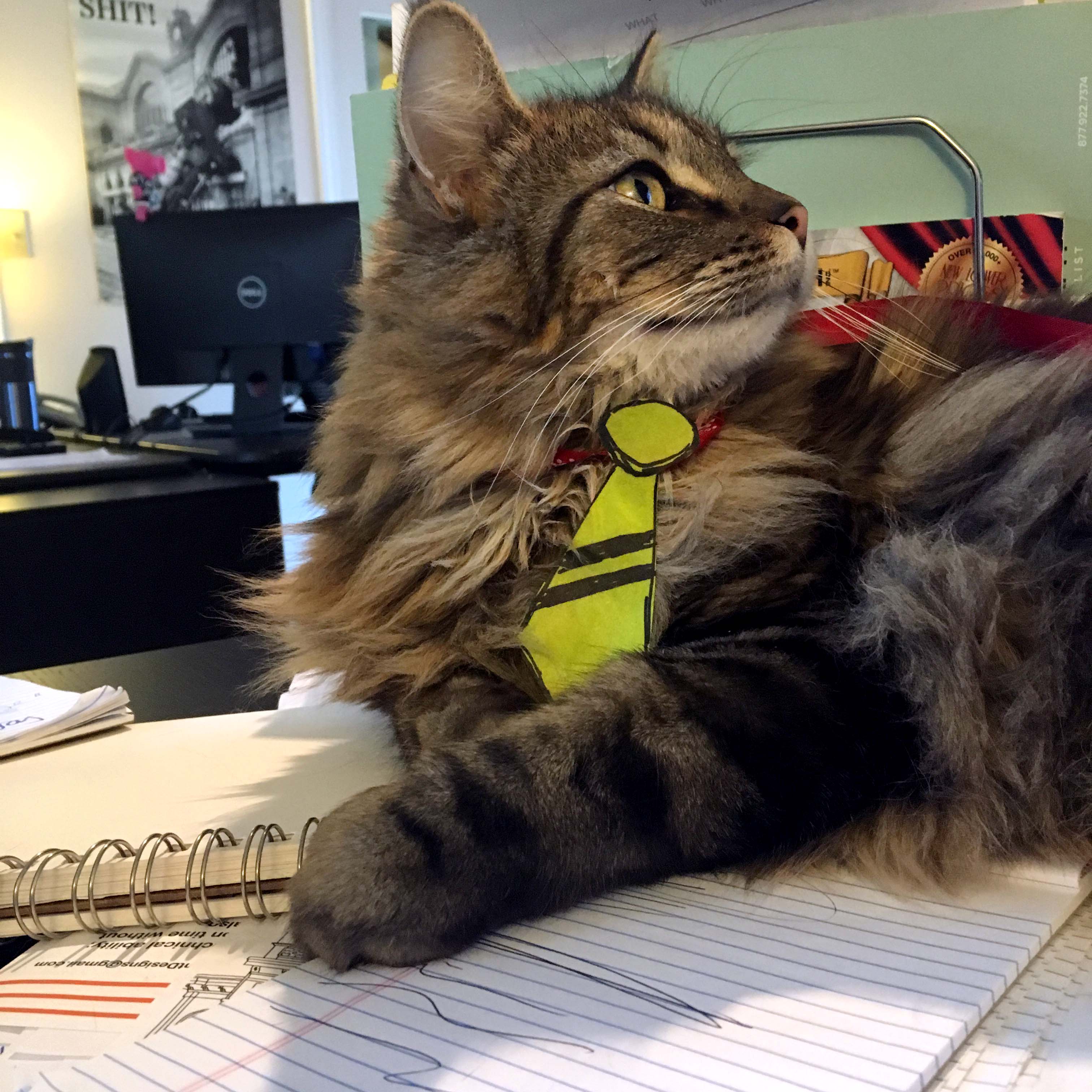
You can use anything in your columns. Set your text newspaper style, or put several images next to each other, like I have below. On mobile devices, these columns all line up vertically for easy browsing on phones and tablets. Divi makes your posts look professional at any screen size.

Zero-Gutter Photo Rows
Low Difficulty
See those three images above? The space between each image is called the gutter. That’s a print design term that basically means margin. Margins are ok. But current design trends often minimize or remove the margin completely.
When it’s a few images in a row, like the ones above, you can safely add a contemporary edge to your layout by tweaking the gutter in the row settings provided by Divi Builder. When you set the gutter to the lowest setting, you get a no-margin, edge-to-edge photo strip.


Pretty Calls-to-Action
Medium Difficulty
One of the most exciting things about using Divi Builder is the easy way you can add call-to-action buttons without any code knowledge. You can easily add a new section with a custom background color or background image. Just fill in Divi Builder with your headline, button text and the URL of the page you want people to go to.
Here’s a fresh call to action section to show you how cool these can be.
Web Design Kickoff
These are the questions you should ask before starting a web design project.
I counted the number of clicks when I made that. Grand total: 12. Just imagine if you put in a few more clicks to set a more interesting background image and tweak the font and button styling.
These demos showed the bare bones of what you can do with WordPress and the latest web design tools. I hope you’re excited to build up your great content into truly super content with enhanced visuals and polished page layouts.
Talk to Roundpeg if you’re interested in learning how a new web design fits into your marketing strategy. In fact, we’d love to talk to you about your marketing strategy too! Like character, plot, and setting in a great story, the five parts of marketing all work together to turn random visitors into raving fans (i.e. – paying customers!)
Roundpeg is an Indianapolis web design firm.
