Symbolic colors of women candidates – Part 2
The marketing for the diverse women running in the 2020 presidential election brings new design symbolism and a broader color palette to political campaign web design.
A few weeks ago, I took a look at the web design and marketing of women candidates for next year’s election. I analyzed their logos, web designs, and other marketing to review the use of symbolism through colors and fonts. In that previous post, we looked at the branding of Amy Klobuchan, Kirsten Gillibrand, and Elizabeth Warren.
Now, let’s take a look at the remaining three women candidates and the unique symbolism used in their political campaign branding.
Marianne Williamson
The dark navy paired with white and pink colors in the logo create an undeniable feminine feel. Although you wouldn’t automatically associate those colors with a spiritual guru, the colors do their job to symbolize Marianne’s message of peace and love. Marianne is laid out in a nice chunky san-serif. The stacked “2020” in her logo is a smart choice and the 2’s relate to the wide heart used across her signage. The election year begins to take on a playful feel with the closed bowls and counters in the numbers.
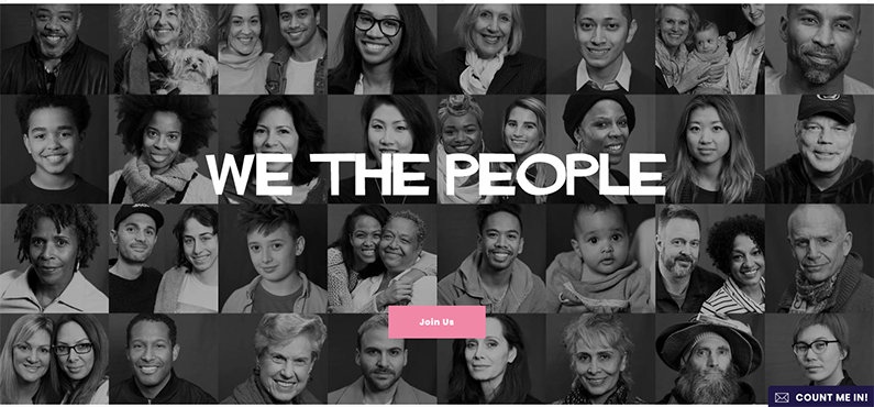
But that’s when things (design things) start to get a little weird. Scroll down from the first CTA on her website, and we notice the introduction of Coromont Garamond. Okay, no big deal, everyone likes a little contrast here and there. Keep on scrolling and a third font enters the stage in giant white anxiety-inducing letters over an array of otherwise nice black and white portraits.
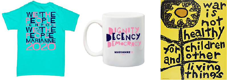
The font is called Hitchcock Sans Serif, and you guessed it, is meant to emulate the infamous poster designs by Saul Bass. Don’t get me wrong, if you’re going to draw inspiration from one of the greatest designers, he’s a good one to choose. What confuses me is how that design choice was made for Marianne’s brand, not only for use throughout the website but also for official Marianne campaign t-shirts.
Marianne advocates for overcoming hate with love. So, perhaps this was an attempt to relate to the symbols of the Vietnam War era protests – which wouldn’t be the most far-fetched concept if only it was executed better. The design team should have paired down the font choices and ensured the fonts have adequate contrast or relate better to one another. Ultimately, it would have done more justice to stick with the font used on her official coffee mug. That, at least, starts to relate to the hand-drawn grass-roots feelings as seen in “War is Not Healthy for Children and Other Living Things” design by Lorraine Schneider in 1965 and other protest posters of the time.
Tulsi Gabbard
At the surface, the logo is simple, slightly modified rounded sans serif font, the whole wordmark being filled with a gradient from orange to navy to represent the Hawaiian sunset and growing compassion. These themes both serve to symbolize her slogan, “a bright future.”
The full color logo doesn’t show up much across the campaign site, but the solid, simple design is proven by its appearance in one color. When you take a closer look at the logo, you notice the outer edges of the T and I are rounded inward and begin to imply a smile shape. This warm, welcoming theme is carried throughout Gabbard’s campaign website by the use of color, but mainly big vibrant photography that include a lot of Gabbard smiling.
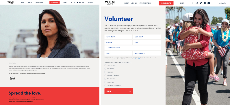
www.tulsi2020.com
This stylish site design has a lot going for it. The use of fonts and bold color choices remain consistent and the design feels strong and secure, assisted by the use of the ultra dark navy and black. As you spend time on the website, you might notice that through carefully considered choices in photography and accented font color, the design still utilizes the symbolic and conventional political colors of red, white, and blue – only with a more deft hand.
Kamala Harris
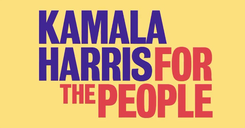
Lastly, but certainly not least, we come to Kamala Harris’s political branding. The logo in all caps reads “Kamala Harris for the people.” The slogan is nearly inseparable from her name, and that’s no coincidence. It was born out of her time as a California prosecutor and rising to address the court. Now, it’s the platform she rises upon. But the symbolism in her mark doesn’t stop there, the interlocking fonts relate to the activists’ posters of the 70’s. The colors, too, pay homage to that era. Specifically, the buttery yellow and the desaturated, rust red were chosen as a tribute to Shirley Chisholm, the first woman and African American to seek the nomination for president of the United States from one of the two major political parties.
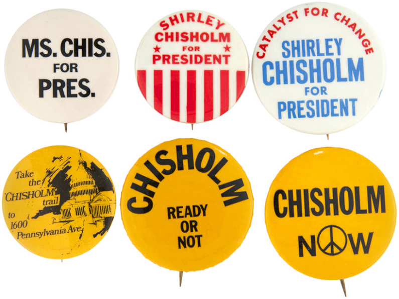
Harris’s campaign website continues to capitalize on the logo’s striking, asymmetrical typography and logo. The fonts and colors all work nicely within the branding set forth by the logo and campaign signage, but continue to convey the sense of advocacy and an urgency for a change in leadership.
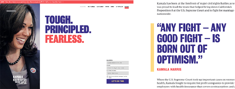
https://kamalaharris.org
Marketing Women Candidates in 2020
The diversity of the women running for president in 2020 brought new challenges and with those challenges came great opportunities to use non-traditional colors and symbolism. Not unlike the candidates, the campaign marketing and web design are paving the way to elevate the next generation of political branding.


