Symbolic Colors of Women Running for President
Gone are the days when a political campaign has to include red, white, and blue. Reflecting the diversity of the 2020 presidential candidates, political branding is evolving away from the colors and symbols that have always dominated political campaigns.
The major marketing trend that can be seen in preparation for next year’s presidential election is that candidates are avoiding symbols in favor of more minimalistic logos. You won’t see that many stars and stripes, but that does not mean symbolism has gone out the window.
Let’s take a look at logo, web design and marketing of women candidates. We’ll look at how the choice of color and fonts are playing symbolic roles in the political branding of three of the six women.
Amy Klobuchar
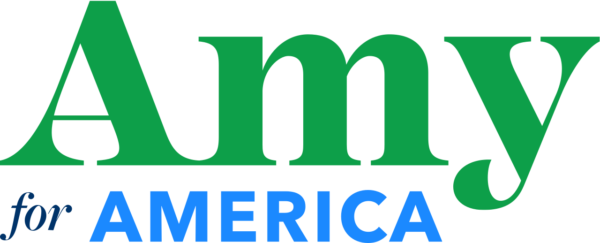
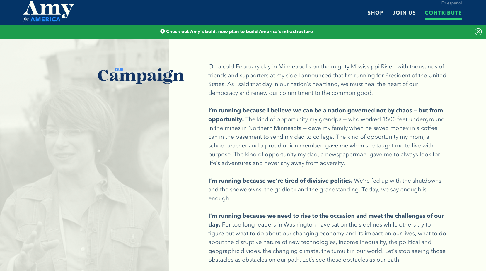
The bright, grass-green of Klobuchar’s branding maintains a fresh, contemporary feel when paired with the light and dark blues. It feels like the lush fields in the middle of the country, the sky, and water.
The only female presidential candidate to use a serif font in her logo. The serif font, used for “Amy” and carried throughout her campaign website as large display type, is friendly, unique, and is reminiscent of hand-painted barn signs and fruit crates. Again connecting her visual branding to the homegrown, the wholesome, and prosperity of the heartland – which is a major theme in her campaign.
Klobuchar’s website – like any good website- is user friendly, and demonstrates a cohesive use of her brand colors and typographic hierarchy.
Kirsten Gillibrand
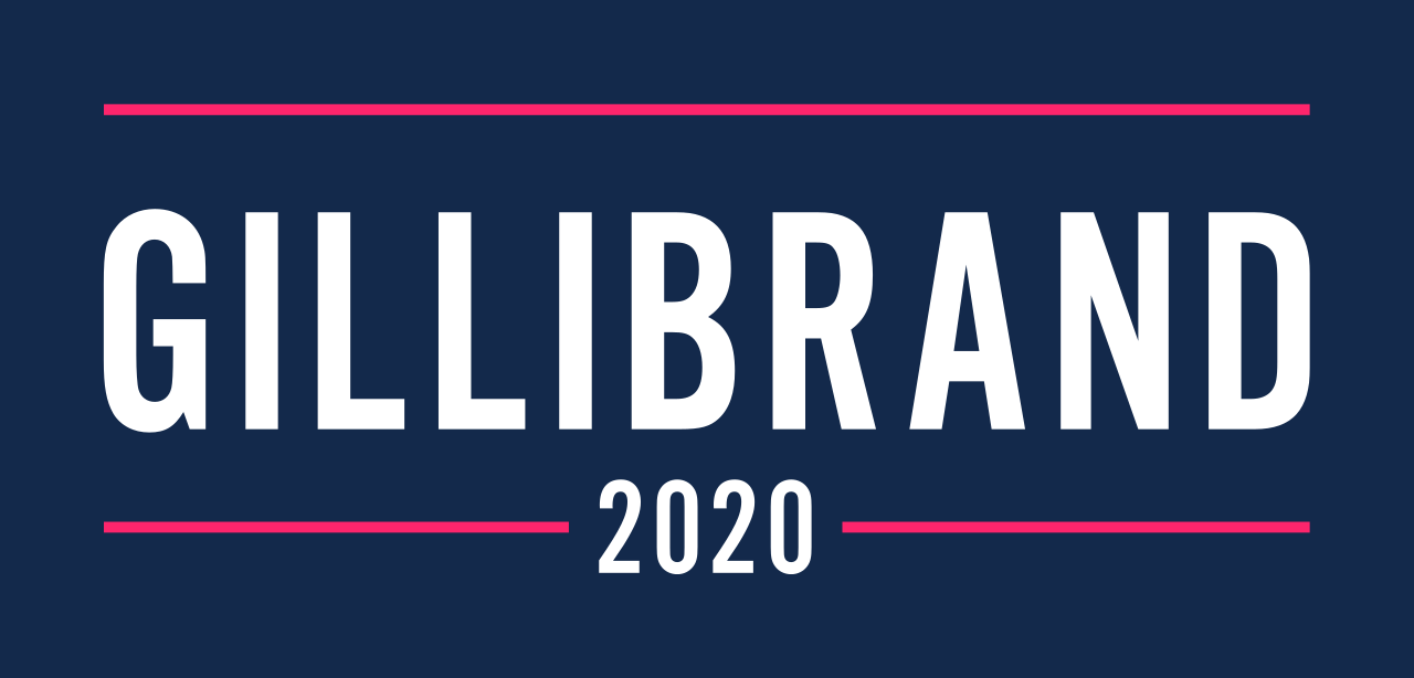
Almost the visual antithesis to Amy Klobuchar’s safe, wholesome-feeling brand that seems to promise security, is Kirsten Gillibrand’s bold, adventurous brand. The use of Sans-serif with rules above and below is not something unfamiliar to political branding, but the use of the color is.
Through the bold typography and use of hot pink and dark navy, Gillibrand’s brand roars into a battle cry – it feels like the voice of the Pink Pussy Hats of the Women’s March. The messaging of bravery (“Do something brave” and “Brave wins”) also capitalizes on this feeling of activism and the fight for women’s equality.
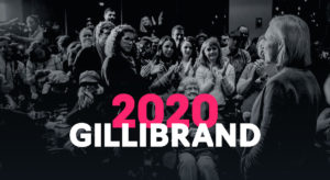
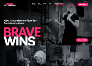
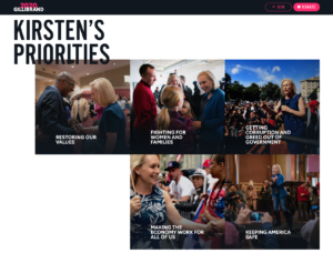
Gillibrand opts to use a different logo across her website. In this mark, “2020” and “Gillibrand” overlap and start to create a feeling of urgency. The same overlapping type treatment is used throughout her website and continues to convey the sense of activism and perhaps even a little rebellion as the design breaks the traditional grid.
Elizabeth Warren
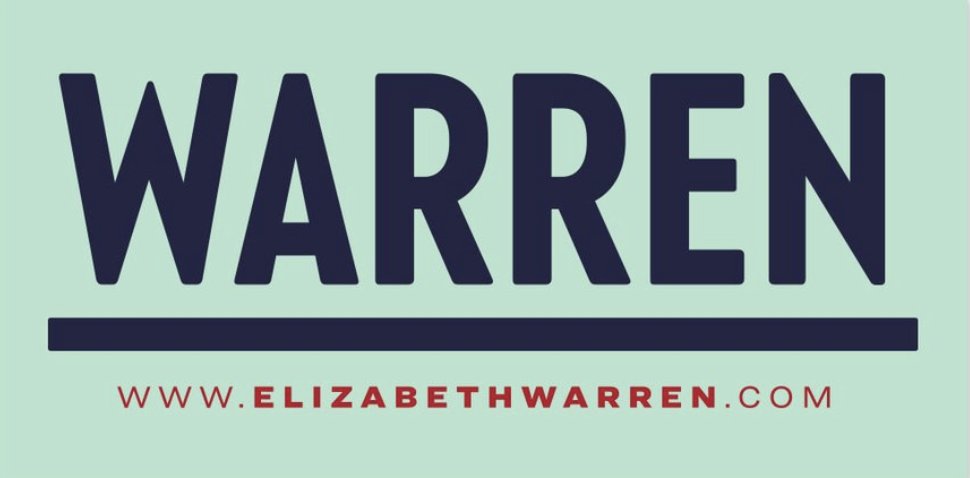
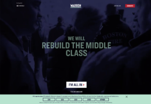
The 2020 campaign logo for Elizabeth Warren is minimal yet bold. The use of a vintage-style sans-serif type relates the mark back to a time with the American middle class was stronger and more prosperous. The color palette of purple, white, and green ties Warren’s campaign to the suffragette movement.
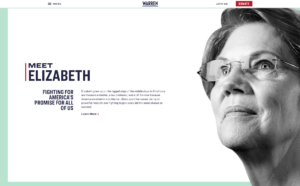
Warren’s campaign website is a great example of a clean, organized web design with well-crafted experiences throughout the site. The site succeeds in balancing the contemporary and paying homage to history. The use of video and mint green typography over the purple screened hero images feels modern and adventurous. Scroll further down the site and a horizontal slider quickly introduces you to Warren’s stance on important issues.
The use of half-tone textures and stylized photography (such as used next to her bio on the homepage) also serves to remind one of a symbol associated with the past – the printed newspaper.
Wordmark Logos
The above candidates, and many others running for next year’s bid, opt for wordmark style logos foregoing a long tradition of using symbols in political branding. Their choice of colors are bold and symbolic, which serves to shift focus away from party affiliation and get straight to the issues they stand for. Wordmark logos can be challenging as they rely solely on fonts and color. With careful consideration to those choices, you can create an experience that is meaningful and memorable.
Marketing Women Candidates in 2020.
With women entering the race in a big way the look and feel of the campaign websites and logos are dramatically different than a few years ago.

