Don’t worry, this is not going to be another post about politics. The internet is saturated with articles for your reading pleasure, and let’s be honest, you’re only going to read the ones that align with your own beliefs anyways.
So check your politics at the door, because this isn’t Facebook and we’re going to stick to design today. More specifically, it’s time to discuss the varying levels of success we’ve seen in the branding for Hillary Clinton’s presidential campaign.
The Hillary Clinton Logo Saga:
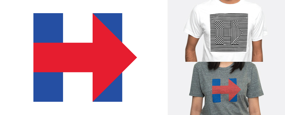
Michael Bierut’s team at Pentagram designed the logo, which has been around for well over a year now. As with basically every new or redesigned logo, it was met with a huge amount of criticism and the Internet trolls came armed with pitchforks and claims they could have done better.
Once the initial frenzy died down, the very simple H with an arrow making up its cross bar was revealed to be an extremely versatile mark. Since its introduction, there have been some hits and misses and no shortage of public reaction to both.
Hillary for a Cause:
Some of the more successful iterations of the logo have also been the simplest. With a few minor color changes, the H easily transitions into a symbol of support for gay rights, women’s rights and other social causes without the need for any accompanying words. There’s little doubt these are the types of alterations Pentagram had in mind during the design process.
Holiday with a Capital H:
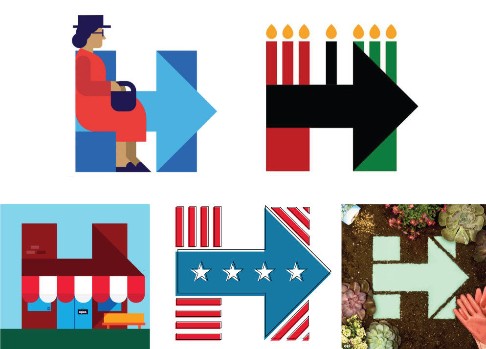
December 2015 wasn’t a great period of time for Clinton’s marketing and PR teams. First there was the anniversary of the Rosa Parks arrest, when someone made the extremely unfortunate mistake of creating a logo that appeared to depict Parks seated at the back of an H shaped bus.
A couple weeks later, more backlash when Clinton was accused of being tone-deaf and insensitive after changing her logo to a Kinara for Kwanzaa. The general consensus was that a politician wanting minority votes should learn to better understand the difference between appreciation and appropriation. Very few people disagreed.
Not all of her holiday logo treatments have been failures, in fact some of them are the most interesting designs we’ve seen from any of the presidential candidates on either side. The Small Business Day version was unique and on-brand, as was the stylized flag for Independence day.
Another successful use of the logo was the garden themed gif shared on earth day. The design works well due to its simplicity. A more complex design (looking at you, Rick Perry!) wouldn’t have translated as nicely.
Sentimental Photo Frames:
The H icon lends itself really well to photo treatments, and these versions are frequently used to show off cities on the campaign trail. The photographs allow an otherwise flat logo to feel personal and familiar in a way an illustration couldn’t.
Another photographic version was shared on Mother’s Day. There’s really no debate about the level of adorable in the black and white photo of young Hillary with her daughter Chelsea.
New Year, New Horrendous Design:
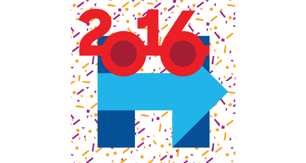
Sure this version isn’t culturally insensitive or controversial, but it’s being included because it offends the eyes of all who see it. Only after studying it carefully I realized it’s meant to represent the silly New Year glasses people often wear in photo booths at bars on New Year’s Eve. It’s a very busy, very confusing design, and it probably shouldn’t have seen the light of day. Don’t drink and design, people!
Hell Yeah, Summer!
There’s no deep meaning behind this design. It was shared on social media on the first day of summer, and it’s gotten positive responses because what kind of person doesn’t enjoy a classic Bomb Pop? This is without question my personal favorite logo treatment so far.
Design for the People:
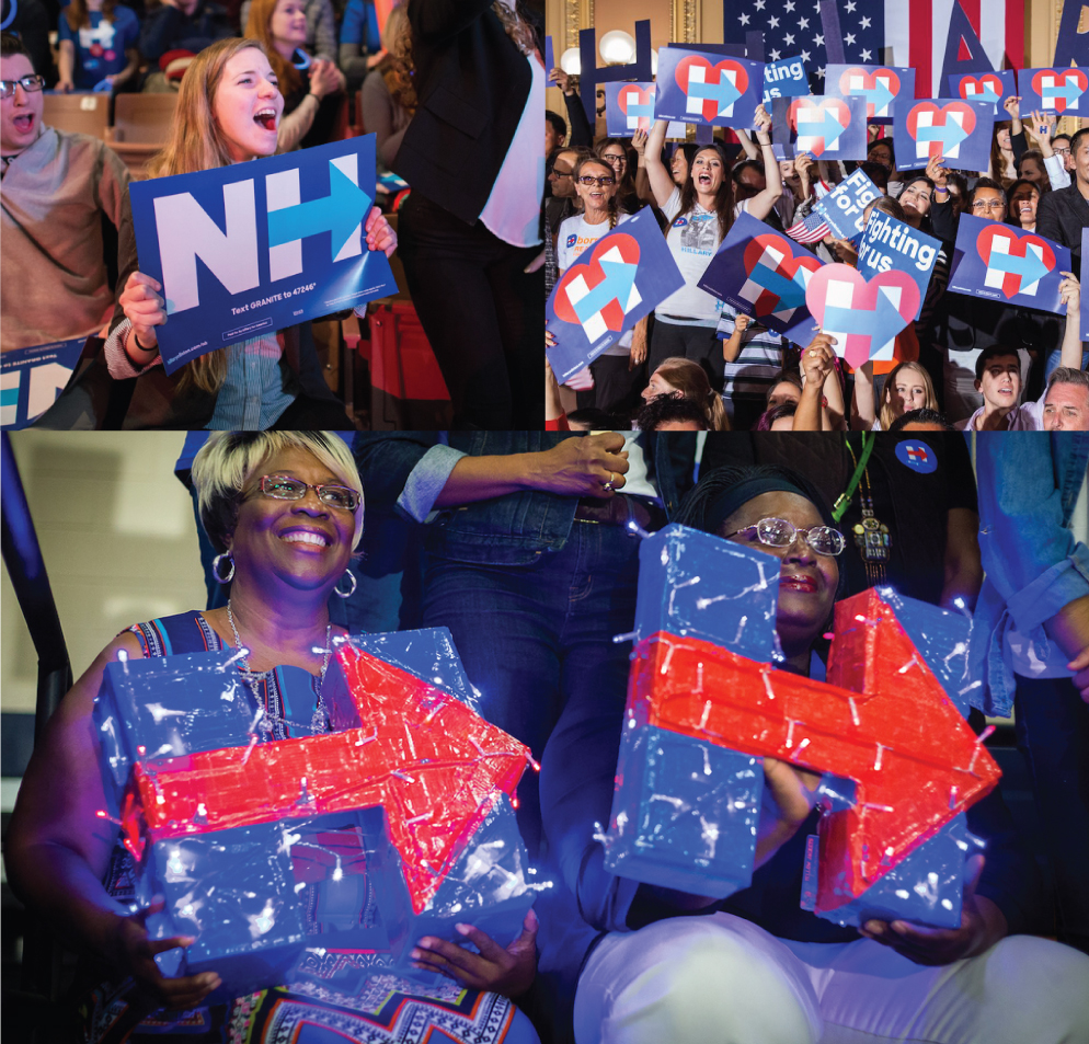
Good branding is created by a designer, but what really makes or breaks a design is how it is used by the people who own the brand. There have been some pretty brutal missteps since the logo was released, but in general, the design itself works. In a sea of rallying supporters, the imagery stands out and reads really well from a distance.
Having such a minimal design has also allowed fans to create their own unique (sometimes very well lit) signage, and that’s always good news for a brand, but especially good news if you’re trying to drum up the positive energy and support needed to become President of the United States.
Roundpeg is an Indianapolis graphic design firm.


