The face of Roundpeg has changed a lot over the years. By the face I mean, of course, our homepage design. It’s sported several looks over the years, each a little better than the last. Join me on a fun journey down memory lane!
2002: Every Business Needs a Starting Point
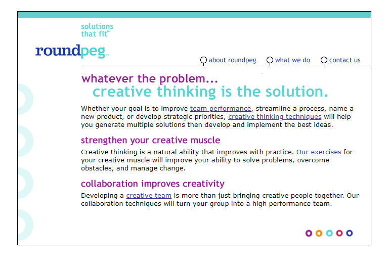
…and this was ours. Believe it or not, our homepage design was actually one of the more clean web layouts designed in 2002.
For those of you who don’t remember, this was a time where everything was still coded by hand. Dreamweaver, still owned by Macromedia, was in its infancy. It would also be another three years before WordPress would hit the net.
Back then Roundpeg’s focus was strategy so words dominated the page. Besides, images simply slowed down page load times anyway.
Websites were tedious, time consuming, and expensive to build so that’s why it would be a while before our first redesign.
Early 2008: Welcome to WordPress
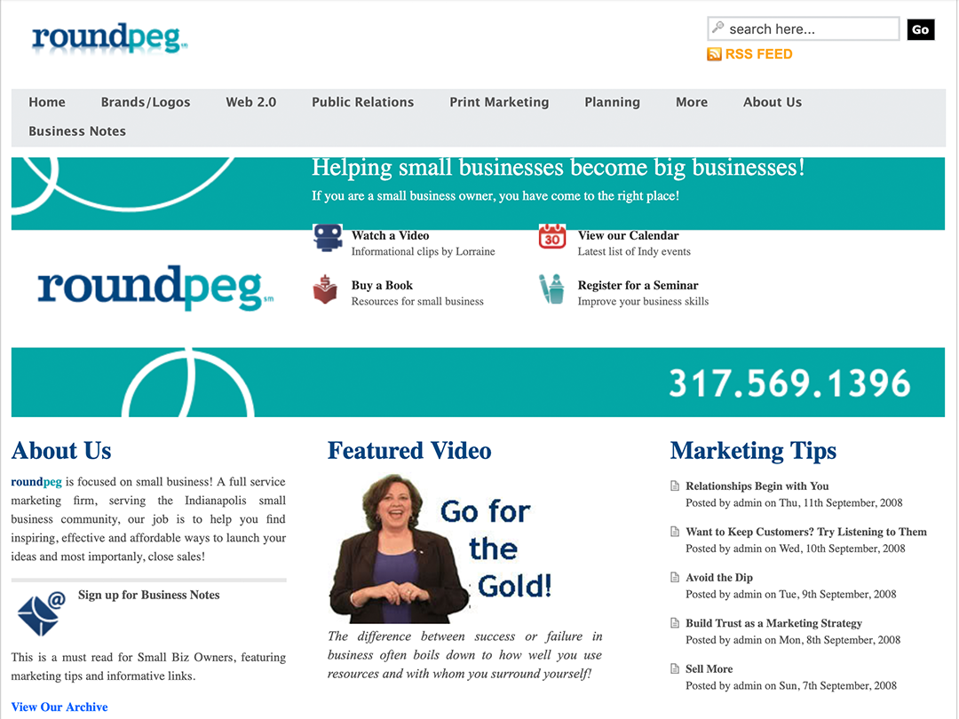
Fast forward six years, Roundpeg has its very first WordPress site. Multi-column rows are introduced for the first time and images play a larger design role.
Coding knowledge continued to heavily influence what we could and couldn’t do, but WordPress still provided us with more flexibility than we had in the past.
In one short year, Team ‘Peg had gathered enough WordPress experience to rethink our homepage.
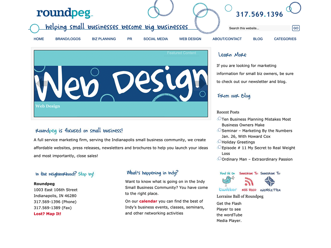
Late 2009: Good, Clean Fun
This may seem like another radical change. If you look closer, however, you’ll see this new layout is really more of a blend of the last two.
Fun fonts and hand-drawn icons were harder to come by in 2009. We were ahead of our time with these “cutting-edge” details on our homepage.
Trends move fast, though, and that novelty wore off quickly. Not all browsers were ready for radically unique fonts, which lead to bland headlines for many viewers.
In less than two years, it was back to the drawing board.
Late 2011: Hello, Elegant Themes
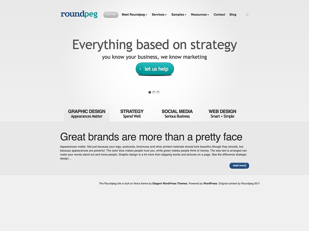
While the page may look a bit bland in contrast to our earlier styles, in funtionality it was anything but.
Thanks to the masterminds at Elegant Themes, we were able to introduce slick features faster than ever before. After all, great brands are more than a pretty face!
Though far more functional, this homepage lacked the Roundpeg flair. It was clean, and very on trend for the sparse “wet look” designs common at that time, but looked just like every other website.
Like many fashion trends, the very sterile feel faded pretty quickly.
.
Summer 2013: Return of the Teal
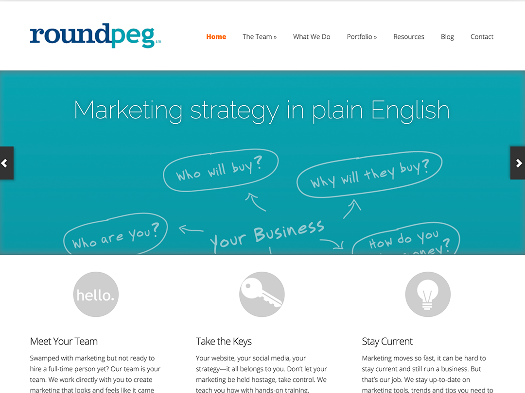
Lorraine and the crew loved the look of the gray site, but the rapid evolution of web functionality made the design less than optimal.
The expanding use of smartphones forced us to create our first “mobile first” design for the Roundpeg website. We made the decision to hide the slider on mobile and the the round ‘hello’ icon was the first thing visitors saw.
It was a friendly greeting, but created a side effect we didn’t expect. A few months after the launch we noticed a spike in traffic to our Meet the Team page. People were naturally clicking on the “hello” button.
That experience helped us understand the importance of vertical position when you design for mobile.
Summer 2016: Out with the Old, In with the Blue
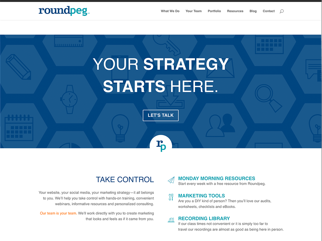
For the first time, our infamous “Roundpeg Teal” took a backseat. The structure of the page, however, was a less dramatic change than in past revisions.
The most important change with this version was our shift to our very favorite WordPress framework: Divi.
This Elegant Themes product had already revolutionized WYSIWYG web design in three short years. It didn’t show any sign of slowing down either.
Based on our experience with our website Divi, became our standard theme for all of Roundpeg’s web projects. A standard that continues on to this day!
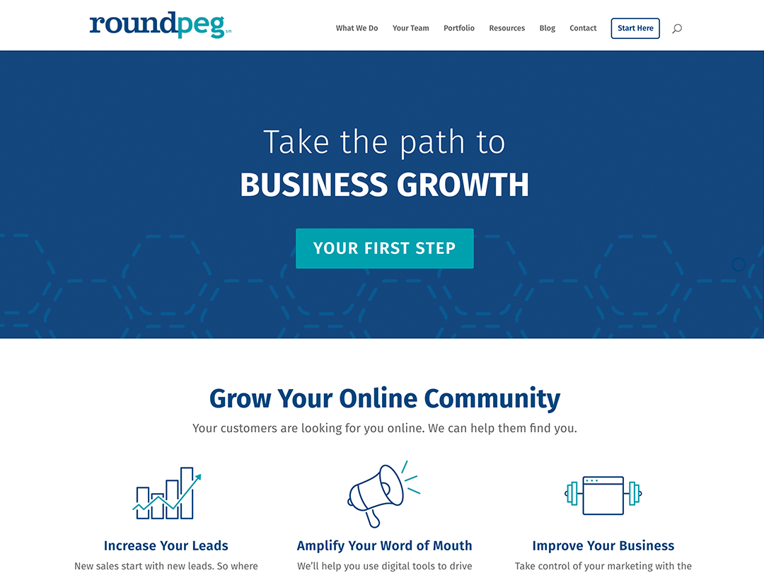
Summer 2019: You Are Here
A wise man by the name of Ferris Bueller once said that life moves fast. He also suggested stopping every once in a while to enjoy it.
We’ve had our fun tweaking backgrounds, icons, and fonts over the past three years. But, unlike Mr. Bueller, we live in the age of the internet and smartphones. Stay stagnant for too long and you’ll be left in the digital dust.
So we have made a few changes in what we feature in our calls to action, but the design is familiar. That is one of the best things about Divi, we can make a few small tweaks on the fly, without blowing up the entire site.
