![]()
Another round of web design reviews! Can you feel the warm weather coming where you live? Spring is in the air. Which means I’m thinking ahead to summer already and everything you can eat on a stick while you’re out enjoying the great outdoors. Let’s see how my favorite snacks fare online. I’ll review each one of these food web designs with notes about things they do well and what needs help.
I hope these notes help you see your own website in a new light. What does your site do right? What do you need help with? For even more help checking the health of your website, try our website audit.
Now, on to our first treat!
Cake pops
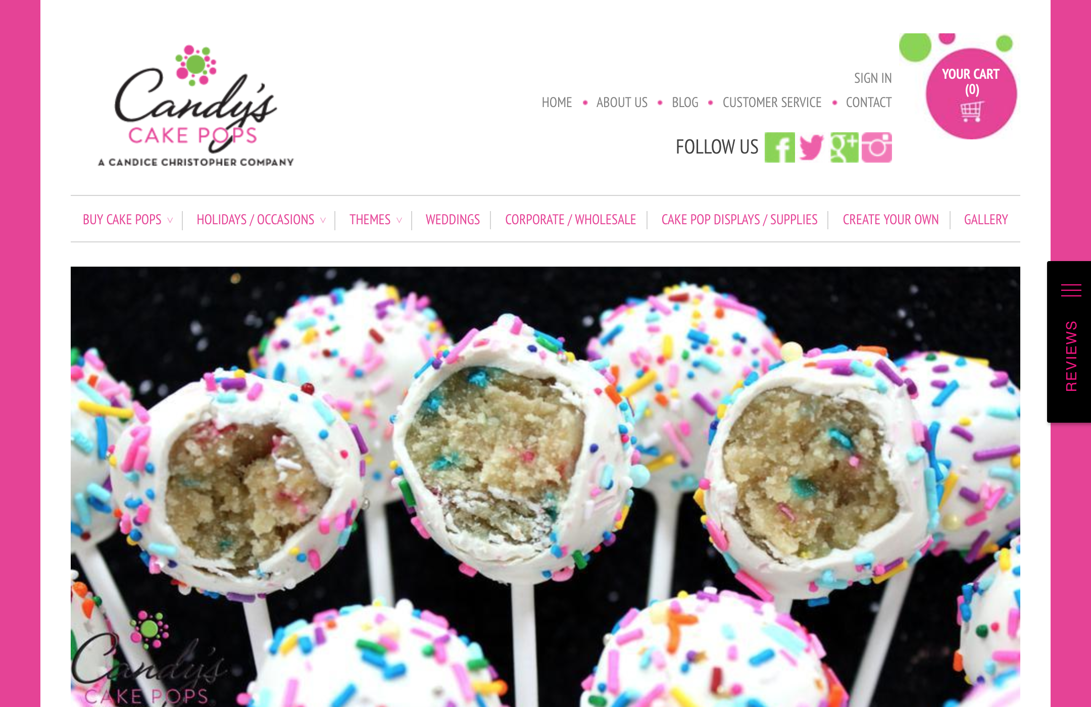
Food web design example: https://www.cakepops.com/
I should start by saying I had a hard time finding websites for some of these. Searching “cake pops” results in a cascade of recipe videos. And no one would claim exclusive rights to a whole a dessert category.
Out of several other similar sites for cake pops, I chose this one for its domain name. There’s something powerful about owning the domain name that exactly matches the specific product you sell. Big ups just for that. This web design opts for a boxed layout with defined borders and bright pink margins. To me, this boxed look is long out of date. Why not let loose and make it full-width? You’d get bigger pictures. As it is, this site almost looks like a blogger’s home page. It has the look of a pre-made template.
But the cake pops look incredible. The product photography couldn’t be much better. That alone overcomes my hesitation with the overall design. Good pictures cover a multitude of web design sins. I give this website three stars.
Ticklebelly Desserts
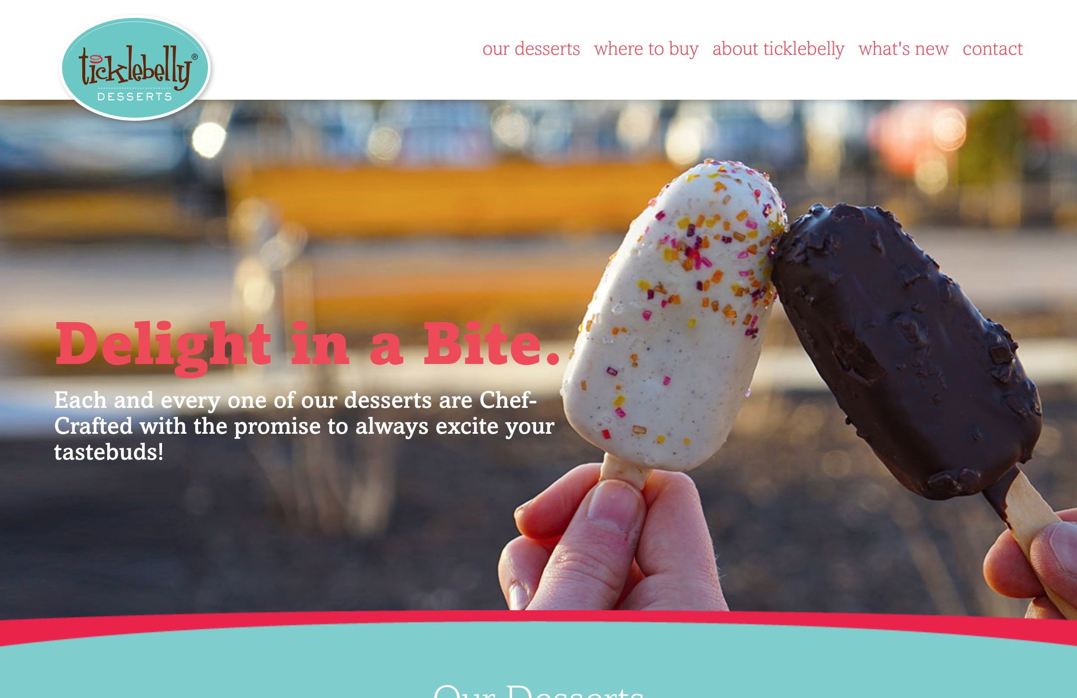
Food web design example: https://www.ticklebelly.com/
Once cake pops took off, it wasn’t long before someone found a way to package a variation suitable for grocery stores. These cake bar treats look like ice cream, but they’re found in the bakery section.
The homepage is dominated by a gorgeous product picture that holds up different varieties. Since the product is a miniature, I think it’s really helpful they show them in the hands of customers so online visitors immediately know the actual size. My favorite part of this website is actually found on their About page. But it’s not the About page. I found that rather uninformative, with generic stock photos and relatively little information. The kicker is at the end of the page. It says Next: Discover Our Desserts with an arrow pointing forward.
I love when web pages end with an instruction. Scrolling is really quite a passive activity. Readers look for guidance all the time. Tell me what to read next, and I’ll do it! Open the door for me. Leave me with a dead end and I’ll turn back. Ticklebelly’s web design is short, sweet, and wins for indulging our craving for one… more… click! I give this website three stars.
Nicey Frozen Treats
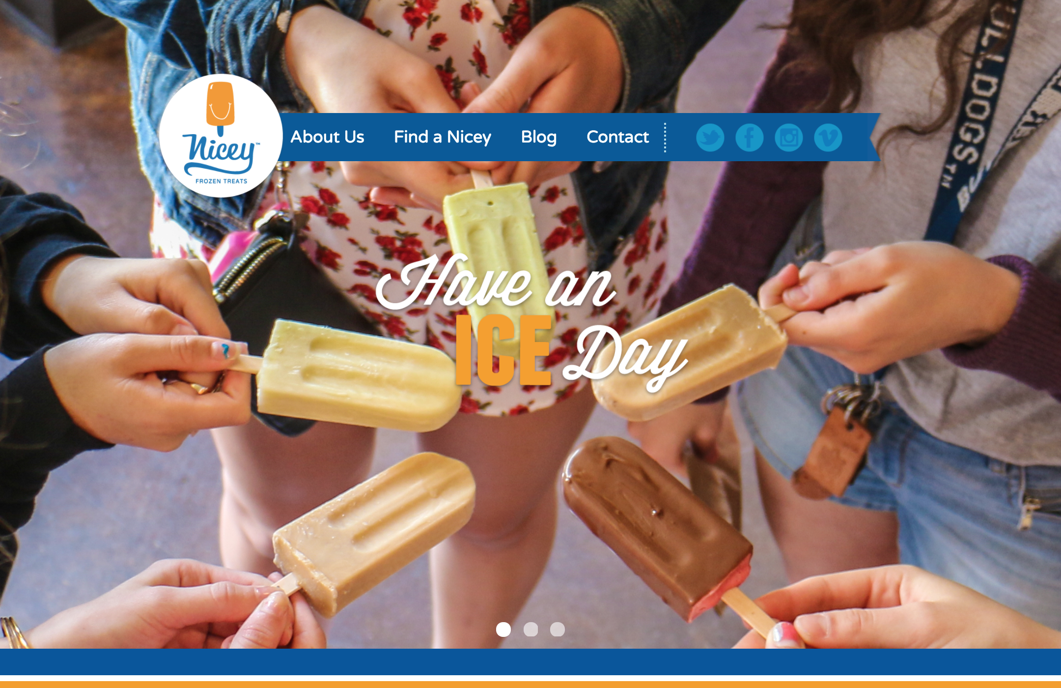
Food web design example: http://niceytreat.com/
Nicey Treat is a local favorite with two retail locations, pop-up shops at farmers markets and a permanent place in my heart. This web design starts with another extra-large home page background image. Again, it shows the treats in the hands of hungry customers. This picture follows the classic Instagram formula of standing in a circle, looking down at everyone’s sneaker tops. Or in this case, a ring of tasty frozen treats.
Unfortunately, the main navigation bar didn’t work when I tried it. Uh oh! But scroll down and you’ll find more charming photos of employees dishing out treats to cute kids and adults alike. Funky typography and asymmetrical, grid-breaking layouts fit 2018 web design trends. It may be intended to be a single page design as well. If the navigation links worked, I would give this website four stars.
Corn dogs
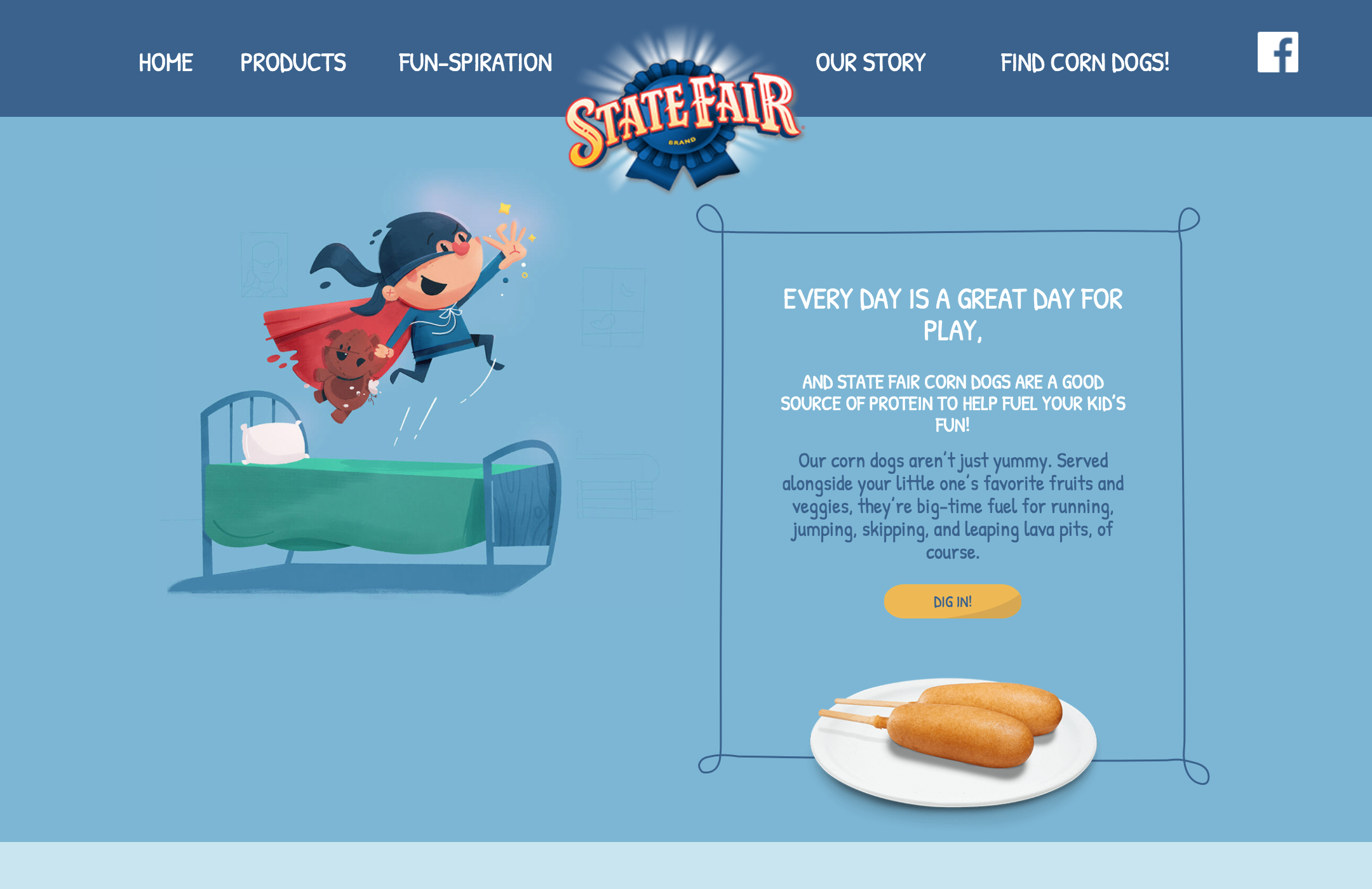
Food web design example: http://www.corndogs.com/
There’s only one corn dog brand that matters. Classic State Fair brand. While other websites on my list today use splashy photography, State Fair goes ultra kid-friendly with charming illustrations suitable for any kid’s book. Except with corn dogs snuck in throughout. I give them credit because the product is already well-known and accepted. No need to educate me about corn dogs. I’m well acquainted. The challenge now is to convince parents that corn dogs are a protein-packed snack.
The fun illustrations work toward that end by displaying cartoon kids in a variety of normal kid activities, all “fueled” by State Fair brand corn dogs. You might think the large, static illustrations are a waste of space but I think they’re important messaging that brings corn dogs out from the realm of unhealthy fair food and into the green pastures of picnics in the park and pre-game dinners (with healthy stuff on the side, of course). I give this website 3 stars.
Cotton candy
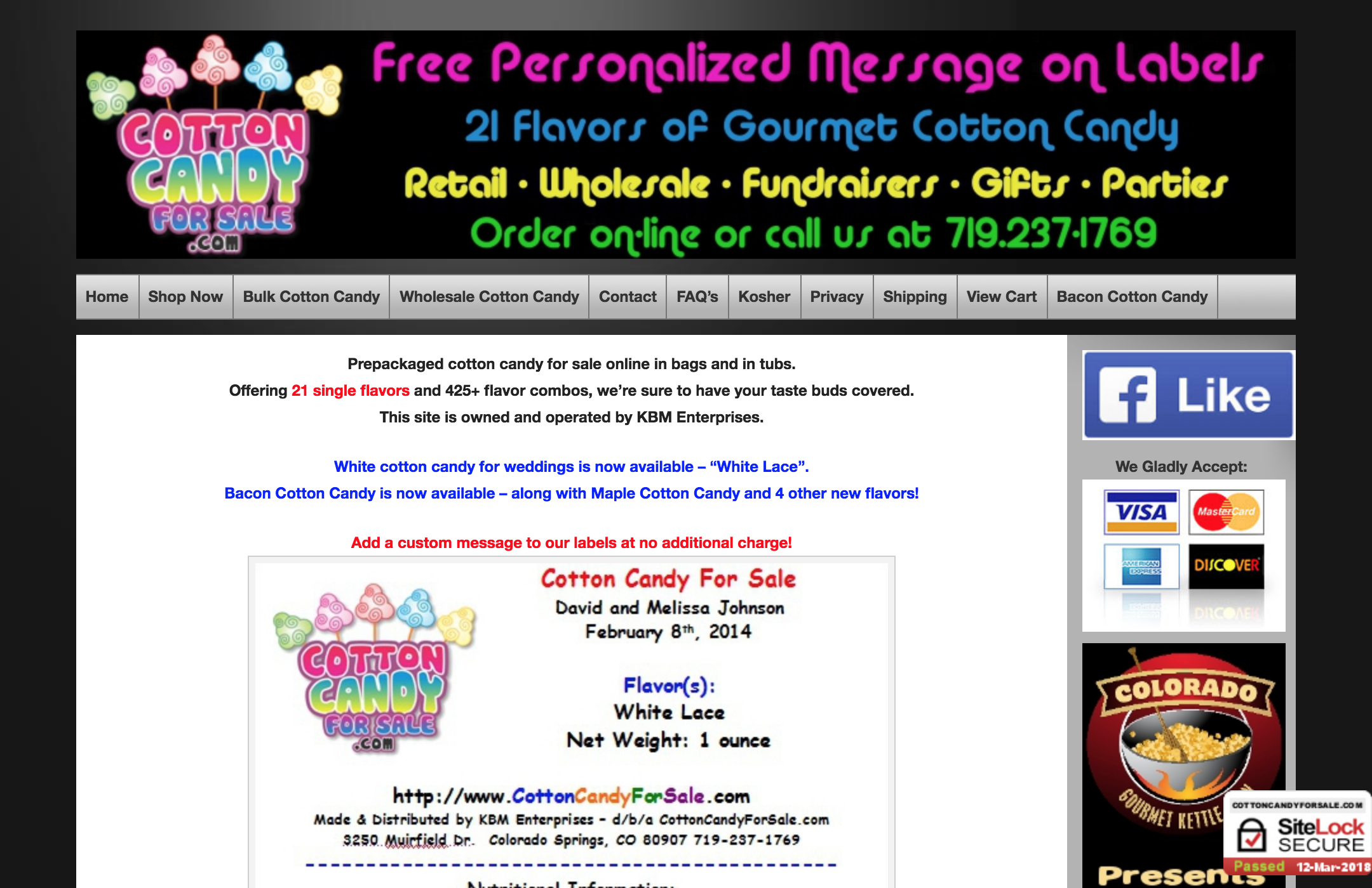
Food web design example: http://cottoncandyforsale.com/
In the dark of their sleepless sugar-high nights, some poor souls are Googling to find “cotton candy for sale” to be shipped in bulk to their doorstep. At least that’s what I imagine seeing in this web design. It’s an old-fashioned look typical of basic attempts at custom WordPress web design. You see a large graphic header at the top (oooh! Groovy neon!) followed by a tiny navigation bar. Then, the basic layout of every single page is a wide left area for page content with a sidebar of buttons or ads in the right area.
The product photography here is straightforward and informative. Mail-order cotton candy was always going to look like insulation foam. But if you make food, find a food stylist and fancy photographer. Spend the money on photos that make me want your product. As a web designer, let me tell you to prioritize photos over the website if you have to. I give this website two stars.
Fanny’s Kebabs
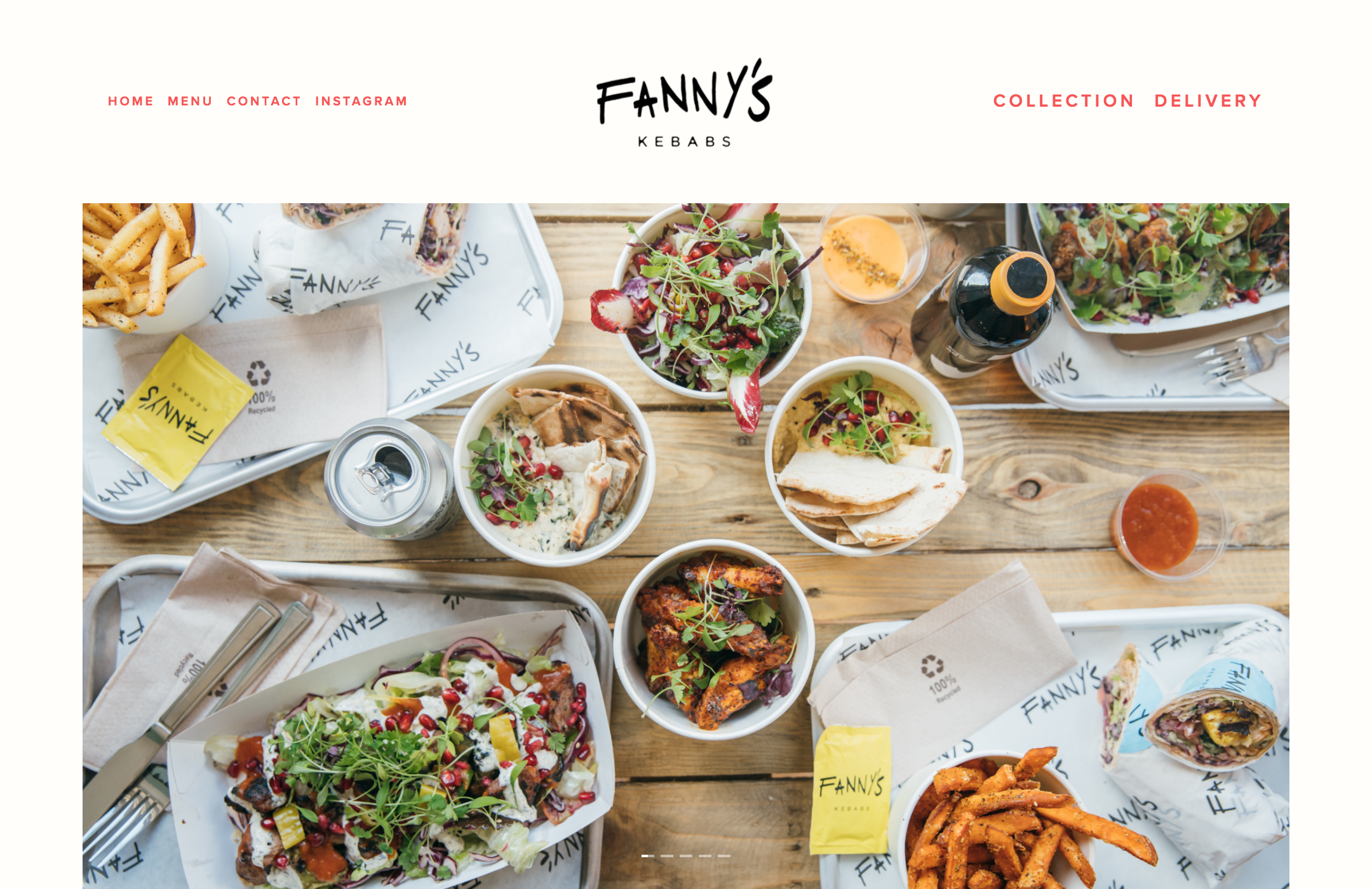
Food web design example: https://fannyskebabs.com/
I realize the food in the pictures here does not have sticks. That’s because English speakers are used to shish kebab, with the skewers. So that’s what I began by searching for. But kebab can refer to a variety of grilled meat dishes. A gyro sandwich could be called a kebab. Really, almost anything wrapped in a pita. Fanny’s starts with an Instagram-worthy overhead shot of a fun feast with all their mains and sides on the table. Just beautiful.
The actual layout of this web design adheres to a hip aesthetic I associate with those website companies that advertise on podcasts. A quick check of the site’s underlying source code confirmed it. My compliments to the chef for constructing a simple, effective site. Because there’s not much web design here. It’s really the classy, original branding and polished photographs that make this site shine. I give this website five stars.
What did you think of these web designs? Do you agree with my star ratings? What industry web designs should we look at next? Leave your notes in the comments or find me on Twitter, I’m @pwolfgram.

