I’ve read a raft of 2018 web design trend articles published lately to find those visual web design trends that everyone’s talking about, not just the nerds, and not just the fashionistas.
What’s next for web design? Sometimes it feels like designers have reached the end of design, or that everything has been done before. Well, we’ve actually thought that before too. After all, “there is nothing new under the sun”. That may be true, a lot of the trends below might sound like repeats. Somehow, bold color and large fonts are always trends.
But I’m confident 2018 will bring bold new designs from vanguard brands while trends from 2017 continue to ripple out to businesses of all sizes.
Feel free to read my all my source articles below for yourself. Or since I’ve read them all for you, scroll on down to get right to it!
- https://digitalmarketinginstitute.com/blog/2017-11-07-11-web-design-trends-to-watch-in-2018
- https://webflow.com/blog/19-web-design-trends-for-2018
- https://www.wix.com/blog/2017/12/web-design-trends-what-to-expect-in-2018/
- http://www.creativebloq.com/features/the-5-biggest-web-design-trends-of-2017-so-far
- https://99designs.com/blog/trends/web-design-trends-2018
- https://designshack.net/articles/inspiration/web-design-trends-2018/
- https://www.theedesign.com/blog/2017/top-web-design-trends-2018
- https://www.fastcodesign.com/90153796/the-9-big-design-trends-that-will-shape-2018
- Video: https://youtu.be/7Dcu_bip8EM
- Video: https://youtu.be/xp8qApChEcM
These are the trends Roundpeg’s testing too. Presented below are the seven trends I predict will make the most impact in 2018.
- Bold, Experimental Typography
- More Embellishments
- Broken Grid Layouts
- Videos
- Maxed-out Colors
- Organic Shapes
- Illustrations
Bold, Experimental Typography
Typography is the way text is designed on your page. It’s everything from font size, to letter spacing, font choice, line height, and line shape. In 2018, blow-out your typography with huge font sizes, high-contrast pairings and unusual choices like serif fonts (oooh).
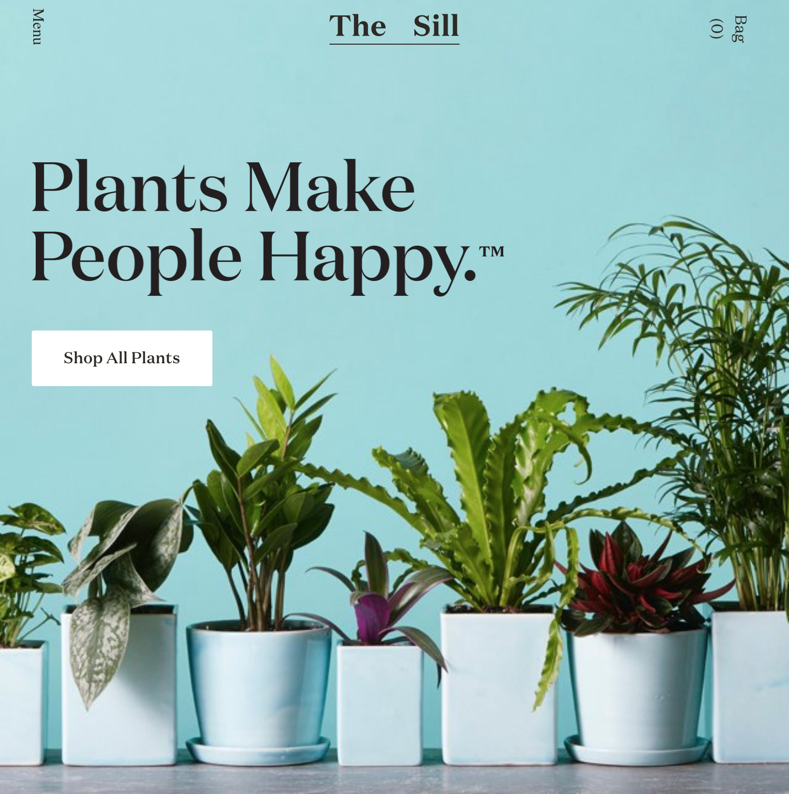
https://www.thesill.com/
Bold typography always seems to be a trend popping up on desigers’ lists. Maybe it’s more wishful thinking than anything as designers love nothing more than going a little crazy with typography and most small business web design clients don’t call for that kind of thing.
However, the tools needed for achieving global brand looks on small-size sites are all there. Access to free Google Fonts via WordPress themes like Divi along with increasingly granular and mobile responsive type control put the power in your hands. Use it!
More Embellishments
In past years, we saw every brand and many big websites turn to minimalism. Everything became stark black and white with just product photos or maybe 1 brand color for links and buttons. Mobile operating systems like iOS pruned borders and textured backgrounds to try and make the design invisible. In 2018, embellishments are back.
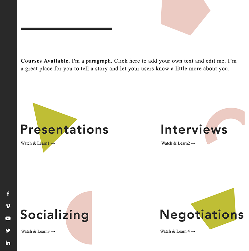
When you walk to the scrapbooking section of a craft store, you come across huge racks of embellishments. Stickers, basically. Little widgets that brighten up pages with a little color or visual interest based on the overall look and feel. As web designers recover from their deep swing to minimalism, designs that stand out in 2018 will take advantage of the novelty of on-brand embellishments.
Broken Grid Web Design
Truly stand-out designs will literally break out of the box in 2018 with broken grid layouts. These are designs that perfect the art of looking fresh and clean while using off-center images or text that could look disorganized to some.
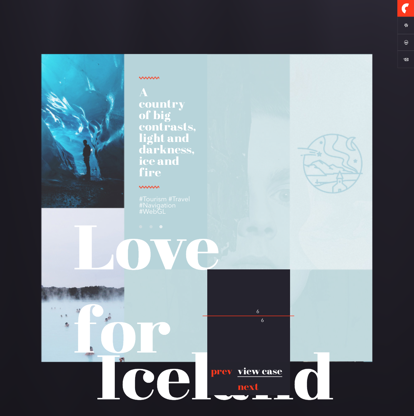
The trick is to let everything spread out. Imagine that one scroll of the mouse wheel is like a page turn. Let your pages elongate to accommodate 800 px tall sections that each only feature a single image or headline. Crop images to squares and surround with generous padding. And, counter-intuitively, maintain a rigid commitment to your chosen grid structure. Then choose one or two elements that break the rules and stand out.
That means creating layers. Imagine you lay 16 photographs in a perfect grid. Then you pass your hand over the grid, loosely shifting the arrangement with some images layered over and beneath one another. Broken grid layouts are more intentional than that, but the best create a dimensional effect by creatively layering text and pictures.
Videos
2017’s big trend was video. Guess what? It’s still a trend. These things play out over years sometimes. Large-scale, high definition photos were a trend and now they’re common practice. I think adoption of video elements is an extension of the high-def photo trend. While the headline here is adoption of full-motion video, I want to shout-out to motion graphics, GIFs and other animations too.
Use complete videos with audio and dialogue to introduce yourself to new prospects and explain your product or process. 2018 is the year small businesses will regularly add video production to their marketing budgets. You need it for better Facebook engagement, better blog posts, and those ultra-cool video wallpapers.
Maxed-out Colors
What’s your primary brand color? Pastels ruled 2017, at least, for lifestyle brands. In 2018, look out for vibrant, maximalist color treatments. Just look at this page Mailchimp made back in 2016! This might have seemed a bit much then, perfect for making a splash with a report like this. In 2018, these same outrageous ideas will go front-and-center.
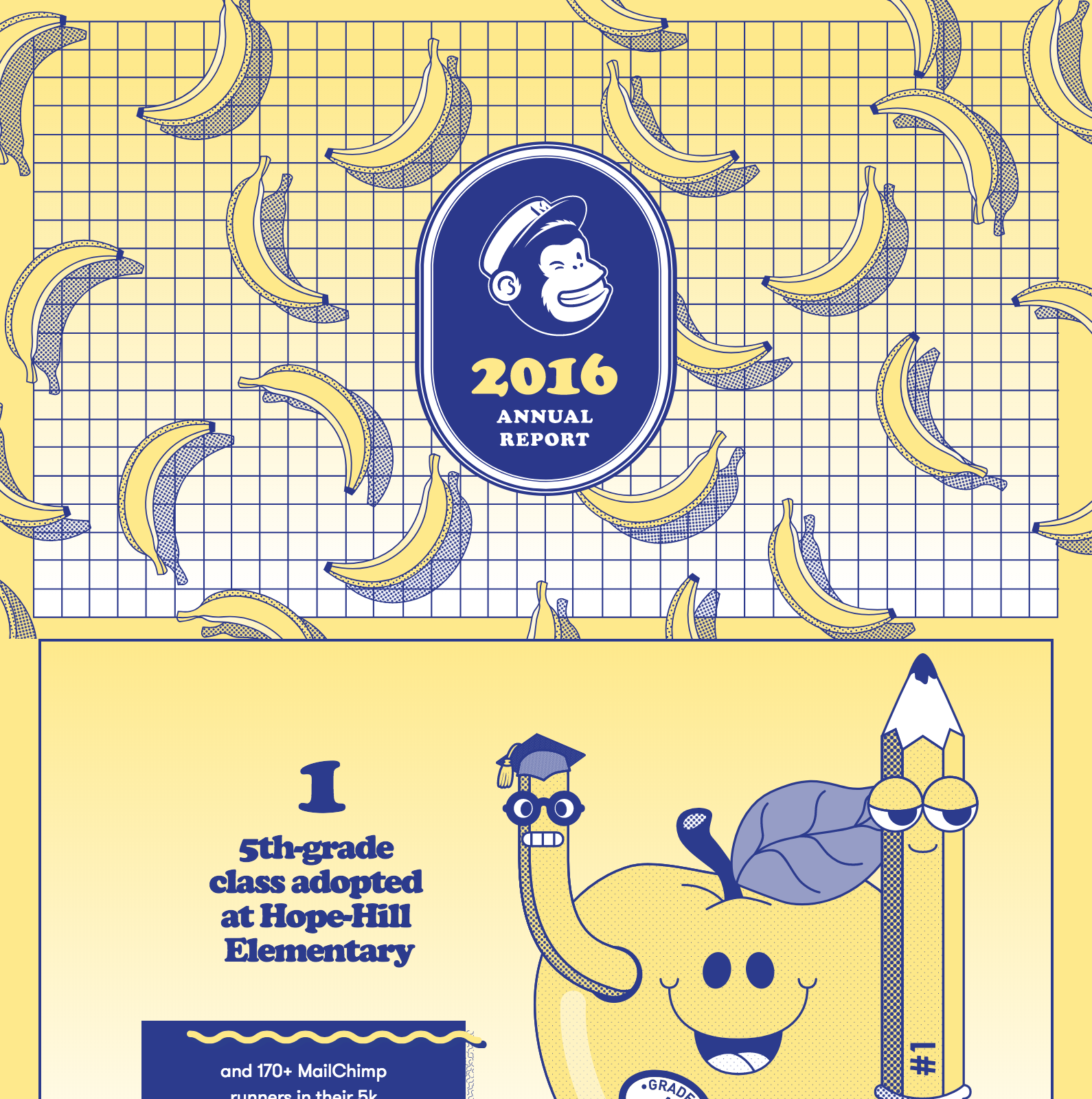
Youth brands have always used screaming colors to captivate their young consumers. However, the world is flooded now with high definition mobile device screens designed to overwhelm you with hyper-real saturated colors. While you may not need to splash neon pink on everything tomorrow, consider developing a brand kit with intentionally chosen color selections that pick up on the bright, energetic colors of 2018.
Organic Shapes
Guys, rounded corners are back! Pill shaped buttons! Look for icons to get larger and curvier. Minimalism’s restrictive tendencies brought about a kind of brutalism in web design. Like with color, the pendulum is swinging back the other direction.
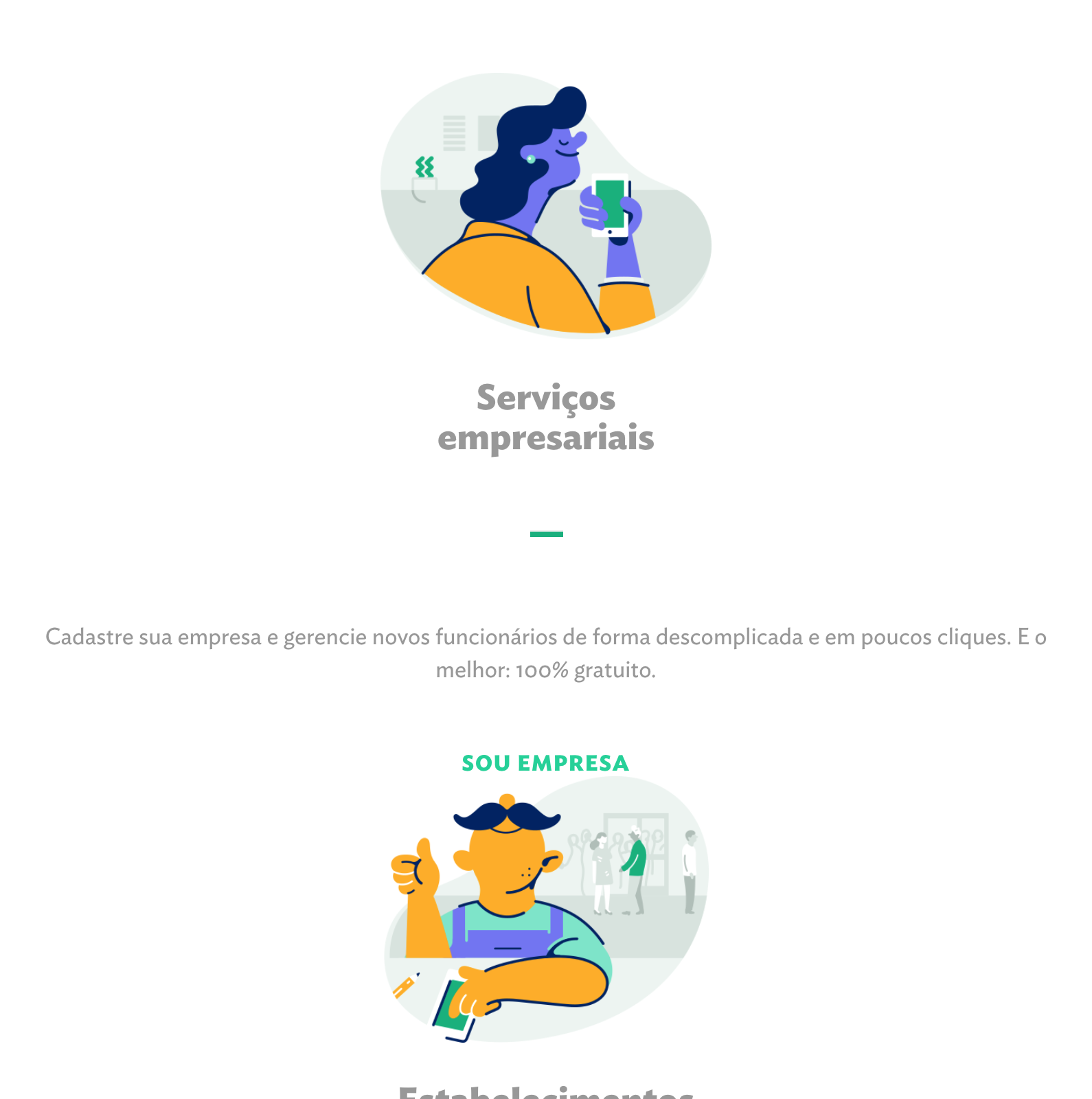
Some brands will always rock squared-off edges and sharp geometry, especially luxury brands and established companies. But look for start-up companies to come up with logos and illustration styles that emphasize a flowing, organic style.
Illustrations
Along with those organic shapes come illustrations. While the amazing proliferation of cell-phone cameras and high-end photography equipment to everyday users, photography exploded. New web design for the past few years have left huge spots to fill with large-scale photographs. Now that everyone’s got great pics, though, how do you stand out?

Use illustrations to communicate concepts with those organic shapes and vibrant colors. Consider making a relationship with a local graphic designer to help you produce graphics for spots in your marketing where you might have only tried pictures before.
What trends are you most interested in? Let me know, I’m @pwolfgram on Twitter. Or leave a comment below, we’d love to chat more these exciting web design developments!
