The Worst Logos from 90s Television Shows
All of the good ideas are already taken. At least, that’s what the current spate of revamped television shows would have us believe. We parted ways with beloved characters we saw once a week, believing we’d never see them again, and then they show up almost 20 years later. We’re glad to see them, but it’s hard not to be curious and wary about what may have changed
As a child of the 90s when these shows initially aired, I may or may not have been of a discerning age that was suitable for all the themes and character arcs of these shows. Fortunately, Google is the great equalizer, and in the meantime I’ve picked up some design chops. In honor of all the revamped shows, let’s take a look at what their logos looked liked.
As I did my research, it was interesting to note the quality of design that went into these logos. The most recognizable aspect of any TV show is going to be the characters and actors that play them, followed by the theme song. A logo opens the show, but then it’s forgotten until you see it on merchandise or more likely in your Netflix queue. With that said, these logos are not only representative of bygone television shows, but also a culture where the internet was still in its infancy. The only people who noticed new logos and rebrands were design nerds. No one else cared. Now, large corporations have to anticipate a backlash to any new branding, whether it’s a good logo solution or not, thanks to the open-ended, mostly one-way conversation we can strike up with anyone we like thanks to social media.
Needless to say, regardless of the stylistic choices and execution on some of these logos, we wouldn’t change them for the world. They’ll live forever immortalized in our nostalgic memories of times past, when we just sat and watched show, rather than simultaneously scrolling through our phones or binge-watching an entire series for hours and days on end.
The Ultimate 90’s Logos
These logos are chosen above the rest because thanks to good design, they have stood the test of time while still being quintessentially nineties. The type treatments are unique, well-executed and speak to the concept of the show in a glance.
Minus the grungy “X,” which I don’t consider truly part of the logo, this mark holds up. Tracked-out type (lots of space between the letters) is all the rage these days, and the digital-looking letters with a high x-height (tall) give you an idea this is not your everyday office drama.
You can’t see that logo without singing the song. Sorry about that. This logo is ever-so-slightly dated because of the color choices, and perhaps because it’s impossible to disassociate the show from the nineties. Add a little thickness to the tapered ends on the “F” and “R” and it’s a free-hand and friendly custom type anyone could be proud of.
The orange splat is forever burned in my memory, and how could it not be? The lovely sign-painter font paired with a literal paint, or more likely slime, is perfect for an audience that just wants to have fun and avoid cooties.
The rest of the logos can be grouped according to their kind—classic type choices that show their age, the stereotypical nineties aesthetic, to the embarrassingly 90s, finishing up with the absolute worst 90s tv show logo.
Classic Type Choice
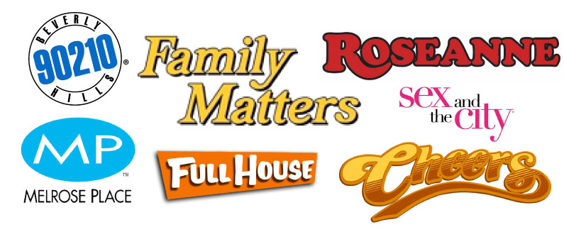
All of these logos use safe font choices to appeal to a wide audience without saying much, and as a result kind of fade to the background of our consciousness. These shows could be about anything, except maybe Sex and the City, where high-contrast thick and thin lines tend to lean towards more fashionable connotations. The Beverly Hills 90210 logo certainly let the area code pull its weight; with different words that logo would be just at home on a Whole Foods package. (Also, I’m aware Cheers was an 80s show, but they had four seasons in the nineties as well as an unforgettable series finale. So it counts.)
Essential 90s
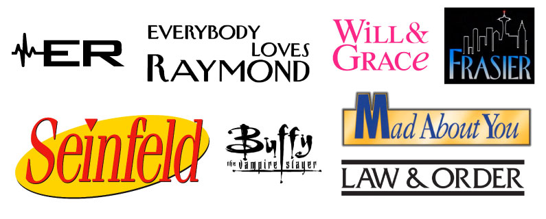
This. This is the good stuff, a time capsule of what the visual landscape of the 90s looked like. Gradients for days, high-contrast type and x-heights that reach for the skies. I was surprised how many logos chose either a serif font (the ones with decoration on the ends of the letters) or a humanist sans-serif which look more hand-drawn than their geometric counterparts. There was also an unbridled desire to smash different cases (upper and lower) together, as well as regular and italic. Will & Grace almost pulls it off using small caps to balance out the italic “e,” but the Mad About You logo is distressing. Why. Why would you do that.
Unapologetically 90s
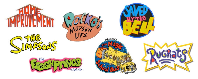
Granted, most of these logos are for a younger audience and therefore less serious in content and execution. So many different colors and crazy type decisions that if we’re lucky we will likely never see again. The Simpsons logo is well-balanced and fulfills its purpose, but the thick drop shadow and ostentatious yellow give away its age. Also, why is there so much yellow?
The Worst “Logo”
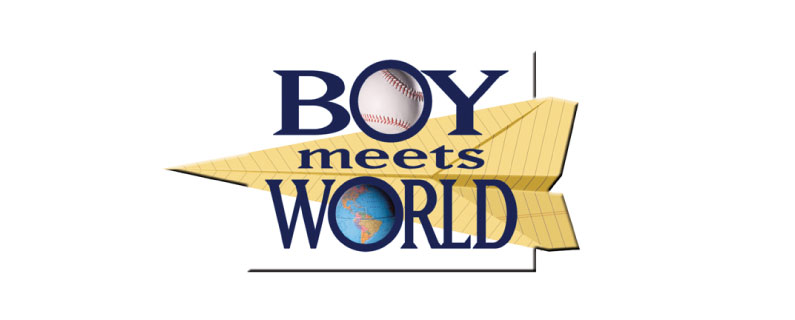
Sometimes there are logos released into the wild that make you wonder if an art director actually agreed to set it free. The Boy Meets World logo, while it lives in my memory as a great show, offends all of my design sensibilities.
It doesn’t even meet the fundamental requirements of being a logo, first and foremost being it needs to be legible and stand alone. Most versions I found required a blank white space behind it so you can actually read the words. The type choice is overtly austere, more at home on monuments than the classroom. And lord forgive whoever squeezed the letters in the middle to meet unruly demands.
You’re probably not polishing off your script for a pilot season anytime soon, but the foundations for a good logo stretch across industries. Legible, consistent type. An icon that’s obvious in what it represents and scales down to small sizes.
Hopefully, everything ties in together to present a concept as a whole that’s greater than the individual parts. Unless, of course, you’re paying tribute to the nineties, then this post is a great source of inspiration for your retro look.
your brand defines how customers perceive your company
Your logo, color, font, icons, and the images you use all come together to create that impression. Use our FREE brand kit to pull the pieces together.
Beginner’s Guide to Dimensions and Metrics in Google Analytics
Beginner's Guide to Dimensions and Metrics in Google Analytics by Isaac Wielhouwer | Jul 17, 2024...
Chatbot Basics 101
Favorite Social Media
What is your favorite social media platform? Remember the days when there was just Myspace? Oh,...
Call to Action Do’s and Don’ts
There is such a thing as a bad call to action The goal of any page on a website, whether it's the...
