Space travel is supposed to be really challenging, right? It’s at the nexus of complex math and science research, government bureaucracy, private business and a nation’s hopes and dreams. You’d think astronauts could handle designing a website. Let’s put them to the test by examining the About pages of today’s biggest players in space.

Why look at their About pages? Why not their homepages? Effective pages synthesize concise copywriting and strategic design. The About (or What We Do) page is part history and part elevator pitch. How do you explain rockets, rovers, robots and everything else? NASA is a huge organization! Planetary Resources is doing really far-out space mining! These are the most difficult About pages I can think of to write. But they’re not impossible.
Looking at these pages, I found five keys to bring to my next project.
Key Points
- Don’t write an About page
- Put what you do in your menu
- Organize your page with clear sections
- Use great big pictures
- Make a video
Don’t Write An About Page
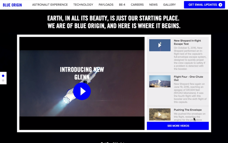
The first rule of About pages is: don’t write an About page. The purpose of this page is to make clear your mission for the business. What do you do and why do you do it? But other pages on your website should already contribute to this message. For example, Blue Origin totally skips anything like “About” or “Us”. I had to look for their Twitter bio for some official text. But the first item in their website’s navigation bar is “Astronaut Experience.”

Rather than spending time explaining a long company history, or revealing any information about its famous founder, Blue Origin gets your blood pumping with inspirational photos and and videos. Meanwhile, they’re touting technological achievements and making ambitious claims about the future. The whole website is their About page! This is a minimalist, modern way of approaching storytelling on your website. But I’ve got no problem with traditional structures either, like that of Virgin Galactic.
While Blue Origin keep things minimal and avoids its celebrity connections, Virgin Galactic is unafraid to show off Richard Branson and splash the Virgin logo over everything they can. Instead of an About page, they opt to create a series of related pages that together tell the story “about” Virgin Galactic.
“Who We Are” is an employee focused page that links to information about careers and company culture, standard stuff. “Why We Go” is a heady, quasi-philosophical statement of intent that positions the company as an experience-machine making astronauts out of private citizens. “Human Spaceflight” expands on that theme.
Both Blue Origin and Virgin are in the space tourism business. If I had to pick one that got to the point faster and with more confidence, I’d pick Blue Origin, despite Virgin’s longer pages. These companies show us you don’t need to open a Word doc titled “About Us” to write a great website. But if that is your plan, at least make sure your page is well-organized.
Organize Your Page with Clear Sections
I will confess, I couldn’t tell you what NASA does. What’s the elevator pitch? Woe to the writer who had to summarize at least 50 years of history and recap everything they’re doing across nearly 200 missions! But they did it just right on their “What Does NASA Do?” page. How? Clearly marked sections.
First, the page states NASA’s general vision (new heights, reveal the unknown, etc.) in a few lofty words and then unpacks that just a little by sharing the questions NASA’s trying to answer in terms simple enough for any child, like “What’s out there in space?” This 330,000 ft. look at their vision is followed up the heading “A Little History” (Eisenhower to Apollo in 112 words), “Organization,” and “Our Work Today.”
This is a very dense page. It could read like a textbook or an impersonal Wikipedia entry. However, the use of personal pronouns warms up the tone. I appreciate the breakdown into the 4 helpful headings. They’re specific enough to let me skim to the end for the latest launch information, but contain rich enough information to help your average eighth grader finish their report without resorting to Wikipedia.
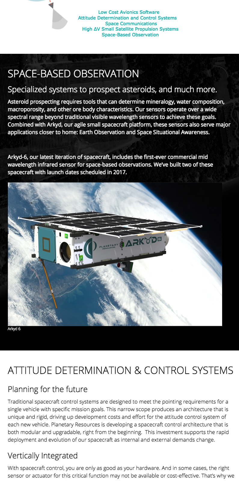
Planetary Resources may never be as cool as NASA, but they do mine asteroids for space metal. And their “Technology” page follows NASA’s lead by organizing their page into clear sections for the five different tech categories they work on.

A mini-menu near the top helps readers jump down to the section they’re interested in. Asteroids are just one part of the Planetary Resources story. Each section includes at least one image or video. Images are key to distinguishing one section from the next.
Use Great Big Pictures
Sierra Nevada Corporation (SNC) expertly demonstrates how pictures share the story of complex industries.

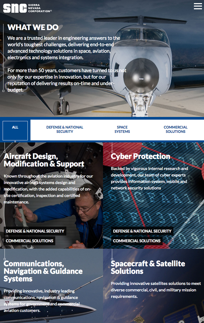
Their “What We Do” page prominently features a dramatic picture of cool aircraft with the text printed on top. While this image does not completely capture everything there is to know about SNC, it sets the mood and looks great. I love the novel way they let users click on category names to filter a list of 37 areas of expertise. Each area uses a vibrant background image.
Pictures quickly tell the story of SNC’s business at a glance. If you didn’t proceed past the picture grid, you’d at least walk away knowing they work in aerospace across a variety of disciplines. I think they could probably engineer a solution for anything. Of course, each of the images is a call to action that clicks through to a keyword rich page of deep content concerning that area of their business. It’s another example of web design that breaks down complex business ventures into digestible chunks.
There’s something Blue Origin, NASA, Planetary Resources and SNC all do that we haven’t talked about yet. Videos have prominent placement on each! But let’s talk about SpaceX.
Make a Video
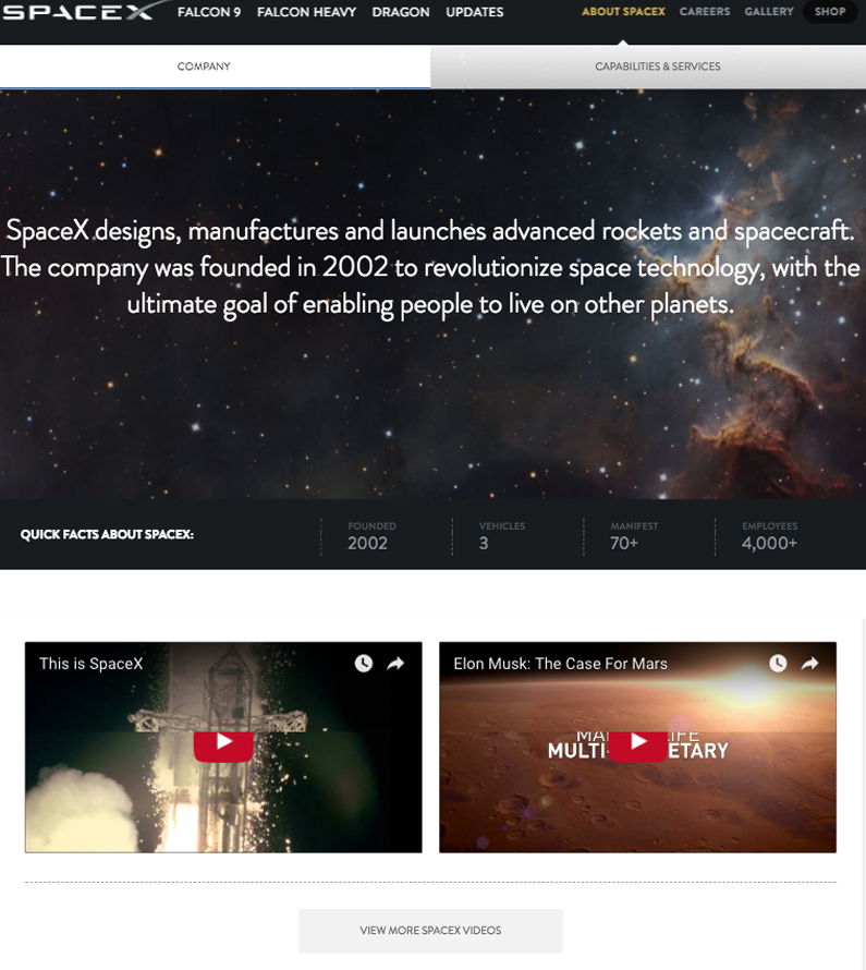
Of all the companies mentioned so far, SpaceX is the buzziest. Focused on B2B services, they don’t offer tourist trips like Blue Origin or Virgin (though two private citizens will apparently circumnavigate the Moon with SpaceX in 2018). Two videos on their “About” page support an ambitious headline. And that’s it above the fold!

One video is a basic promo reel you might show before your CEO walks out for a presentation. Plenty of slow-motion rocket footage. But I think it does the trick. It tells me SpaceX designs and builds rockets with innovative capabilities the other companies don’t have.
The second video is a little out of place. It’s a bit of Elon Musk hyping Mars as the next great destination. SpaceX doesn’t go to Mars yet. They help launch satellites and deliver cargo to the International Space Station. But the Mars video unpacks their stated mission to make life multi-planetary and gives it some meat. These videos simplify complex business models and presentations to 90 second chunks.
More company information is down below these videos, for sure. The photo-rich history timeline is especially nifty. But I think the point is that you get the gist of SpaceX quickly just checking out the videos.
These space-faring companies have decades of history dealing with complex challenges most of us have difficulty grasping. But their About pages work because they work with these powerful tools:
Key Points
- Don’t write an About page
- Put what you do in your menu
- Organize your page with clear sections
- Use great big pictures
- Make a video
What’s your company’s mission statement? Could you tell your company’s history in five pictures or less? Would a new customer know what you do just by looking at your website’s navigation bar? Consider these points as you review and revise your own website.

