Add Color and Texture to Your Brand
The key to a successful brand is a consistent visual identity. To put it simply, in order to gain brand recognition you have to look like you, regardless of where you’re being represented. This is achieved by using your brand’s logo, colors, and icons consistently.
Take a look at your current branding. Does it accomplish this on all platforms?
If you answered yes, then you’re on the right track. Congratulations! Now it’s time to take things to the next level. Does your branding include cohesive textures and patterns? This is an aspect of branding that many companies overlook, or they assume they can get away with something generic, but this is a huge missed opportunity.
First things first, what exactly are brand patterns and textures?
Consider them like wallpaper. They are designs used to accentuate, but not steal the show from your logo. While it’s true these elements are generally not presented front and center in your designs, they can play a vital role in creating strong brand recognition. The beauty of brand patterns and textures is their versatility. They can be used in countless different ways, and they offer some flexibility that traditional branding elements like logos aren’t suitable for.
On the Web:
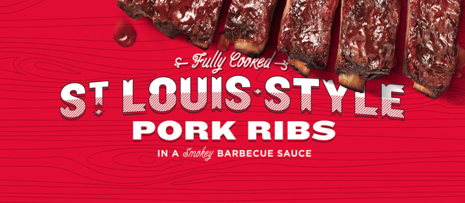
One of the most common places you’ll see textures and patterns used is online. The elements make great backgrounds for products and text on homepages and in blogs. This is a subtle yet effective way to get your branding on graphics that may be shared across the internet, without slapping a logo on everything in sight.
On Printed Materials:
Before you go and include a bunch of stock photos in your company’s brochure or on direct mail pieces, you may want to consider a more unique approach. In most cases, incorporating a pattern or texture that was designed specifically to match your brand will look more polished and purposeful.
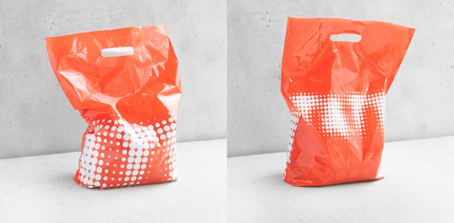
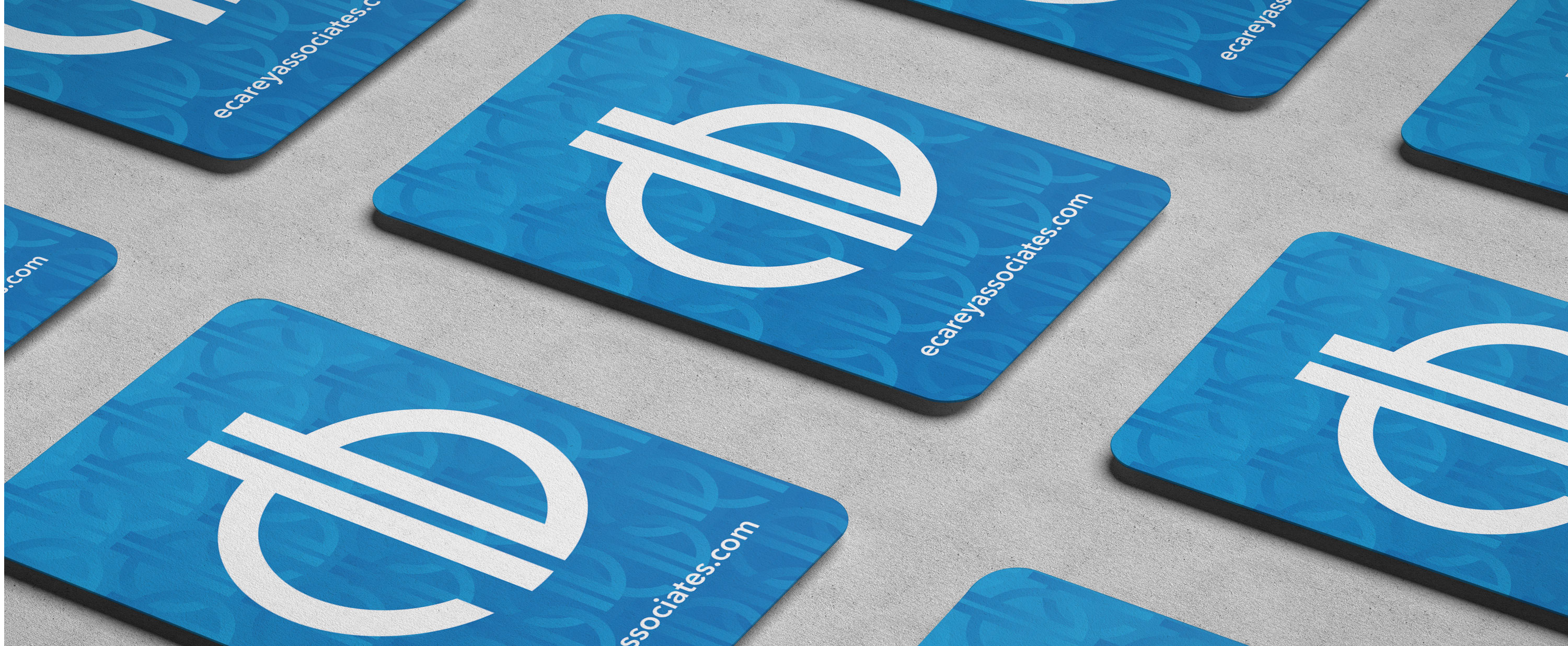
These patterns and textures work very well on packaging design, on vehicle wraps, and even on the back side of business cards as an extra visual element and pop of color.

Social Media:
You’ve probably noticed your company’s social media pages look different depending on where you view them. The size, scale, and placement of the profile photos and cover images vary from platform to platform and it’s nearly impossible to predict what these graphics will look like on different tech devices.
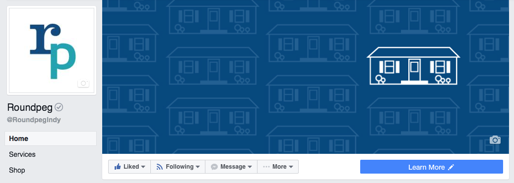
One of the only fool-proof solutions for this conundrum is to stop fighting it. It’s a losing battle. Trying to include text or crucial images in cover photos rarely works out and you end up with awkward cropping. Using a pattern or texture in social media headers creates the “wallpaper” effect mentioned earlier and alleviates the need to frequently create new images.
Are brand patterns and textures really right for your company?
In most cases, the answer to this question is yes. Just as a consistent logo and color palette aids in brand recognition, so does a recognizable pattern, or pattern set.
While some companies use this as a way to incorporate a bit of fun into their brand, there’s no right or wrong way to do it. It’s entirely possible that the best strategy for your company is to keep all patterns very simple and subdued. The important thing is to consider which areas your brand is most likely to use the new elements and design around that. Start looking around at websites you enjoy and print marketing materials you find throughout the day and you’ll begin noticing how prevalent and flexible these designs really are. The possibilities are endless and this will become even more apparent as technology evolves.
Listen for more on this topic.
ready to work on your brand?
Grab a copy of our brand resource kit today.

Rebrand with Design Thinking
What is design thinking and why is it so popular? Well, it's a process used to redefine problems...
Big Brands aren’t Better
Is it true that brand-name products are superior, or does the power of branding make us want to spend that extra dollar?
Evolution of Typography in Web Design
Learn more about the evolution of typography in web design.
Designing the Perfect Blog Feature
Stand Out from the Crowd Designing the perfect blog feature looks different for every company....

