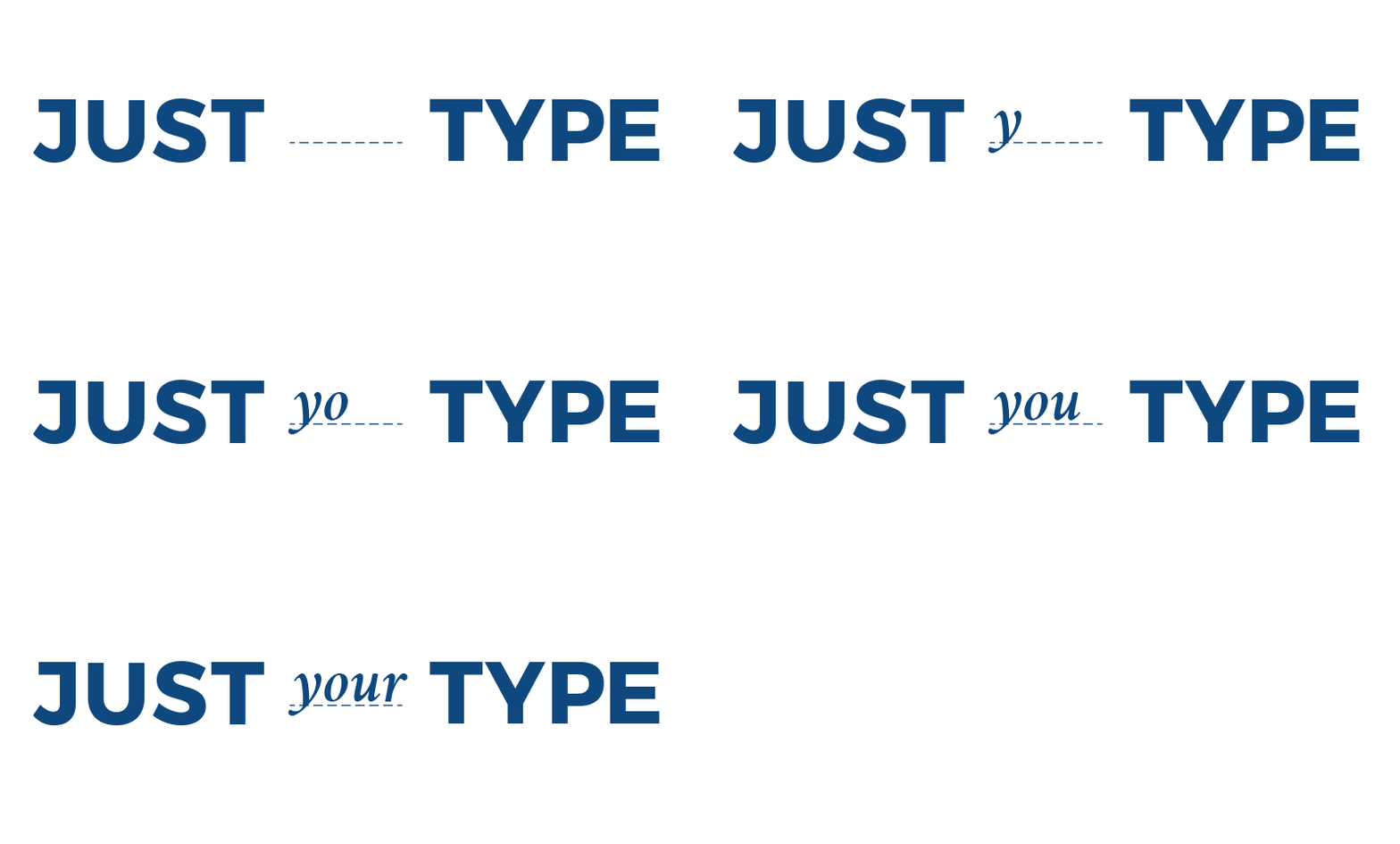
Just Your Type

Type and fonts
A while back I wrote a post letting you know about all the fonts Divi Builder has for crafting your website. Which is all fine and dandy, but much like tools, fonts are only useful if you know how to use them. Below are a few recommendations, as well as helpful pairings.

Serif or Sans?
There isn’t really a “wrong” choice, but it’s best to know which screw you’re working with before you choose a screw driver. For instance, if you’re choosing a typeface for your blog post, some are easier to read than others. Typically a sans-serif (the style without any edges pointing off the ends) will be much easier on read online. In print, the more classic serif fonts will work well.
Rather than handing your reader a flathead screwdriver to strain their wrist on, a drill is much more appropriate for the task at hand. For more in-depth information on the differences and relative merits of serif vs. sans-serif typefaces, read this blog.

It's all about that space


Opposites Attract
Whether or not this truism is applicable to romantic relationships, it’s an excellent rule of thumb when you’re matching fonts for your website. Depending on the voice you’re using for your site, choose a style that will apply to titles and move on from there. Fonts for large bodies of copy should balance the titles as well as provide a pleasant reading experience. Below are some examples of font pairings using the Divi-provided styles.
MONTSERRAT
HEADING ONE
OSWALD
HEADER ONE
RALEWAY LIGHT
HEADER ONE
Crimson Text
HEADER ONE
FRANCOIS ONE
HEADER ONE
Looking for the right font for your website?
Learn a brief history of typography and the common mistakes to avoid.

Beginner’s Guide to Dimensions and Metrics in Google Analytics
Beginner's Guide to Dimensions and Metrics in Google Analytics by Isaac Wielhouwer | Jul 17, 2024...
Chatbot Basics 101
Favorite Social Media
What is your favorite social media platform? Remember the days when there was just Myspace? Oh,...
Call to Action Do’s and Don’ts
There is such a thing as a bad call to action The goal of any page on a website, whether it's the...
