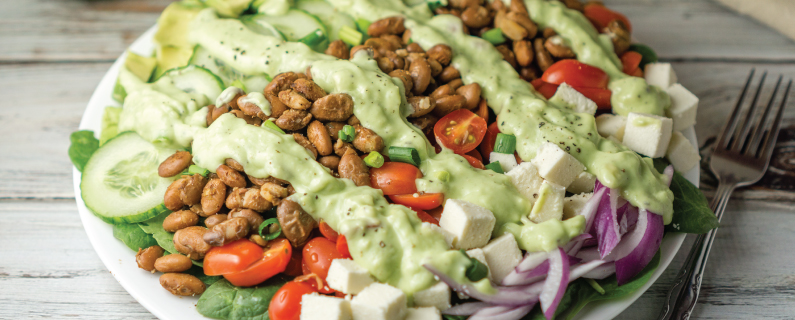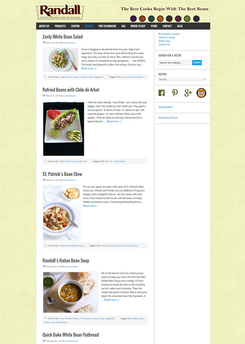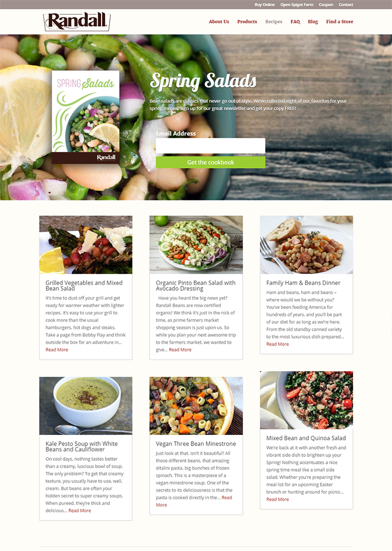
When it comes to food marketing, it is all about the picture. No matter how good you make something sound, if you want to motivate someone to action you have to have a beautiful image. Recently we discovered that it isn’t just an individual image, but the arrangement on the page which makes people, click, browse and scroll.
Updating the Randall Beans website, we focused on new ways to present all the content we have built up over the years we have worked together. Some of the most valuable content is the recipes. Always important to site visitors, the new wider layout with the grid format allows visitors to see more recipes at a glance. Of course, they can still search by title, but judging by our web data, most people seem happy to browse.
The cookbooks have always been an important part of the site. We used these simple downloads as a way to capture email addresses and keep visitors coming back. The new site features a beautiful image at the top of the page with a cookbook offer that changes every few months. With the full page image, the cookbook is hard to resist.
The results.
While we are proud of how great not only each page looks, but also the overall website, the real story is how well it is performing.
More downloads
The large offer at the top of the page dramatically increased (compared to the average of 2015) the number of people interested in learning new ways to cook beans.
April is typically the beginning of a slower season for beans so it is even more surprising to see a record number of downloads this past month.
More blog page views
The new format really encourages scrolling. In the past the average visitor would reach the second page of the blog before stopping.
Now when we check the Google Analytics we see visitors routinely navigating to Page 3. Many people aren’t stopping there. We often see Pages 7 and 8 on the list of pages viewed.
%
Increase in Downloads
Blog Page
Evolution, not revolution
The old Randall Beans website was built on WordPress so we didn’t need to completely blow up everything we had built four years ago. All of the content developed over the last four years was migrated easily once the new page was built. Also using Divi as our theme, we were able to roll out the changes to the site one page at a time.
And we don’t have to wait four years to do it again. In an age of growth driven design, the site will continue to evolve as we add or change pages as the brand continues to grow and change.
Do you want more?
Roundpeg is an Indianapolis web design firm.


