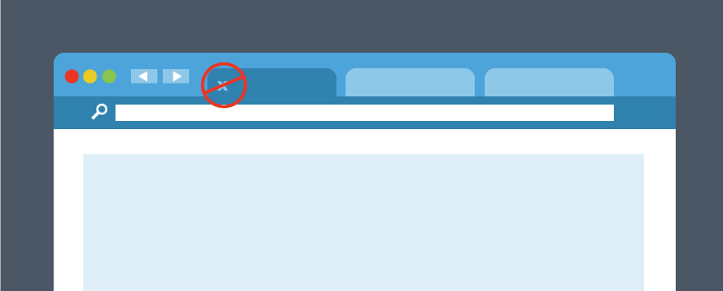
Your hook worked: someone clicked the link on your Facebook post or your email newsletter. You sweet talked them and now you’ve brought your date home. It’s a nice home, too – beautifully designed, lots of features and you’ve decorated with some nice links to all your social media pages.
But you may have forgotten something. What’s the skeleton in your closet that’s going to make your date run for the hills? It may not look so scary to you, but it can and will make people click that little X in the top right corner of the screen. Take a good look at your website to make sure you don’t have any of these mood-killers, and make sure you keep your date for the long haul.
Contact Page With Only a Submission Form
One of the most important lessons of running a business is to make sure your customers feel cared for. Too often I’ve seen a great site with a “Contact Us” page that only leads to a standard comment submission form asking for my name, email and my comment or question. If you only give visitors to your site this way to communicate, at best it tells them you don’t trust them with your contact information, and at worst that their message will sit in an email inbox for days or weeks before being read.
Undesired Media
You may think automatically playing a sound or video clip when someone opens your page is a great way to greet them, but it can likely have the opposite effect. Many visitors to your site will have other tabs open in their internet browser, and will focus on only one at a time. I can’t count the number of times I’ve opened multiple tabs and started reading an article in one only to be interrupted by video or sound from another. Most of the time my initial reaction is simply to hunt for the tab with the audio icon, and get rid of it.
If you think your page is special just because someone opened it, you may have another think coming. Even big dogs like ESPN autoplay their media, and they’ve earned a lot more than most businesses have. Don’t assume you’ve earned your audience’s ear, or you may lose their eyes as well.
Labyrinthian Design
Statistics show that 55% of visitors to a given website spend less than 15 seconds there. Your visitors’ time is valuable, and if you don’t respect that fact, they won’t be visitors for very long. If your visitors can’t find exactly what they’re looking for within the first glance, they’re going to look elsewhere. If you have to hit “Ctrl-F” to get to where you want to go, you’re in trouble.
That means that you need to understand what someone who ends up at your site is looking for and to prioritize what information is at the opening of your landing page. You may be in love with how your website design looks, but if it doesn’t fulfill its purpose of driving business, it’s not doing you any good. Always think of function before form when it comes to your landing page.
All the unique visitors in the world are no good if they close your tab immediately. Now that you some ideas of what could drive visitors away, you’re ready to entertain some company. So put on that Barry White album, spray some air freshener, and bring that date home – you’ve worked hard for it.

