 Failing to appear consistent is one of the fastest and easiest ways a brand can make itself seem unprofessional. I’ve often been given business cards at networking events which looked completely different from the websites the cards led me to. If your customer is confused and has to double check to be sure they didn’t type the wrong address, your branding probably has some consistency issues.
It may sound like a simple fix, but it’s more than just designing a logo and slapping it on everything as is. Branding is found on business cards and social media and everything in between. Assuming one version of a logo will work across the entire spectrum would be a huge mistake.
This is where your brand style guide comes in. It sets the standard for how your brand is presented, using specific rules and guidelines. This comes in handy when working with a new designer- especially one who isn’t familiar with the brand. This makes your company appear more professional. It also allows you to have more control over the look and feel of your branding and provides something to refer back to if things are done incorrectly.
Brand style guides vary in size and specificity depending on the size and type of company, but there are a few things they generally have in common.
Brand Description
This is a short intro to the brand. It often includes a brief history of the design and how the design elements were chosen.

Logos
Obviously a style guide must include at least one logo. This section should include the most common or primary logo, along with any other versions which are used in other marketing materials. Basically, if there is an alternative version of your logo you want a future designer to know about, add it to the brand guide. Companies will often add a version for dark backgrounds, a black and white version, or a version that includes a tag-line.


Typefaces
It’s important to include these in case another designer is working with the brand down the road and needs to recreate the same look. There’s nothing more frustrating for a designer than being provided logo files with no fonts and no style guide to tell us what we’re looking at. Providing logo fonts is important, but you should also include additional body copy and web safe fonts as well.

Social Media Avatars
It’s extremely common for brands to use an alternative version of their logo on social media. Small sizes and odd shapes mean many logos aren’t legible on these sites and on mobile devices. In these applications a simplified logo or an icon is used in place of the full logo. Social media sites are constantly changing, so you’ll want to be sure you have flexibility when it comes to the avatar. It’s important to take spacing and proportions into consideration here as well, since cropping varies across the different platforms.

Color Palette
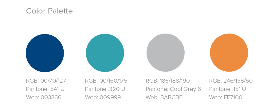
Always include colors in your style guides. Your color palette is something which should be followed very specifically wherever your logo is used. That’s why it’s important to provide formats for print and web. Besides the colors in your logo, list any supplementary colors and when they are to be used.

Incorrect Uses
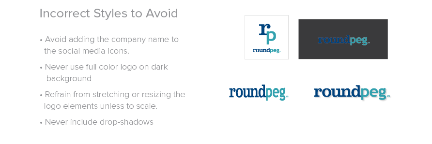
Not every brand guide will have these, but if your logo is often displayed incorrectly it may be helpful to show a list of “what not to do.” It’s less likely your logo will be distorted if you specify the rules in advance. As ridiculous as many of these look, they’re all common mistakes I’ve seen made to our clients’ logos in the past.

A brand style guide can be as simple or complex as you’d like, but having one for your company will save a lot of time and money down the road and may end up preventing mistakes and inconsistencies.
