Many people see January as a month to start fresh and set personal goals for the year ahead. Similarly, the beginning of the year is also a time when many companies reevaluate their marketing strategies and make changes in order to improve the image of their brand.
As the year goes on and companies get busier, it can be really easy to overlook something as simple as updating your company brochure, but these details can really make or break a brand’s image.
Simons Bitzer, a CPA and business planning company, realized their current brochure no longer matched the rest of their brand and wasn’t representing them in the most professional way. The updates we made to their website and the direct mail campaign we designed last fall both had a clean modern feel, and used some great photos and bold pops of color.
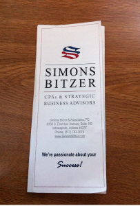
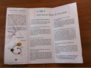
 For this project, we started with a copy of their old brochure. It had a lot of really great information, but was lacking personality. The goal for this brochure project was to convey the same message in a more organized way and with a bit more style.
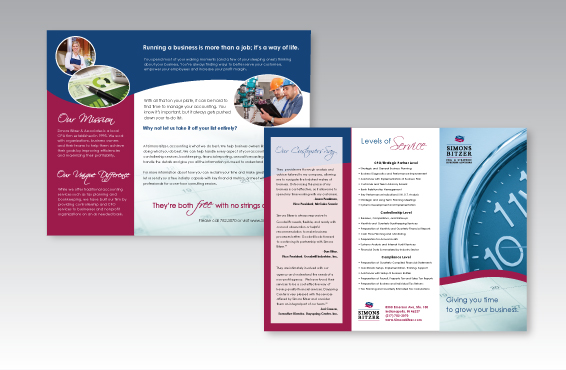
I used many of the same elements that were used in the direct mail pieces, such as the curves and the photos, which really helped keep everything cohesive. One of the things I liked about the old brochure was the way it broke up the standard tri-fold layout by carrying the title across two panels. I used this same idea, but I brought the body text across both panels as well, and added some emphasis to the title.
Simons Bitzer allowed us to eliminate some of the copy, which was great because everything else now had a bit more room. We were able to rearrange the information to emphasize the most important parts such as the company’s mission and what sets them apart from the competition.
The final brochure turned out really great, and Simons Bitzer can now take pride in knowing their brand has a unified look for 2013.

