One of the things that I love best about building websites using WordPress is the ability to go back and enhance what we have done. We had a great chance to do that for Simons Bitzer recently.
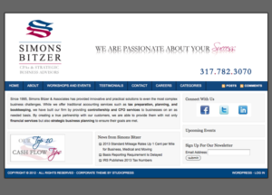
Two years ago, we built a website for the account firm using the Corporate Theme from Studio Press. It was simple, clean and professional. But a lot has happened in website development in the last few years. Now strong, dramatic images dominate home pages. These interesting images are found across industries and even accounting and law firms are adding interesting visuals to their pages.
The challenge was finding interesting images instead of the standard stock photos of people in suits or button down shirts with sleeves rolled up to grace the home page. Fortunately, we had just completed a three part direct mail campaign for them. Each of the three attractive fliers included a strong cover with just a little text.
Peter transformed the cover art work into an attractive rotating banner for the site, reinforcing three of their primary services. The simple addition of these images gives a whole new feel to their homepage. The added benefit is that these images reinforce the messages of their direct mail campaign, creating a continuity across mediums for new customers getting to know Simons Bitzer.
Along with the strong new images, we added just a bit more content to the home page, including a new call to action which is designed to increase sign ups to their newsletter. Like adding the right accessories to your favorite dress, the new images give the web site a whole new feel, without the expense of a major redesign.
Check out the before and after images below and see what a difference the images make.
This website was designed by Roundpeg, an Indianapolis marketing strategy firm.


