
Doctors make me nervous. I’d really prefer to avoid those stifling waiting rooms, those cold exam rooms and especially those convicting questions about my unhealthy living.
Doctors’ web designs often don’t help my nervousness. Sometimes they even make me feel sick, but for web design reasons. There are four main battles for medical practice web designs to overcome.
- Attack of the Stock Photo Robots
- Death by Milquetoast Anti-Branding
- The Slow March of Time and Endless Neglect
- Incomplete or Missing Content
Not every medical practice web design wins every battle. To help us understand each one and how they can be overcome, I’ve selected the eight web designs featured below, grouped into pairs, one pair to illustrate each battle, both a winner and a loser. The identities of all losers have been obscured.
Attack of the Stock Photo Robots
Stock photos are professionally-taken images purchased from a catalog. Some web designers might even remember ordering CDs of clip art and stock photos! Today, most stock photos are selected from an online vendor like iStock. It’s incredibly easy to log on and search the catalogs for a picture you like. But the danger is that stock photos and illustrations often look cheesy and insincere.
Just look at these blank, robotic stares!
Loser

Sorry doctors. I might wish I was as handsome as that cute family. But they’re so clearly models that their picture might as well be a brick wall. Far better to showcase your own patients and staff. Showing professionally-taken pictures of your own people “maintains the spark of authenticity” that makes your website your own.
Winner
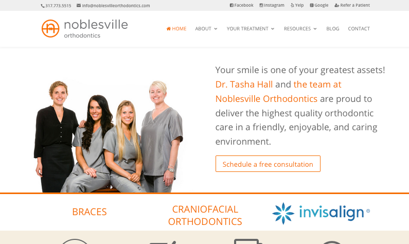
Noblesville Orthodontics took the time with a professional photographer to get beautiful, polished pictures of their doctors and staff. They boldly show off these great shots on their homepage. These are people I can’t wait to meet.
Bonus winner

All of the images on this homepage are clearly stock, but I want to give this practice credit for choosing photos with an updated, natural look. It’s too easy to pick images that look like a 1990s Newport we’re-all-so-happy-we-just-can’t-stop-laughing cigarette ad. This site mostly avoids that cheesy trap.
Death by Milquetoast Anti-Branding
Unfortunately, many medical practices suffer from bad branding. It’s still common to meet doctors who do not have a logo or mark other than maybe some old letterhead. Worse, they may have some branding, but it’s executed so poorly that it’s keeping their business down. Timid color schemes and meek logo design make it hard to design a corresponding website that “pops.”
Winner
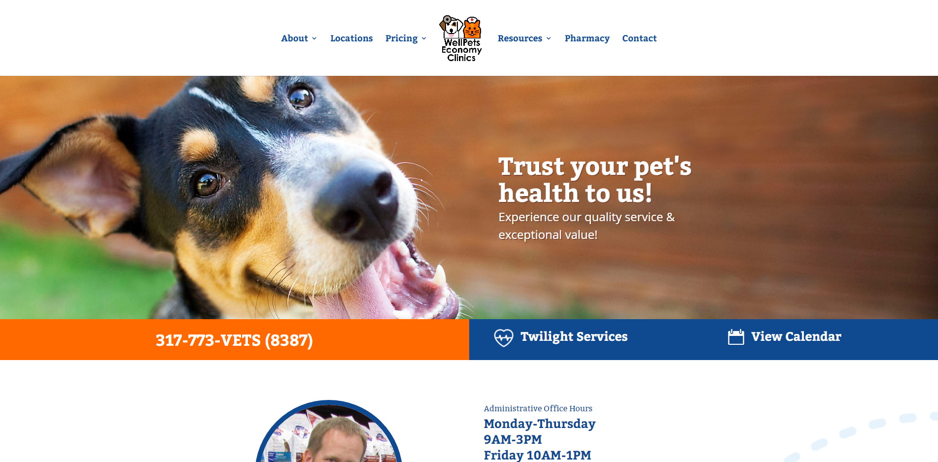
Fortunately for WellPets, their brand exceeds my expectations for local veterinary providers. They have the obligatory dog and cat characters, dressed in medical uniforms, of course.
But the thick, poster-style lines in the drawing match the width of the lines in the business name. Bold orange (inspired by the orange cat character) meet calming blues to make things interesting. Their homepage is a big winner with that great photo of an adorable puppy. Another example of how to pick the right stock photos.
Loser

The loser for this match seems to have gotten their color palette from a mid-90s waiting room. It’s trying for professional and sophisticated but ends feeling gloomy and dim. The logo itself is passable, but the business name is carelessly stickered on. This screenshot obscures it behind a blur, but I promise you it sucks. The poor design actually causes me to doubt their trustworthiness. Ouch.
The Slow March of Time and Endless Neglect
Sorry about that bummer of a heading, but I had to get your attention! Many clients I’ve worked with in the past state “our site was old and it was time to get a new one” as their reason for deciding to invest in web design services. If I had one wish, I would ask the genie to make it so clients paid more attention to their existing sites and updated them in small increments over time so they stayed forever young.
In the future I want clients to come in saying their strategic objectives changed or they decided to choose a new content platform, something like that. I don’t want anyone to give “it was old” as their excuse. You know why your website got old? Because you let it go. But some clients are already on the ball.
Winner
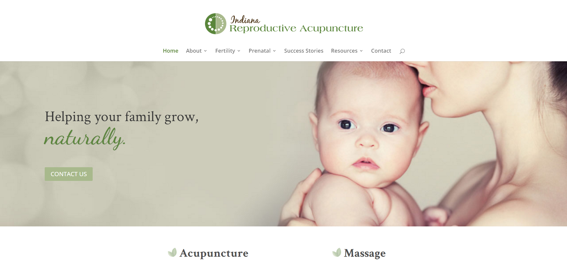 So, I can only award this one because I’ve worked with this company on multiple website updates. While it’s not obvious from their homepage, we’ve worked with them for a long time to progressively improve and revamp the site.
They frequently come back with new ideas and requests for changes. And their staff has been trained to use WordPress so they can edit the text on the site at any time. They pay attention to their site because they know customers do their shopping online and online research is a big way their clients decide who to call.
Loser
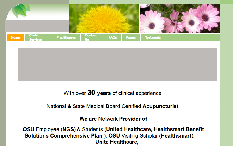
I feel especially bad for this site. If I couldn’t tell from the outdated design, the copyright notice helpfully notes that nobody’s looked at this since 2007. Yikes.
It’s too easy to pay a web designer to get you setup with a basic website, check that to-do off your list and move on. But every month your site passes in neglect is full of opportunities you’ve decided to ignore. Pay attention to your site. Care about it. Ask someone to help you with it. Spend a little, spend a lot, just make sure it’s included in your future plans.
Incomplete or Missing Content
The hardest battle any website needs to fight is the fight for quality content. Content includes good writing, but also good pictures! Google will only highly rank websites if customers spend time actually reading your stuff and making use of your resources. The big question: do you have the content?
Unfortunately, the web design process may include planning for great new content pages but that content might never be produced leaving blank pages. Naturally, your customers are going to feel a little thrown off if you promise online scheduling, before and after pictures and other features and fail to include that.
Winner
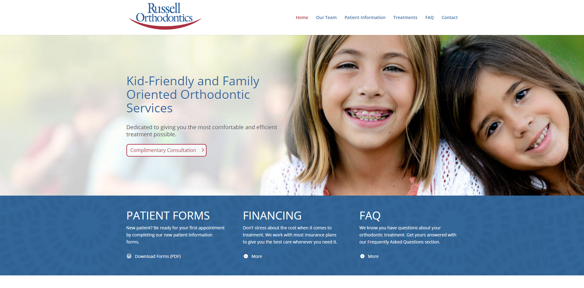
Russell Orthodontics falls into none of those traps. They follow up with an easy scheduling form as well as some general information about services. The key to this site is really those beautiful kids on the homepage as well as the picture of their office building just below.
So, this battle was about content. What about that? How did Russell win? Let me show you the loser.
Loser

Other parts of this site were excellent. The stock photos look fairly human, the branding was fresh and interesting and the design looks updated (though ugly to me). However, everything else can be hunky-dory and you’re still ruined if key pages are missing or broken.
In this case, this orthodontic medical practice website is missing the photos for its before and after page. This page is linked directly from the primary navigation, and it’s empty! Not only that, but these are the before and afters, they’re supposed to be dramatic reveals, the persuasive proof that these doctors know their stuff and produce results. How could you let it go empty like this?
This is one of those cases where the winner won, not because the before and after images are better, but because they decided to let go of them. Russell Orthodontics doesn’t include before and after images on their website. But neither does their website promise them. On the losing site, this page is linked to very prominently, the doctors promise a lot, but fail to deliver. Don’t promise pictures like that if you can’t post them.
The four sins of lame medical practice websites are bad stock photos, lackluster branding, neglect and missing content. Does your website fall into any of these? You can recover. Take stock of your site, make a list of your pain points and “wish list” and talk to a web design consultant to forge a path forward.
