
Medical web designs are often badly out of date. I won’t name names, but it’s easy to neglect your online presence when many customers come by referral and word of mouth. When patients get your number from a friend, there’s a good chance they’ll just call. However, the younger your patient base, the more likely they’ll use the internet to research your name.
For these web-savvy folks, a well-kept web design is a sign you’re up-to-date and ready for new business. What does well-kept look like in 2016?
Before We Start
For this post, I’m talking aesthetics only. These trends and ideas relate only to the look and feel of the web design. I won’t talk about live chat, click-to-call phone numbers or remind you to build a form for scheduling appointments. Instead, we’re exploring novel color schemes, elegant page layouts, stock photo alternatives and more. Let’s begin with the beginning.
Start with a Focused Message
If there’s one thing cell phone’s changed about web design, it’s the intensity of the message. There’s not much room to spare, even on a tablet screen. And you still have two seconds or less to hook viewers. Try rolling out the welcome mat.
This section sits above your main homepage, even above your logo and header. The web design welcome mat makes it easy for visitors to solve their problem with immediate action.
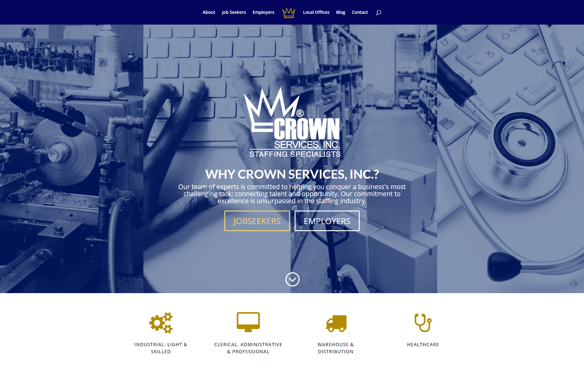 In the screenshot above, Crown Services divides their visitors into two audiences. They serve both job seekers and employers. But these two audiences need very different information. This first section welcomes both and immediately links them to the page designed specifically for them. No poking around on the homepage trying to figure out where to go. Which is great! Visitors are time-starved and eager to take care of business.
Application for Medical Web Design
The center of the welcome mat should be your medical practice logo. In the background, consider using a high-quality photograph of your building like Noblesville Orthodontics. You might also choose an image that shows patients who have received the benefit of your care, like Advanced OrthoPro. Below your logo, include a brief headline. Crown Services asked and answered the critical question, “Why us?” Noblesville Orthodontics opened with a warm greeting.
Most importantly, you must include an action button. Either direct visitors to customized landing pages, like Crown Services, or use a button that links visitors to the most important action you want them to take. This is often “schedule an appointment”.
Be Bold Like a Dorito
My favorite development in art and web design is the surge of bold colors and patterns. Think about prominent advertisements from Apple and Spotify. These flashy music videos entice young audiences. But it’s not just youth brands livening up their look.
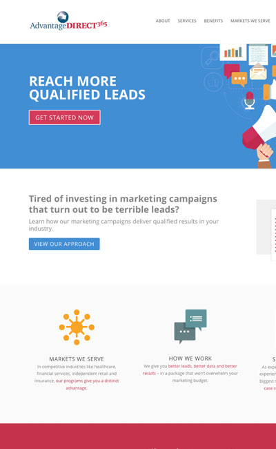
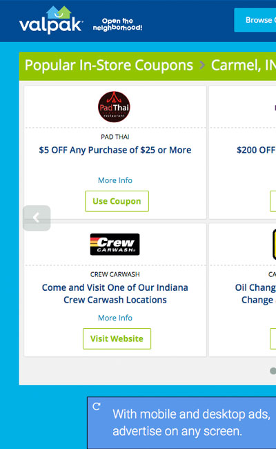
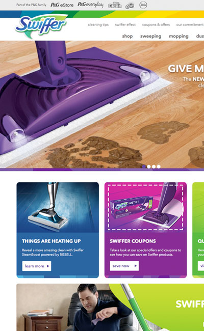
Household brands like Swiffer and Valpak sport updated web designs. Advantage Direct 365 uses playful illustrations inspired by flat web design. The new designs are full of rich, saturated colors and crisp, fresh-feeling lines. The bold color choices contribute to a high-end feel. Not to mention looking great on HD screens.
Application for Medical Web Design
As you work with a web designer, tell them you’re looking for a modern design that uses color generously to emphasize important information and calls to action.
Bonus Tip: Look closely at your logo, business card, letterhead and appointment cards. What color is used most often? For medical brands, shades of blue, green and gray are common. Consider working with a professional graphic designer to find a bright complementary color. A shade of yellow, orange or purple can be a great addition to your web design. Carefully broaden the color palette used for your practice’s branding.
Embrace Your Natural Beauty
It’s time to put your best faces forward. Use high-quality photographs of your own staff and patients instead of stock photos. The Internet is all about using pictures to attract eyeballs. Pictures are bigger too, filling up screens edge-to-edge.
Website builders like Squarespace use photographs as wallpaper behind the main headline and other text. Many new WordPress themes are the same.
You need pictures to cover these spaces. And not stock photos. Work with a photographer to plan a photo shoot designed specifically to generate images for your website. Stage “slice-of-life” images. These should look polished, like an ad. Featuring your own people maintains the spark of authenticity that makes it your own.
Application for Medical Web Design
The Catherine Peachey Fund committed to using only their own photographs on their non-profit medical web design. The researchers featured on their homepage are actual recipients of support from the Fund. These are the guys whose work is changing lives.

Now, imagine if The Catherine Peachey Fund had used stock photo scientists instead. The real thing is clearly better. Get great pictures by working with local photographers. It’s worth the investment.
Be Delightful like Disney
Think about Disney World for a minute. Disney’s designers are masters at creating pleasing experiences. Everything comes to life. Not just the rides, but the fountains, walls and sometimes even the trash cans. Waiting in line is never more fun than while you’re entertained. It makes you want to stick around and explore.
This is the same behavior we want to encourage in website visitors. Look for examples of user experience expertise from your web designer. Are they creating basic brochures or engaging experiences?
Application for Medical Web Design
High-speed internet service is everywhere. More people can access larger files with shorter waits. This frees up web designs to include more motion and interactivity. Subtle movement and animations are pleasing enhancements to user experience.
See the neat, energizing video background made for Special Olympics Indiana. Or hover your mouse over the video and the Buy Tickets button on storytellingarts.org. These simple touches make your website look and feel like a rich, interactive experience. Even if visitors are just clicking buttons.
Design Like a Storyteller
Remember the welcome mat idea from before? The welcome mat section is partly a response to the limited screen size and attention span of mobile device users. It’s also the expression of renewed focus on art and copy in web design.
Today’s web design tools let designers produce print-quality digital materials. You can have just as much polish, professionalism and control over detail as print designs. High-speed internet service brings these rich experiences to your visitors on an incredible variety of devices. Provide them with a high-quality web experience that sets you apart from all the rest.
Application for Medical Web Design
Make a list of the web pages your visitors use most often. You might think of page titles like Meet the Doctor, Our Office and New Patients. On a neglected website, those pages might have useful info, but look like a book report. The danger is that visitors pass right over your important information. There’s a reason no one reads fine print. Long paragraphs just look like a chore.
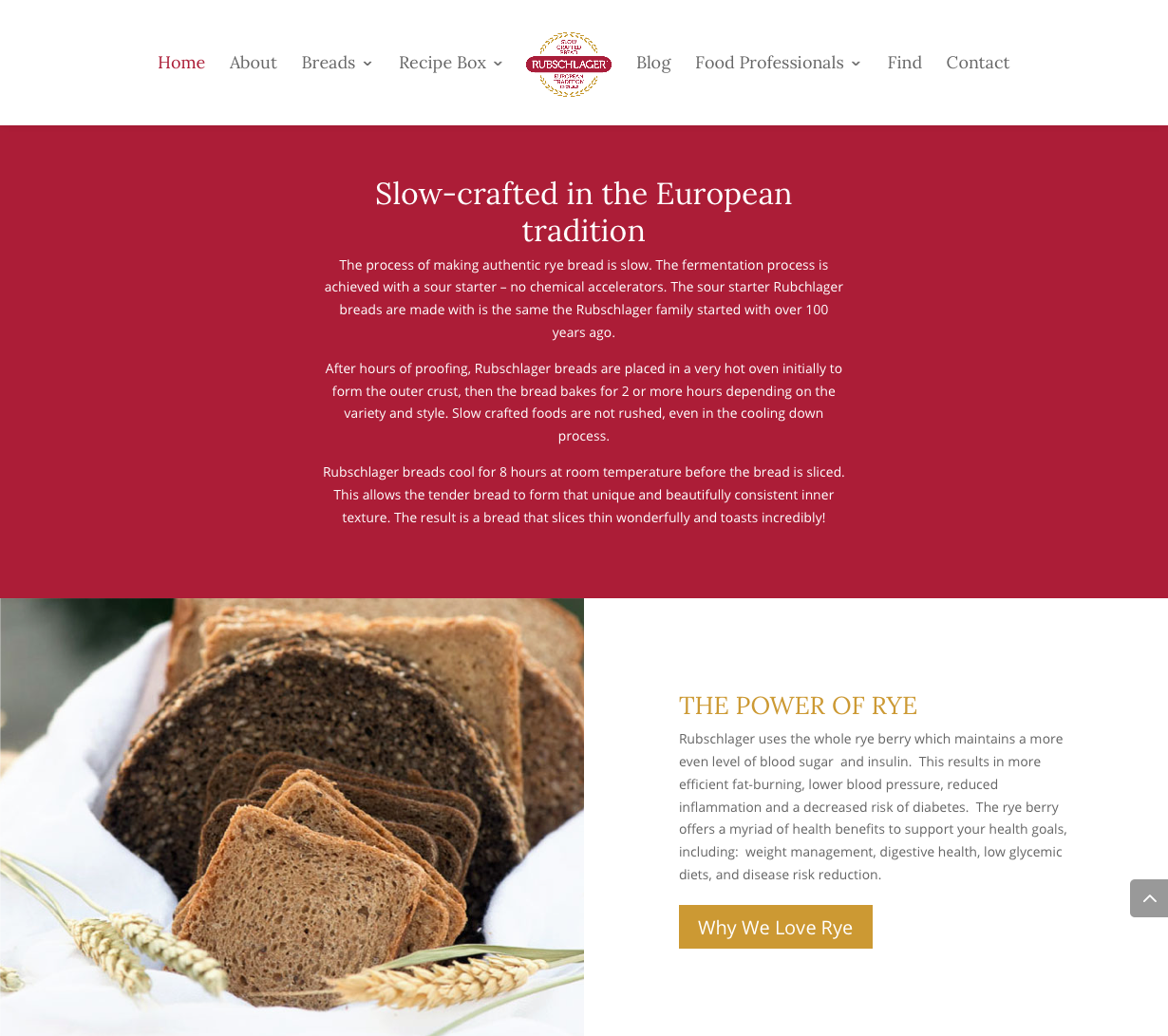
In the screenshot above, Rubschlager Breads used several short paragraphs to explain their business and their specialties. They’ve also padded each section with a healthy amount of extra space, giving the text room to breathe and stand on its own. Professional photographs support the claims made in the paragraph text.
To achieve high-end quality, minimize the word count where you can and ask your web designer to make pages inspired by high quality graphic design. Think of a print magazine or journal you appreciate for its design and presentation. Bring these to your web design meeting and use them to explain your likes and dislikes.
Wrap Up
In your new web design, establish a focused message with the welcome mat section. Present your most important information first (or immediately link visitors to the page where they can get it). Embrace a generous use of bold color to liven up your pages. Consider how your existing brand can be upgraded to include a broader palette of usable colors. Book an appointment with a professional photographer to shoot natural, professional photographs. Delight visitors with subtle UX animation. Ask your web designer to show you how. And while you’re in that meeting, tell them your preference for story-oriented web designs that visitors are pleased to explore, like the best magazines and graphic design.
Resources:
- Even Forbes raves about these trends.
- More developments in web design explained in plain-language by Elegant Themes.
- Check out this extensive list of 2016’s new web design options.
Ready to start your web design?
Roundpeg is an Indianapolis web design firm.
