NY Fashion Week has come and gone. Retail buyers have looked over the lines and made decisions about what they think the hot trends will be for next Spring. While there’s no red carpet or paparazzi for the 2017 web design trends, we are definitely entering web fashion season.
Every year in the late Fall, web fashionistas including a few at the ‘Peg write year-end wrap-ups predicting what well-dressed websites will be wearing next Spring. Sometimes a new trend becomes the next little black dress and other times the trend is gone before it even catches on. So, what’s on the way in and what’s on the way out?
2017 Web Design Trends
1. Variety is the spice of life
When we started designing websites more than a decade ago, there was essentially one layout for all the pages. Then came the widget-driven home pages with distinctive looks, but all the inside pages were still the same. It was like having one dress in a dozen different colors.
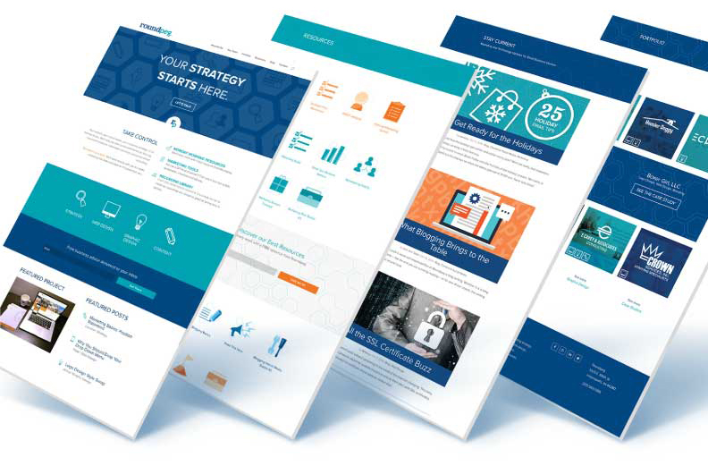
That is not true anymore. With sophisticated (yet easy to use) web design tools, every page on your website can have a different layout. Some pages can have sidebars while other can be full width. Single, double and triple columns can be mixed and matched to deliver the right content at the right time.
It can be tempting to go wild and just push the boundaries because you can, or add a rotating image and a parallax scroll but don’t. Just as you don’t need feathers and fringe on the same dress, not every page needs every possible design element. Edit, edit, edit to find the balance point between variety and chaos.
Using a limited color pallet helps bring a sense of unity to the site. Next you need to focus on function, by having the tough conversations about the purpose of each page. When you know what the page is supposed to do, it is easier to pick the right design elements to improve the user experience. When you find the balance, your web pages look like an award winning collection.

2. Tiles are Still Hot, but One Size Does Not Fit All
As early as 2014, we saw a rise in popularity of the masonry grid style layouts. These “Pinterest’ influenced pages featured little cards of information and strong images to direct your attention. We expect to see this web design trend continue in 2017, with a twist. Instead of neat rows, with equal sized pictures, expect to see the tiles coming in all shapes and sizes.
Why are these tiles or “cards” so popular?
- They make it easy to organize a lot of information into digestible pieces.
- They are useful on a home page to direct people to the right segment of the website.
- They work seamlessly with responsive designs, not only intuitive but easy to understand without explanation.
Next year look for more interesting layouts with blocks of color in different sizes, under text or creative mixing of images and color. This flexible approach to tile size frees you to match the box to the content instead of forcing you to limit your word count to match a specific space.
3. Ready for Your Video
We are seeing more and more video splashed across home pages and expect to this trend to continue. However, I’m on the fence with this. While interesting in theory, many businesses don’t have anything business related which is interesting in a silent video. Do I really need to see your team walking down a hall smiling? Just because you can have a video doesn’t mean you should.
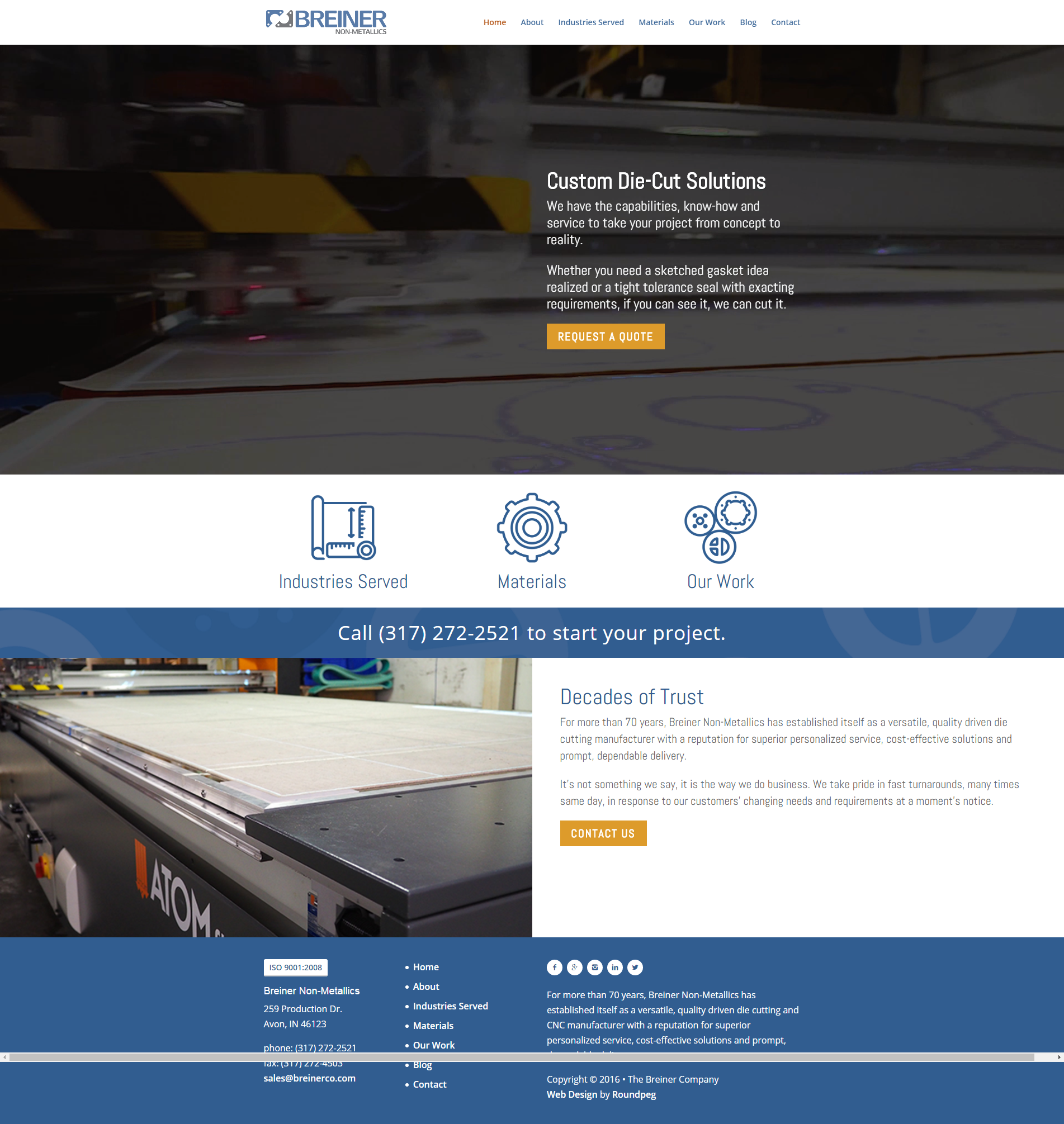
If, however, like Breiner, you have footage of your equipment in action, that video will enhance the user experience. So the suggestion for wearing this web fashion trend is to be sure it looks good on you before you buy those 4 inch purple heels. 
4. Take Your Last Bite of the Hamburger
Sure this little circular menu looks cute on mobile devices, but it just looks silly on a full-size website. As more UX (user experience) pros weigh in, we are starting to see a shift away from the hamburger and back to a more visible, informative menu when space allows. Since I was never in the burger camp, I won’t be sorry to see these go.
Look back
Right about now you are probably wondering whether we are any good at this web fashion prediction game. Well, you can go back and look at some of our early posts and judge for yourself. They are worth a look back to see how much has changed, and how much has stayed the same.
2011
In our 2011 web predictions, we anticipated a shift to smaller logos and headers and a rise of mobile responsive design. Look at any website today and you know we were right. We also expected rotating images to be hot, and they were for a little while. But just like colored denim and peplum skirts they have been pushed aside by more attractive alternatives.
2014
This was a fashion packed year as we looked at longer pages, larger images and single point conversions. Of the three trends, conversion is one you need to continue to watch.
Are you ready to embrace the 2017 Web Design Trends? Download our web planning guide so you will be wearing the latest web fashion in the Spring of 2017.
Roundpeg is an Indianapolis web design firm.

