Evolution of Graphic Design
The true purpose of graphic design is to communicate. A design can be beautiful to look at, but if it doesn’t send the right message it’s not accomplishing anything. When you look back at the history of graphic design, especially advertisements, you’ll notice the designs largely reflect what was going on in the world at the time.
Note: If you haven’t updated your logo and graphic design in awhile it may look as outdated as some of these examples.
The design styles are different because the viewers’ needs were different. You couldn’t, for instance, take the neon geometric patterns of the 80s and use them to instill a sense of patriotism in people after World War II.
Taking a look at some of the iconic designs through the decades, it’s easy to see how much graphic design has evolved as the world around us changed. Here are some designs that stand out to me (for better or worse) from each decade.
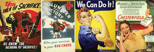
Advertising from the 1940s
The most notable examples of graphic design in the 40s can be split into two groups. World War II designs, especially propaganda posters, and the advertising boom that followed the war. Design in general during this time became more in-your face in terms of graphics, icons, and text. Less copy was being included, and instead, ads were relying on huge, often startling slogans.
The theme of patriotism was prominent not only during the Second World War, but also in the years following. Although ads still mentioned the war for years after it ended, designs took a somewhat more optimistic turn. With the economy on the upswing, there was a greater need for advertising and packaging designs, and advertisers were waiting in the wings with positive, often patriotic messages.
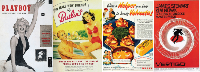
Advertising from the 1950s
Design in the 50s had a bit of everything. The entire decade was packed full of interesting and often bizarre designs. Sex in advertising became huge, especially with the publication of the first issue of Playboy magazine. Sex was used frequently to sell everything from cigarettes to socks. There was an overall theme of “happy, beautiful people” in advertising, so if there happened to be a product that a sexy woman couldn’t sell, a smiling family around a dinner table seemed to do the trick. The kitschier the better!
One of the best parts about the 50s in terms of design, was the rise of graphic designer Saul Bass. Bass is widely known for his movie title sequences and some of the most iconic logos in American history. Bass was known for finding clever ways of making the ordinary, extraordinary and his unique style has influenced designers ever since.
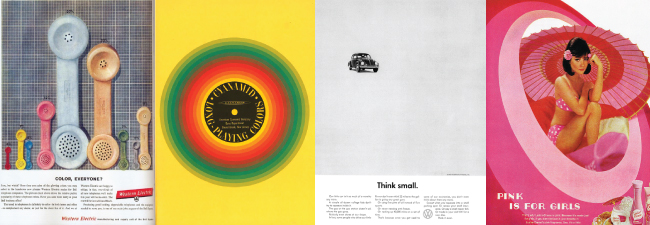
Advertising of the 1960s
Trying to choose one type of design as the most notable for the 60s would be extremely difficult. Cultural wars and activism were everywhere, and everything from human rights to drugs and the environment were being hotly debated. On one hand, advertising was taking a more modern turn, as we saw some very “Don Draper-esque” concepts come to light. Rather than bold images and taglines, we were seeing clever ideas and big concepts.
On the other end of the spectrum, however, we were beginning to see bright colors and psychedelic graphics, especially in the music industry.
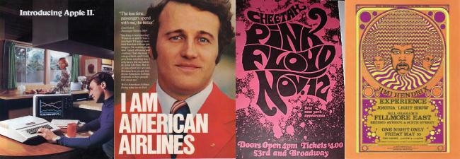
Advertising of the 1970s
Music proved to be one of the defining features of the 1970s, and many of the most iconic band posters and album covers come from this time. The psychedelic style that emerged in the 60s continued to flourish, and the typography followed suit.
Technology was also coming into the spotlight in a major way during this decade. We were we seeing more color photography used in designs, thanks to advancements in camera technology. By the end of the decade Apple computer ads, which were modern for the time, were popping up everywhere, and we were being told we could have our very own personal computer!
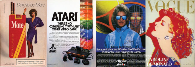
Advertising of the 1980s
It’s hard to think of a decade that tried harder to be cool, (to varying levels of success) than the 1980s. This was an interesting time for design and had its own very distinct style. Think geometric patterns, complementary color schemes, and technology as a glimpse into the future. (Seriously, people in the 80s loved to depict the future.)
Another notable aspect of 80s design, was that it was beginning to speak more to women, and in ways it hadn’t before. Less “don’t burn dinner!” and more “be bold and fashionable!”
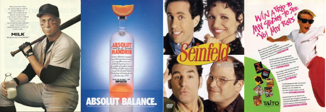
Advertising of the 1990s
This was a quirky time for design. Everything from the ad campaigns to television, to fashion seemed to be like the lovable next door neighbor. Everything was a strange mix of funny and embarrassing. Either the typography had to look wacky and hand drawn, or the colors needed to clash, or at the very least, someone should wear a milk mustache.
Which decade was best?
With so many different design styles, it’s hard to choose only a few to focus on, but these were some that really stood out and seemed to best reflect each era. We’ve seen drastic changes in the copy/image balance, use of color and photography, and overall tone. For instance, currently, we’re seeing very modern and minimal designs and an obsession with all things technology related. Our attention spans may be shorter today, but our designs are generally sleek and to the point. What changes do you expect to see as design continues to evolve along with our ever-shifting culture?
A step-by-step guide to building your brand

Rebrand with Design Thinking
What is design thinking and why is it so popular? Well, it's a process used to redefine problems...
Big Brands aren’t Better
Is it true that brand-name products are superior, or does the power of branding make us want to spend that extra dollar?
Evolution of Typography in Web Design
Learn more about the evolution of typography in web design.
Designing the Perfect Blog Feature
Stand Out from the Crowd Designing the perfect blog feature looks different for every company....
