Giving Boxer Girl a Fighting Chance

About Boxer Girl
Boxer Girl LLC, develops parcels of land that are in need of redevelopment and revitalization. Boxer Girl focuses on how members of the community live, work and play together to create safe and community focused living developments.
The Challenge:
Owner of Boxer Girl, Jane Hendrickson, came to us with a very specific request, to incorporate the imagery of a boxer dog in a way that didn’t feel cartoon-like. Our challenges were to create a professional looking brand and steer away from any misconceptions the company name could face. For example, we wanted to make sure the brand didn’t feel like a fitness/boxing company, or anything pet related. We also needed to keep things from getting too feminine since we were working with the world ‘girl.’
Design Goals
- Balance strength, femininity and professionalism through logo design and overall branding elements
- Stay true to the name Boxer Girl while giving it a feel that reflects the business
- Carry design through a range of collateral

About the Dog
Long before she started the company, owner, Jane Hendrickson had the name in mind. She often referred to herself as a ‘boxer girl” so she always knew the dog would be part of her brand. The illustration had to be interesting, yet not juvenile.
We started with a hand-drawn sketch, which was then converted to vector art which could be used everywhere, from marketing collateral to the website.
About the Colors
The colors were chosen as a nod to Jane’s background in construction management. We chose a more muted version of the orange and grey combination often seen in construction branding. Several shades of grey are used throughout the website to create depth and contrast, and the orange is used in areas to grab the viewers’ attention.
About the Font
We used an interesting san serif (Avant Garde) to keep things modern and friendly. This fits with Jane’s personality and the approachability she wanted the brand to have.
About the Website
The primary goal for the Boxer Girl website is to spotlight the expertise of business owner Jane Hendrickson in real estate consulting and development.
The web design is inspired by the crisp, modern aesthetic of the logo. There’s little extraneous decoration. The main page photo was carefully chosen to include a building typical of those Boxer Girl is involved in developing. The architecture of the building and its colors were chosen to complement the Boxer Girl branding.

The Results
The finished product seamlessly brings together the dog imagery, strong, blood colors and a crisp clean website to support the Boxer Girl brand.
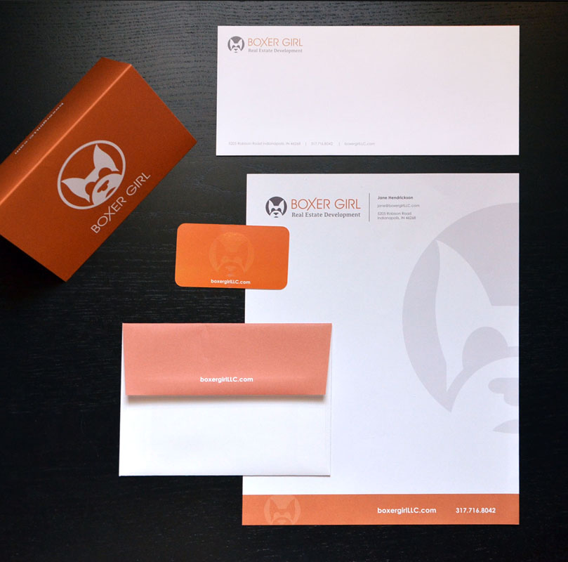
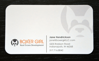
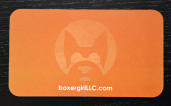
Jane and the Boxer Girl brand now have a full suite of branded collateral. The logo works together with the overall brand. The use of orange creates visual interest that makes the brand stand out. The logo works well on business cards and is the perfect accent on the website.
- Bold unique logo
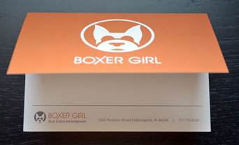
- Business cards, folders and note cards
- Cohesive brand image that represents Jane Hendrickson and the Boxer Girl brand
As the owner of Boxer Girl, I cannot express enough thanks and praise to your team for my website, logo branding, creative composition and most of all experience as we brought ideas into reality.
Boxer Girl’s website is viewed for many reasons – from initial citizens concerned about real estate development in their town to city representatives wanting to fit the product with the need to finally buy stakeholders who desire the same goals as our firm. As a business owner, you want to solidify “first impression” and a corporate business cycle we live in every day no matter our profession.
Roundpeg excelled in every aspect and set the expectations in the correct position from our firs conversation to the day company collateral pieces were delivered to our door step. Take time to celebrate a victory Roundpeg and take credit for a job well done.
