Minimalism in Web Design
What is minimalism in web design?
Minimalism in web design means removing unnecessary design elements and creating a more simplified interface. As web design focuses more and more on good user experience, designers need to create the most usable and attractive websites possible. It is really easy when designing a full website layout to be overwhelmed with all of the new tools at our fingertips.
Very often designers can get carried away with too much motion, lack of hierarchy, overuse of vivid colors, basically building pages that have way too much going on. When a designer uses a minimalist approach and applies little or many minimalist principles, it can help the design to become attractive and still effective with few elements and ultimately improve the users’ interactions with a website.
I’ve always been drawn to a more minimalist approach when it comes to building robust pages. When too much is thrown on a website page that I visit, it is easy for me to get distracted and kind of frustrated when looking for something I need. When I first employed these principles I thought they were strictly aesthetic. But what it really comes down to is the user experience because when the focus is “less is more” there is a clear focus for users to reach their goals.
6 minimalistic principles in web design
Below are 6 of my favorite minimalistic design principles but there are many more that you can consider when creating your next web project. For example, you can also play with textures, small details, animations of text, layering, and overlapping text boxes, illustrations, copy/heading sizing for emphasis, just to name a few.
- White Space or Negative Space – Gives user’s eyes a break between sections and focuses on the importance of your content. This is one of my favorite principles to incorporate because it always creates a nice balance on the page.
- Typography – Using bold and beautiful fonts was one of my favorite trends to see in 2020. Within minimalism, a decorative font can go a long way by complimenting the other text on the page. Because headings separate your content, it is fun to make these elements stand out by making them larger and adding accents of color or patterns.
- Choose colors carefully – Colors can be tricky when you are focusing on a minimalistic style. If you think greyscale or simply black and white when you think minimalist you are not alone in thinking simple equals no color at all. But in fact, designers have implemented the use of vivid backgrounds that capture more attention. Too many colors can be very irritating so the best approach is to use complementary hues, throwing in some black or white typography, or using bright photos, as long as there is a balance.
- Navigation Set Up – The use of over-complicated/in your face navigation is nowhere to be found with this principle. Home buttons are easily replaced with the logo and main navigation items stand out but the use of excess items no longer need to be that obvious. When simplifying your navigation make sure that you aren’t hiding links and instruments that are important to your users. This can be achieved by placing your important CTAs as soon as someone hits the page.
- Consistent Structure – Minimalist designs are often highly creative and artistic. Maintaining a simple and very clear visual hierarchy is another essential feature. When beginning a layout, designers will use basic grid structures and then slowly breakaway, making the sections more interesting and eye-catching.
- Carefully Choose Images – For me and many others, a site can instantly look professional with the use of the right images. Beautiful imagery is a lot more powerful than you think. Images should be used to complement the content on your site and not just for decor. Different style choices can give your imagery new life like simple shadows, borders, filters, and animation effects.
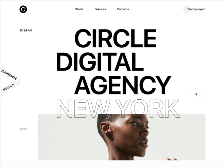
Circle Digital Agency
The Circle Digital Agency homepage uses multiple principles such as creative typography with a subtle overlap and interesting negative space. When you scroll through the page you will notice a really cool effect when you hover over images. The site shows that even though there are complicated effects the overall design is classic and simple.
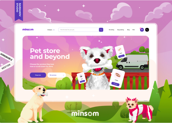
Minsom Online Pet Store
The Minsom online pet store is a highly illustrative and fun site. The homepage uses subtle animations to draw your eye down and around, not on one fixed point. This website relies heavily on visual elements and less on bogging down the site with a lot of text. The consistency of design illustrations makes the site less overactive and complicated.
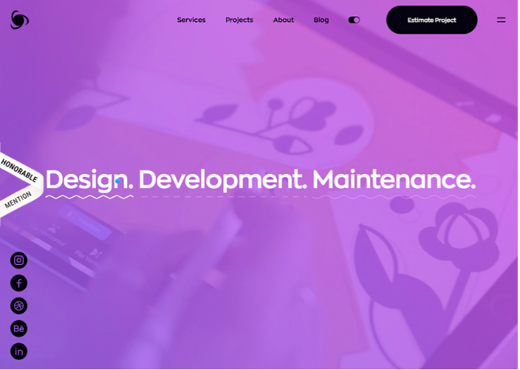
Ronas IT
Ronas IT is a great example of combining an innovative and unique layout with a minimalistic approach. The site allows the customer to instinctively scroll through the page and the different text and images give an unexpected experience. This site also uses a hamburger menu instead of an inline menu, which is going to be a growing trend in 2021.
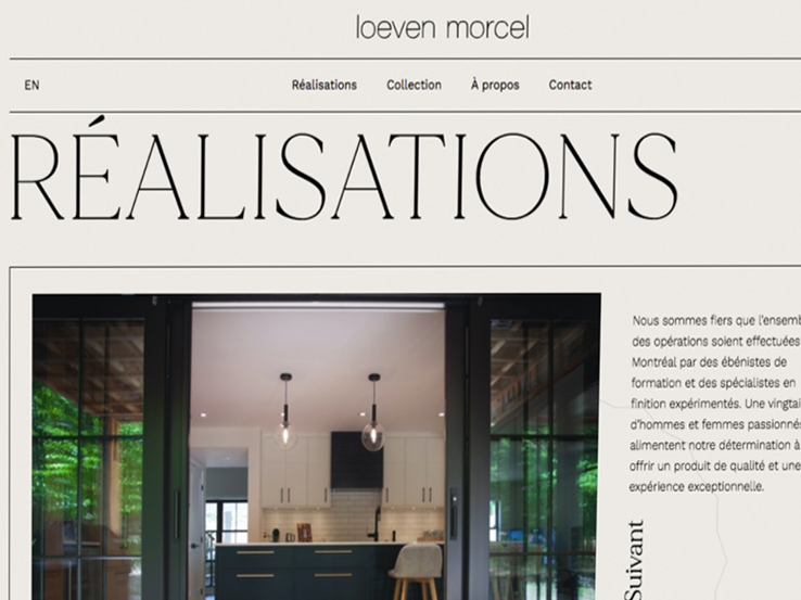
Loeven Morcel
The Loeven Morcel homepage uses a layout that showcases their gorgeous photography. The sections are minimal with an average amount of text that is pleasing to the eye because of the vertical headings. When scrolling through the page each section uses a different creative element like overlapping, text widths, and white space varying in padding sizes.
Let simplicity work for you
The combination of usability and great aesthetics is key to a beautiful and successful website. Designing a website using minimalistic principles is not easy but when you thoroughly think through each element and focus on consistency, you are heading in the right direction. When your site has easy navigation, clear CTAs, and visual hierarchy, you create an amazing experience for your audience that will guarantee them coming back to your website.
starting a new web project?
The project will go smoothly if you do a little homework upfront. If you are like most business owners, you may not be sure where to start. Download our web design guide to begin your design process today!

Call to Action Do’s and Don’ts
There is such a thing as a bad call to action The goal of any page on a website, whether it's the...
Let’s Talk Web Navigation
The Web Navigation Bar (aka, the nav & primary menu) The web navigation bar is a custom-built...
Canning Cookies, Creating Cohorts: Google’s Advertising Shift, Explained
The devs over at Alphabet are not just trying to bolster their profit; they’re trying to make something that could be problematic better and more secure.
A Deep Dive into Web Scams
What exactly are web scams? Web scams are illegitimate internet websites used to deceive users...


