The Fonts of Roundpeg
I admit it, I am a font geek. The curve of a lower case letter ‘l’ or the swirl at the bottom of a lower case g is something I get excited about. Now I do understand that normal people probably don’t notice or care, but I do. That’s my job. The subtle differences between fonts help define, support, and expand a brand’s identity.
When I started Roundpeg, there were lots of branding decisions to be made. The choice of font was something I agonized over because I assumed that would not change for the life of my brand. While my logo is exactly as it was when we started 17 years ago, our supporting fonts have definitely changed over the years as the company has grown and changed.
As I left my corporate job, I wanted a logo that was the complete opposite of the tightly wound corporate environment I was leaving behind. Roundpeg, my brand, would be approachable, straightforward, fun, and creative. The two fonts which comprise the logo were chosen to communicate those ideas to an audience of marketing managers who needed a less traditional spin on their programs.
I liked the idea of using lower case fonts in the logo. To me, the e.e. cummings style had a more informal feel. The challenge was to find a font or two with interesting lower case letters.
In the beginning …
Clarendon and Trebuchet
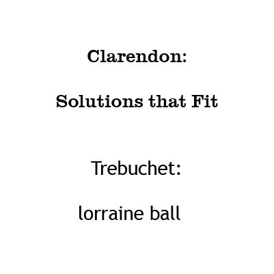
Clarendon, the font used for the “round” part of our logo is a big, fat font with round letters. Despite the elaborate serifs (the decorative tails) it is surprisingly easy to read. The swirl on the “r” was the perfect way to start our name.
While it looks good for our name, Clarendon is actually not a practical choice when you are writing a long document. The letters are just too clunky. Our second font needed to be much more legible.
We start our name with a fun “r” and wanted to finish strong as well so it was important that the “g” leave a lasting impression. Trebuchet, with it’s backward “g,” was the perfect choice. Back in 2002 it was a relatively new font. Designed by Microsoft, it was used primarily for websites so few print designers were using it.
The slight tail at the end of most letters made Trebuchet highly readable, but less formal than traditional fonts. For the first seven years those were our fonts.
Quirky
Complete in Him
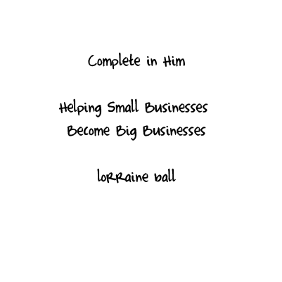
By 2009, Trebuchet was everywhere. What had once been distinctive, now made us look like everyone else. We decided to add a new display font. Complete in Him, a quirky handwritten font, brought a playful feel to our designs. Weirdly, there is no lower case r, but the font is so informal it still felt approachable to our small business clients
Growing up …
Chalet-Paris Nineteen Sixty
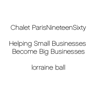
By 2010, the company had definitely matured. We were working with bigger companies and wanted to make our branding look more polished. As we switched our web site to the very sleek Nova theme and changed our tagline, we knew it was time for a shift. We fell in love with the sleek, but very round feel of Chalet-Paris Nineteen Sixty.
Web Safe …
Railway
While interesting, Chalet Paris was not a common font. That wasn’t a problem in print or in graphics, but it didn’t display consistently across the internet. By 2013, we had come to rely on our website more as our primary marketing tool, so we needed to be sure it was perfect.
Railway seemed like a natural choice for our new font. It still had nice round letters which made it fit nicely with Clarendon, and the little tails reminded me of Trebuchet. A popular, readily available web font, it looked good everywhere.

Sleek and Strong …
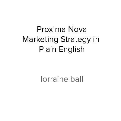
Proxima Nova
In 2016 with our brand and company coming into its own, we were moving away from start ups and micro enterprises. We wanted a font style that, while still stylish, was a little more professional and Proxima Nova was our choice. This beautiful and really readable font made browsing the Roundpeg website a pleasure.
The ultra bold version was perfect for headlines, and the thin version was great for body copy.
Uniquely Roundpeg
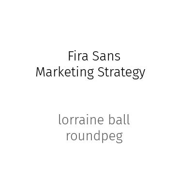
Fira Sans
Recently we noticed that Proxima Nova is showing up everywhere. Suddenly we look like everyone else. So I gave TaLeah a challenge to find a new workhorse font for Roundpeg.
I wanted a font which had a “G” with attitude. That was something we had lost along the way. I also wanted to return to a font which had a slight serif. The result is Fira Sans. We are rolling out the change slowly, with a full release coming this fall with our upgraded website.
Does any of this really matter? The average person may not notice the individual font choice, but when presented consistently over time, the font makes a huge difference in the overall impression and feeling your brand conveys.
Want help with your font selection? Give us a call.
