Anyone who knows me knows about my obsession with color. For those of you who don’t, let’s make one thing crystal clear: when I say I love color, I mean that I REALLY love pushing the limits on color. Whether it comes to my hair, my decor, or even my organization methods, color plays a major role in my everyday life.
Although many brand my tastes as “eclectic,” I’m not alone in my color driven decision-making. In fact, a recent study from Buffer found that more than 90% of people will select a new product to try by its color alone. And with literally millions of colors visible to the average human eye, how can you possibly know where to even begin?
Forecasts from Popular Trendsetters
Many designers turn to Pantone for pallet inspiration whether their focus is in fashion, interiors, or graphics, . Although Pantone has not broadcast their official color for 2019, other experts such as Sherwin Williams, Dutch Boy, PPG Paints, Behr Paint, and Benjamin Moore have announced their predictions. Put all of these together and you’ll have yourself a nice, cozy pallet for your home.

And by for your home, I don’t mean your site’s homepage. Although these colors make a great basis for more calming brands like this spa, most sites using only neutral colors typically don’t leave as much of a lasting impression on millennial visitors. Why?
We Millennials are See-it-Alls
From TV babysitters, to the birth of mainstream internet, to the marriage of social media & smartphones, millennials are the first true generation to grow up in a world of nonstop content. One way or another, we’ve seen it all.
This is why our humor and interests appear to be so “random” compared to past generations. It’s nothing personal, there’s just so much competition. Without a unique twist, your idea is bound to be missed in the sea of billions of other concepts. The good news is that a “unique” concept is not as enigmatic as it sounds.
Right in the Childhood: 80/90’s Influence
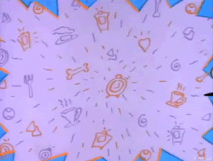
Any other 90’s kids out there remember when everything you’d see on tv looked like this?
Either way, I hope you’re a fan because this style is back and more vibrant than ever.
Vibrance aside, the biggest difference this time around is that colors are no longer tossed together for shock value. Instead, designers have taken vintage motifs and harmonized the colors with more modern color schemes. Sure, the concept isn’t new, but the execution has received a major facelift. Once I got passed the whole “omg, I’m old enough to see my childhood make a comeback” phase, it was pretty easy to fully embrace this revival of familiar motifs.
I also love the increased popularity of simplifying intricate Memphis Designs into subtle graphics to be used as icons, logos, and even delicate tattoos. Designers use a splash of bright color to grab the viewer’s attention, while the lines come together to tell the story.
Another Throwback: Gradients
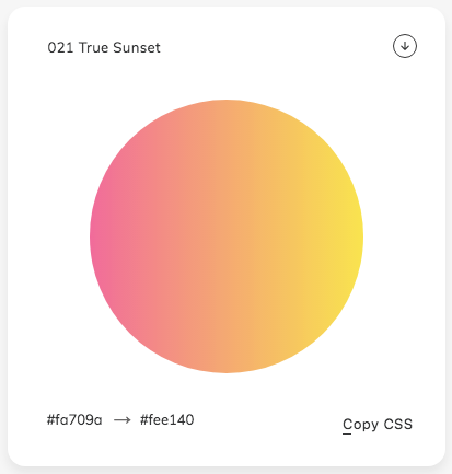
If you’d rather not relive the end of the 20th century, or patterns of juxtapositioned shapes just aren’t your bag, gradients are an alternative solution for modernizing a flat design. Once again, the key is to stay subtle, or at the very least simple. In this instance, we’re hinting at that 90’s influence, not reliving it. Basic color theory still applies here, friends.
Harmonizing the Two Concepts
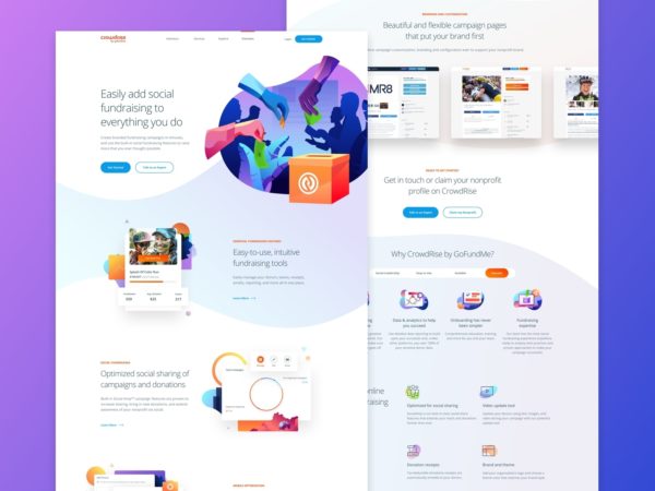
So what do you get when you take rad 90’s style and merge it with new-age gradients? Bold graphics featuring organic geometric shapes that utilize subtle color changes to create a sense of depth. Some may even refer to this style as Flat Design 2.0. This new sense of depth creates a more “natural” environment for users that better guides them to where they can (and should) take action.
We’ve got a few projects in the works utilizing this newer concept, but they aren’t ready to show just yet. This other interactive example also fully encapsulates the Retro Rewind feel you’ve been reading about these past few minutes. Subtle gradients, bright colors, and fun graphics creating harmony while also directing the viewer’s eyes to where they need to go next.
tl;dr Color is the New Black
So in short, color is still back! Bold and unique palates are becoming more of the norm, but limits can still be met. Go too far, and you’ll be diving into a totally different style known as brutalism.
I’m not going to dog on those of you who may be into this niche trend, but I will say that most take “ugliness” at face value. Even if your design choices (or lack thereof) are deliberate, most consumers in our neck of the woods are not going to react a page they find repulsive in a positive manner.
So let’s keep it pretty, let’s keep it fun. Most of all, let’s kick off 2019 with a colorful party like it’s 1999!
If you want to explore a color story our brand kit can help.
[su_brand_kit]


