If you’ve ever tried on something that was one-size-fits-all, chances are, it didn’t fit you. At least not the way you’d hope. But it seems as if logo design is heading in that direction.
Logos have a lot of responsibilities these days. They’re like celebrity that never gets the chance to lounge on the couch in their pajamas, cramming some nachos into their face. Logos are camera-ready, always. If they are doing their job well, they look good on your website and on that big sign you had installed out in front of your business. They must look good on your business card and the company t-shirts. They look good when you see your avatar on Instagram. They look good as a tiny button for an app on your phone. The only person that works harder and looks better than a logo is Beyoncé.
But man, sometimes they need a break. Or it would seem designers are willing to cut them some slack. Sure, sans-serif fonts in all caps are bold and define an all business, no nonsense style. You know exactly what it says and what the company’s about because they’ve earned the right to be there. These simple examples of logo design were created by some of the best minds design has to offer.

But then, the internet came along. You could buy things without ever talking to or even seeing another human being. Smiles were replaced by pixels. Logos had a lot more heavy lifting to do, all by themselves.

Smug little bastard.
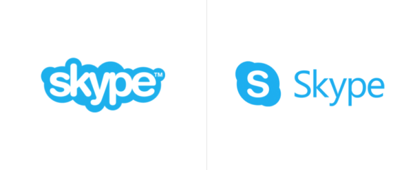
So designers started cutting logos a little slack. You know, for the sake of legibility. Airbnb and Skype descended from the clouds and put on a tie.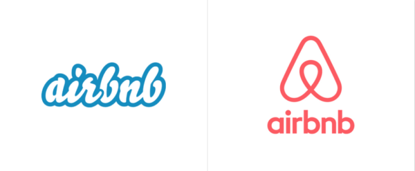
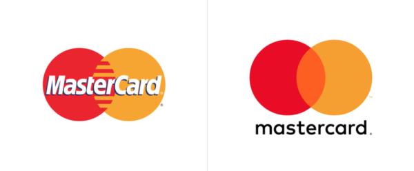
MasterCard lost its drop-shadowy side and grip that would crush your fingers in favor a gentle blend of colors and rounded sans-serif in all lower case. See? They’re approachable and friendly. No uppercase letters to contend with.
But then, everyone else wanted in on the game. Pinterest put down the hot glue gun and brushed the sequins of their lapel.
Calvin Klein was tired of being the calm, cool, collected one of the group and just started YELLING out of NOWHERE.
Some of the brands out back caught wind of what was going on and barreled in through the door. One was vaguely familiar but no one could quite place him nor knew who had invited him. His suit was a little tight and the skinny tie didn’t really go with his combover. Everyone assumed it was someone else’s dad trying to be one of the cool kids. It wasn’t until the next day the realized it was Century 21.

Then it started to get entirely out of hand. Facelifts and mutations that rendered logos utterly unrecognizable and entirely disconnected from what they sold. Despite all its efforts, Taco Bell could never really quite get rid of its unique odor.
Everyone had always respected Burberry, the guy who drank scotch and was always neatly dressed. Out of the blue he started wearing plain t-shirts and jeans, though he refused to take off a tartan scarf in the sweltering heat.
Then all hell broke loose. Starbucks. Nike. Shell. Ford. Even Twinings put down his pipe and reassessed his visage.


Eventually, everyone turned around and realized everyone else looked exactly the same. What used to be a collection of boisterous personalities and staid characters was a monotone hum. No one could see color; the room went dark.
Looking to update your logo design without heading down the path where it looks like every other brand? Start by organizing your current brand assets.
Download our Brand Asset Kit Today
[Formstack id=”2605218″ viewkey=”ixsrgJNVd1″ ]
