This post was written and produced with Melanie Gaston. Read more from Melanie.
There are 126,367 catering businesses in the United States. With an estimated 270,000 people employed in the catering industry, there’s a lot of competition and it’s only getting hotter. Like photography, it seems like everyone knows a cousin with a catering company or a boutique cupcake shop, or a cookie business. How do you convince someone not only to work with you, but to override their family ties for you?
Catering websites should immediately establish the overall presentation style and cuisine of your catering company. Work with your own favorite photographer to capture your settings in all their glory. Maybe even ask customers if you can feature their event! Keep your pictures fresh every year, as they can quickly look out of date and your menu options may change. Include website features like photo galleries, menus, and quote request forms.
I searched far and wide to find these six catering website examples. I think each one shows off something special. They all have at least one element of the following: the best overall catering web design, the best website extras, best headline or writing, best catering marketing integration, best website navigation, and best photography.
Take a look to see what you can learn to improve your catering website for next year’s rush.
Best Overall Catering/Food Vendor Web Design Example
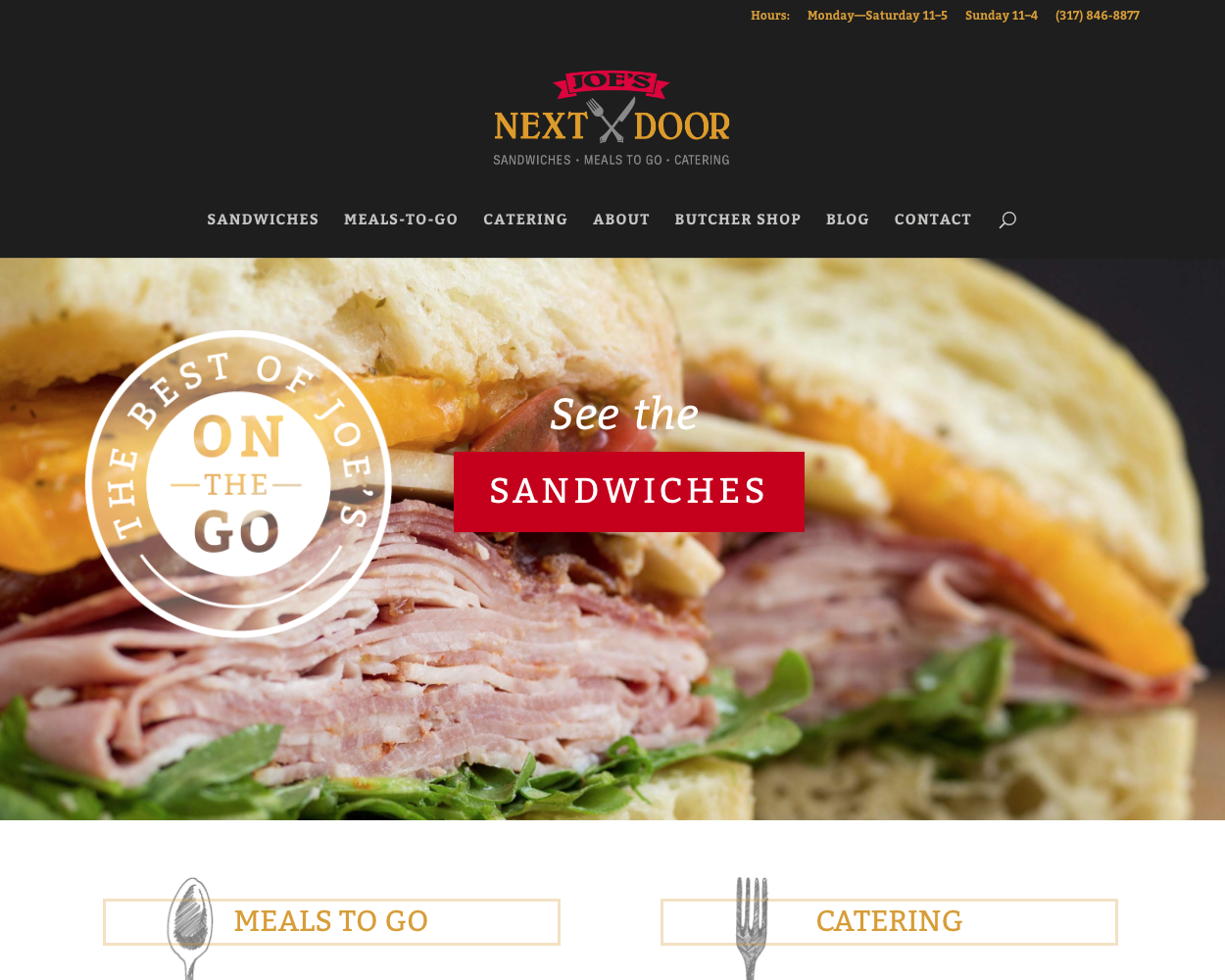
Joe’s Next Door is the sandwich shop and catering operation of Carmel, Indiana’s Joe’s Butcher Shop. It’s a Main Street treat serving sandwiches made with meats and ingredients from the butcher shop next door. A tall, gorgeous photo of an Italian sub sandwich graces this catering web design. The website navigation is crystal clear, dividing content into the sandwich menu, an explanation of their walk-in meals-to-go counter, and the catering options. Every time a sandwich is mentioned, a small camera icon appears so you can see what you’re ordering.
Best Website Extras
Stone Cove Catering has the best website features of this bunch. I think of website features as the essential elements of a website for its industry. Where Joe’s Next Door is the best in overall web design, Stone Cove Catering has several extra features that help it overcome other deficiencies.
While it hides the whole navigation away with a hamburger icon, once you find the Menu page, they present four sample menus as artfully designed cards that Wes Anderson might have used in one of his films. I love seeing the big picture of my event’s food will go together.
Best Left-Turn
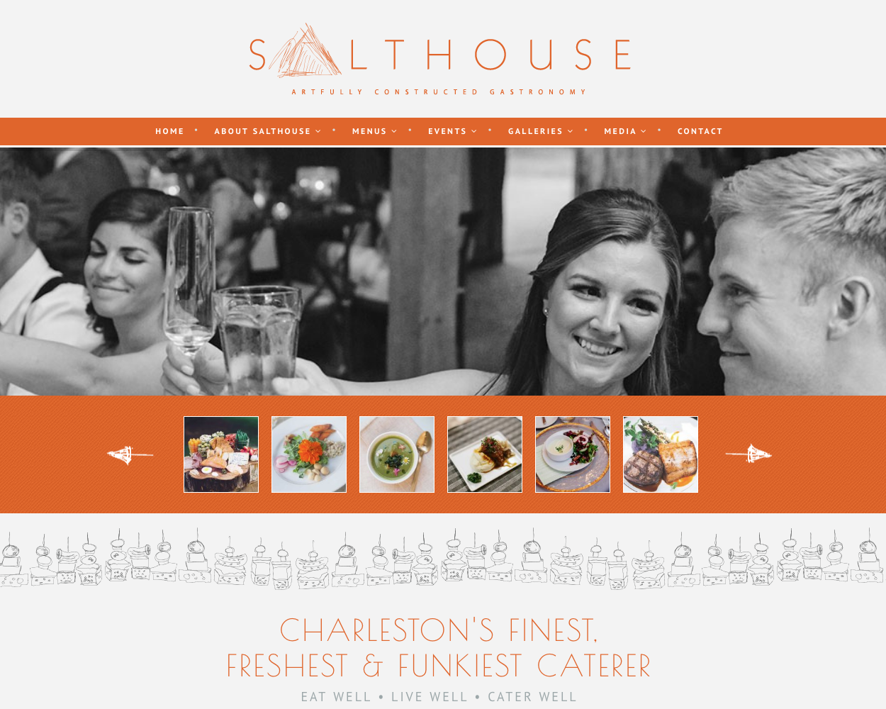
https://www.salthousecatering.com
Sometimes, you’ve got to take a detour to find your true self. Deep, I know.
For Salthouse Catering & Events, that means pairing unusual sketch-style illustrations with lines like “Salt is essential… [it’s] the only rock we eat…” and “We are designers of food, simple or sublime.”
None of the other catering web design examples on this list uses the word “funky” with such authenticity. Really! The company branding is unique and cohesively applied to the web design. It’s clean and fresh, but also convincingly gourmet-looking and weirdly classy.
Best Headline or Writing
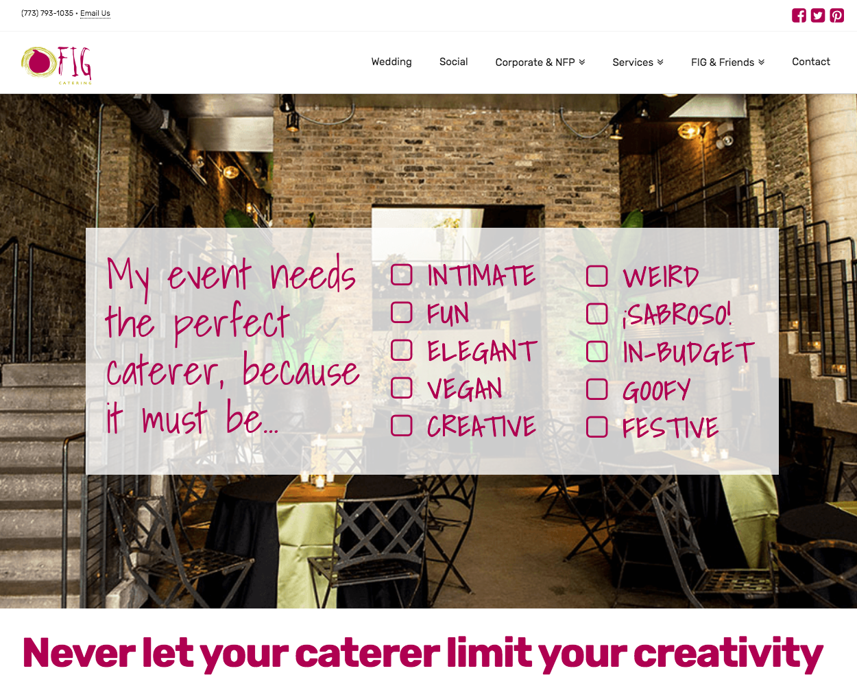
The catering website world is all about photography. You can say a lot with a killer billboard image. But I don’t want to leave out creative writing. If your hors d’oeuvres are only ok, you can make up for it with a standout headline to say how you’re truly different.
First of all, FIG Catering looks so fun and creative. Like a funky downtown bistro that delivers plates and plates of classic favorites and imaginative creations. Their home page features a photo gallery from their active Instagram. The interior pages creatively link to each other, creating a strong web of support for organic SEO performance, and each page (already loaded with good CTAs) ends with a strong “Contact Us.”
This copywriting is a little flowery, but I don’t mind since this is fine dining. But it’s also a little edgy, which goes with their fun colors and stand-out illustrations.
Best Website Navigation
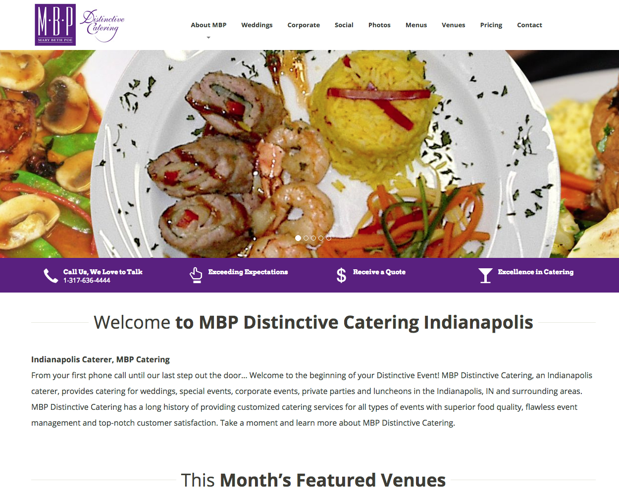
With a clear, easy, no-bones-about-it style, MBP Distinctive Catering identifies the specific event types they commonly do. On each page of the website, there is a sidebar that identifies other pages that are similar and found in the same section. The images across the site might not all be the highest quality, but that’s not what this caterer is all about. They want you to get the information to you, in a pretty clear and concise manner, with not too much extra nonsense in there.
From looking at this site, I know that MBP has a lot of experience – over 30 years! – to set this business apart from the competition. With this site, there’s no beating around the bush or setting you out on a wild goose chase to find out what’s on their sample menus. They know what you want to see, and they’re gonna make sure you can find it.
Best Photography
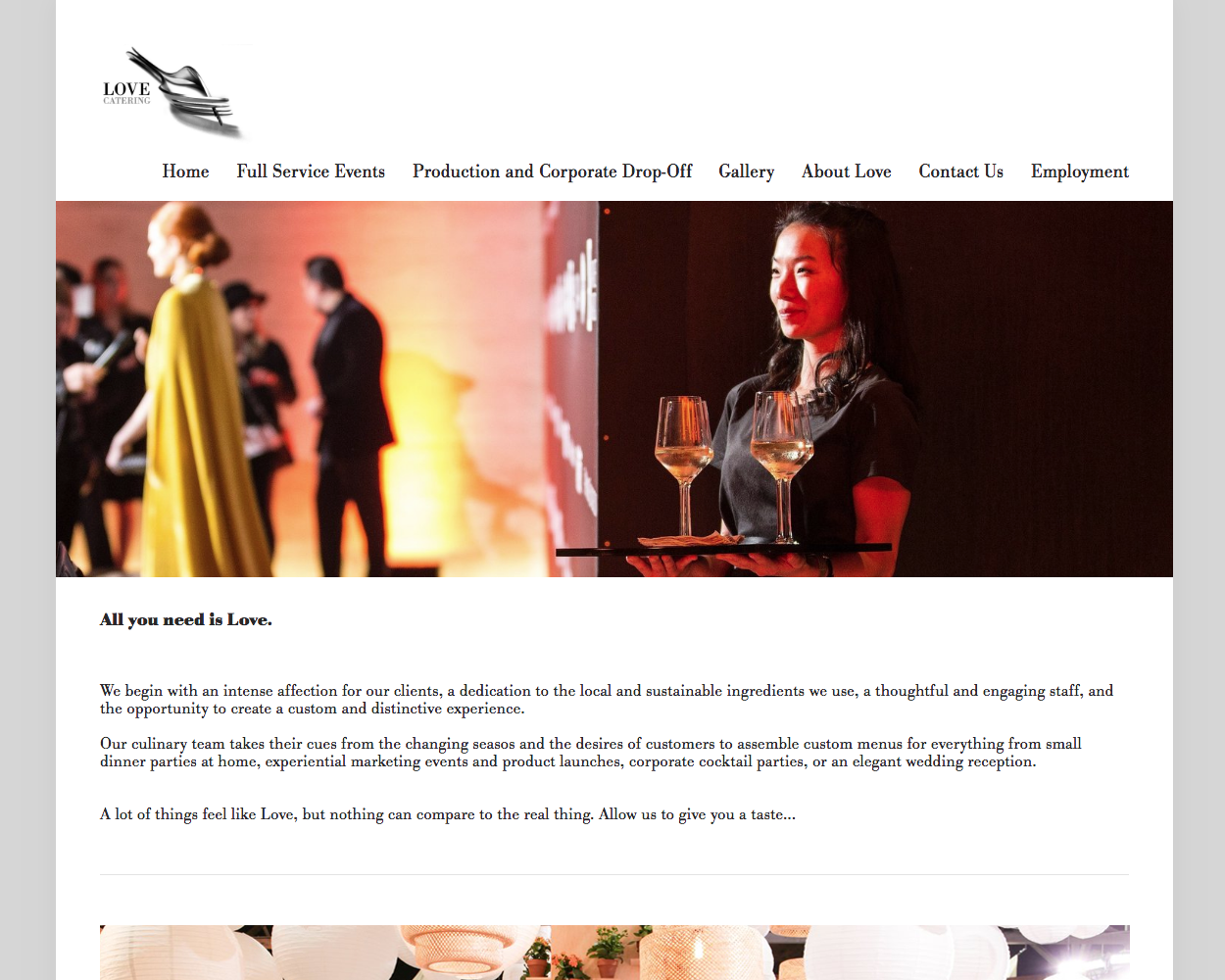
Lots of food, pictures of servers, pictures from events, high quality. It’s LA so it’s glamorous. The great photography never seems to stop; from food – of course – to event spaces to the employees, this site really wants you to know that Love Catering is about providing high-quality service. Sure, it might seem a little over the top at times, like the fact that their menu page is comprised of just pictures, but that is exactly what they’re trying to accomplish. The proof is in the pudding, and gosh darn it, Love is going to show you that pudding themselves.
If you’re doing BBQ in Tennessee, adjust appropriately for your audience. Something tells me people interested in that BBQ would roll their eyes at Love as much as vice versa. If you’re hoping that your event will bring in the highest of society to your personal or corporate soirée, definitely take a peek at what this catering business is doing out in California.
Wrapping Up
From extravagant to simple, you can really find any sort of vibe to fit your needs and tastes. Ultimately, let it be up to your feelings and taste buds, and maybe not solely to the fact that your cousin’s best friend’s hairdresser’s neighbor runs a catering business. Shop around, read reviews online, and talk to people before making a decision about who will fulfill your catering needs. And if you are the caterer, do something to set yourself apart from all those other options out there! Let your personality shine through your website since we know that a lot can be said through the food on the plate as well as the story on your website.
Inspired by some of our catering web design examples? Ready to work on your own? Take the first steps with our web design starter kit

