Deaton’s Mechanical is a family-owned mechanical contractor based in central Indiana with 25 years of experience. They talked with Roundpeg about updating their logo and designing new business cards and literature. Over the course of 25 years, many different versions of the logo had been used on their communication pieces, so the new design would also provide for brand consistency moving forward.
Their old logo was suitable and functional for their business; it communicates that Deaton’s is trustworthy and capable. Our objective was to make subtle changes to modernize the logo while building on the original mark so they would retain all of the brand equity Deaton’s has built up over the past quarter-century.
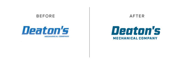
We wanted to keep the thick, italicized type since it is essential to the wordmark. In the original design, the difference between the thick and thin strokes in the letters, as well as the flares on some of the edges, dated the mark a bit.
We looked for a more modern, typeface which mimicked the voice of the Deaton’s logo but shaved off the decoration. We settled on Typekit’s Industry Ultra Italic. It provided a similar sturdiness, with a more uniform weight throughout.
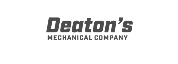
The apostrophe provided in the font created quite a bit of space between the “n” and the “s,”. It was also a significant departure from the original logo. We switched it out to blend in a little better.
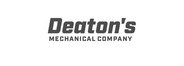
It’s not immediately apparent, but compared to the rest of the word, the “s” is a little squished. To give it a little more white space we angled the edges on each end of the “s”.

Finally, to create a little more consistency and to customize the Deaton’s mark a little further, we applied the angle cut out from “s” to the top of the “t,” and both ends of the “c”s in the words mechanical company. The angles keep everything nice and tidy and add a little more edge to the mark without being aggressive.
The final word wordmark is shown here with a shiny gradient.
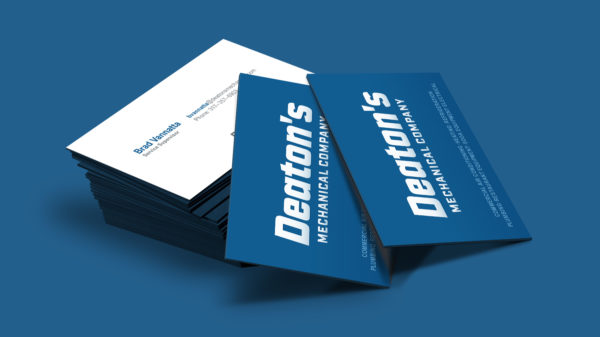
The final logo gives a fresh professional logo to their business card.
It’s always fun to come up with a bunch of ideas for a new logo, but sometimes updating an older logo with a lot of brand equity can be its own fun challenge. The most important thing is determining is whether you need to refresh your logo, or scrap everything and start over. Not sure which one? Take a quiz to find out.
