Everyone is entitled to their own opinion. For example, if you’re standing in a museum in front of a painting by van Gogh, you might have some feelings about it. You might appreciate the emotional lift his paintings of sunflowers bring to your mood. You may quickly stride past the garish portrayal of The Potato Eaters, with the shadowy colors and mottled faces. It might make you uncomfortable so you scurry along to Noon-Rest from Work (after Millet) and imagine the sweetness of rest after a hard day’s work.
A painting fulfills its purpose hanging on a wall and letting viewers come to their own conclusion about what it means. They typically have as much time as they wish to stand and posture in front of it, pretending to know more than they do about art. And it makes no difference one way or the other to van Gogh; principally because he’s no longer living, but he made those paintings for himself alone. Everyone else is free to come to their own conclusions.
A logo is the opposite. It can’t just sit pretty, hanging on a wall eating bonbons. It has to work. According to the genius and prolific designer, Tom Geismar, a logo has to fulfill three criteria:
A Logo Should be Appropriate–Fits Well with the Client and Their Business
This seems obvious, but I am often dumbfounded by how often logos misrepresent a business. I have never seen a logo featuring a smiling pig when the company actually sells chicken sandwiches but just choosing the wrong colors, fonts, or style can be as misleading to a viewer.

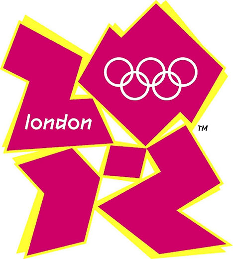
One of the best (or worst) examples of this is the logo for the 2012 London Olympics. Not only is it illegible, but there is nothing which communicates the international, cross-cultural feel of the Olympics. The hard angles and weird color combination belong on the floor lit with strobes in a London dance club, not on the Olympic banner.
Distinctive – Stands Out, But Easy to Recognize and Memorize
Is your logo memorable? Ask someone if they can draw it from memory. For example, visualize the Nike logo. McDonald’s golden arches. Apple’s apple and Target’s target. I am pretty sure you could scribble any of these on a napkin and someone else would be able to recognize it.
The problem is those logos are already taken. And even if you try to come close, it is likely you’ll be mistaken for the logo you are copying, followed by a flurry of cease and desist letters from that company’s lawyers
So your logo needs to be legible, look good, and not look like anything else in your industry.
Flexible – Works In Different Sizes and in Various Contexts
It used to be you could pop a logo on a sign, a business card, and some stationery and call it a day. Now a logo needs to make sense when it’s only a few pixels wide on your phone and equally interesting when it’s several feet wide on a billboard.
This is what it means when a logo has to work. A painting can just hang there and look pretty. Your logo needs to do more.
To be a good mark, a logo has to meet all of those requirements. One of the best was designed by the master himself, Tom Geismar. Initially, the people in charge didn’t like it. You may have seen it before.

Introduced in 1961, the Chase logo still fits all the criteria of a good modern logo, despite its advanced years. The color blue and the serious geometry communicates an impression of a business you’d trust with your finances.
Today it would be hard to get away with a simple geometric mark among the sea of similar logos, but back in 1961, there was nothing else like it. It “served as a kind of ‘empty vessel’ into which meaning can be ‘poured.’” And while it wasn’t necessarily intentional, it scales beautifully to the app you tap on your phone. Exquisite.
Geismar also explained to clients “it is never love at first sight.” A logo can meet all of the requirements, but the thing it represents needs to live up to the logo as well. That takes time and for people develop familiarity with your brand and project their feelings about it onto your logo.
Not everyone was initially a fan of the logo, but after a while, the higher-ups were wearing the Chase logo on their cufflinks. It was a mark they were proud of because it represented a bank they were proud to work at. And it looked good, too.
What About Your Logo?
Have you created something that correctly communicates your brand, product, and image? Does it scale, and more importantly, will it hold up over time. If not, maybe it is time for a rebrand.
