Logos and branding are ubiquitous. For those of us who grew up in the modern advertising age, it’s akin to asking a fish “how’s the water?” Hard as it is to imagine, it wasn’t always that way. Taking a look at logo evolution, we see that in the beginning companies could start using a new logo and branding system without anyone noticing. Even the concept of a logo is fairly recent, the first trademark placed in 1875 in the U.K. for Bass Pale Ale. Incredibly enough, it’s beautiful.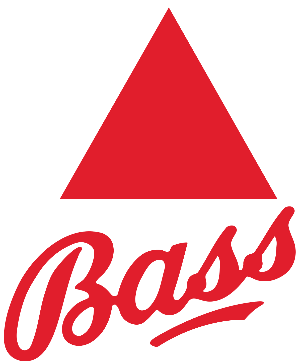
Logo Evolution 1880- 1920
What follows is a desperate slugfest of ugliness and incredibly ornate illustrations. Which, to history’s credit, was all they had. “Designers” as we know them did not exist; if you were creatively inclined you made your profession as a painter or illustrator. However, if you couldn’t get your hands on an artist, your bookkeeper could handle designing the mark to represent your entire company. At least, that’s how Coca-Cola handled branding in 1886.
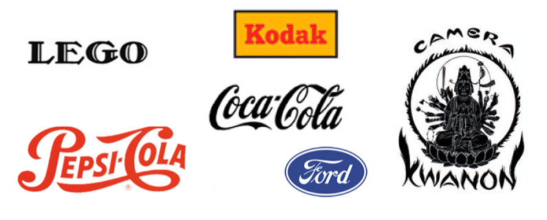
The swirling, ornate script influenced the style of many logos at that time, including competitor Pepsi.

The original Ford logo was beautiful, but it loses something when you have to scale it down to a hood ornament. That is probably what influenced their decision to switch to a simple one-word script logo with the Coca-Cola inspired flourish underneath. 
1930 Streamlined and Stronger Logos
By the 1930s companies began to recognize the power of a logo, and that it’s super helpful if it’s at least legible. Coke, Pepsi, and Ford streamlined their designs, and we see the emergence of more strong serif fonts in logos for companies like Kodak and Lego. Look closely at Lego’s first go at a logo. They seem to be aspiring to reach a rather lofty demographic: switch out the letters and you could put it on a COACH bag.
While most brands went for a strong legible style. One exception was Canon. Yes, the great-grandparent of the Canon DSLR you have sitting at home had a logo which initially paid tribute to an eastern deity.
1970’s Originality
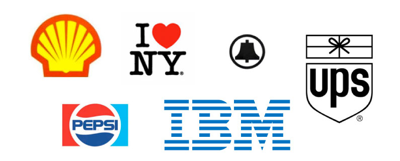
By the seventies, design started to come into its own as a profession and industry. Some of the greatest known designers were putting pencil to paper (gasp!) and creating work. Their discipline rid us of excessive design and brought a startling clarity that withstands the ravages of time and serves as an example for the rest of us decades later.
Today – Flat Design
So where are we now? Logos used to look nice on letterhead, business cards, and perhaps a sign or tv spot. Now, they’re squished beyond reason into little boxes on your phone. The result is a move by most companies, regardless of the industry, to simpler designs, with companion avatars which can represent the brand on social media.
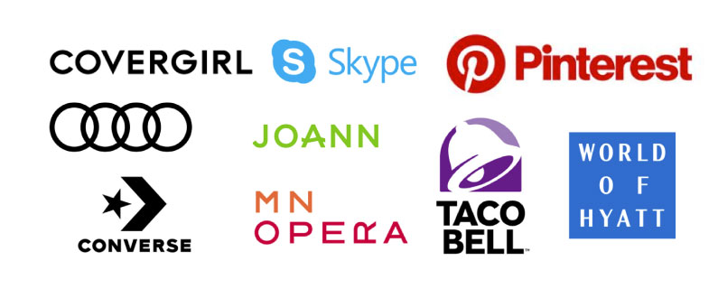
Logo images pulled from https://www.underconsideration.com/brandnew.
The move to simplify has sucked some of the creativity out of logo design. Note how COVERGIRL, Converse, and Taco Bell all essentially have the same “C.” The logo for Joann fabrics genuinely looks rejuvenated, but the rest have been conceptually flattened like a pancake for the sake of function and appearing “modern.”
When I look at these boring “modern” designs I miss the originality of the 1970’s logos, most of which still seem fresh and relevant today. Unfortunately, we may be forced to endure simplicity to the point of absurdity, à la the Dropbox rebrand. Does it bother anyone else the flaps are so long you couldn’t actually use the box?

So what’s next?
As the logo evolution pendulum swings hard towards minimalism and sans-serif typefaces, there are small glimmers of hope that a shift in direction is coming soon. A few logos have used a subtle gradient effect, similar to the Taco Bell logo, to stand out against the sea of flatness. Design behemoth Pentagram is dismantling the concept of a logo as we know it and often prefers to create a modular identity.
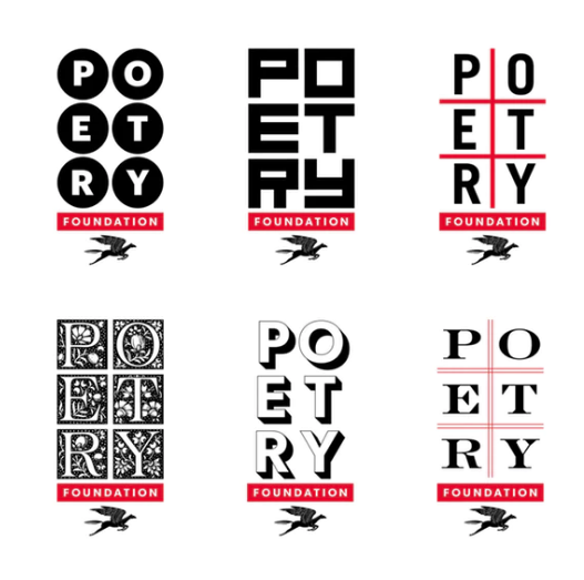
They set up the boundaries, and within them, anything is fair game. Each mark still represents the Poetry Foundation, but they all have a different aesthetic and serve a different purpose.
Current logos already work pretty hard, but logos of the future will have to sing and dance. Quick animated shorts for corporate logos are common and may become an industry standard. And even a little further down the road, we’ll have to consider the implications of how a logo and brand identity can be experienced via virtual reality.
Fortunately, at their core, logos serve the functional purpose of representing a business in a glance. As long as your logo clearly and legibly articulates the core of your business, it’s doing its job.
Does your logo need an update? Give us a call.
[su_brand_kit]
