I love live music.
Whether you are a die-hard fan of one particular group or are just looking for something fun to do on a Saturday night, live music is the best.
Before moving to Indianapolis, that was one of the things I was most looking forward to. Coming from a smaller town that doesn’t get much traffic from well-known or great acts, I was pretty excited for the opportunity to go to some good shows. This may, or may not, have resulted in me spending much more on concert tickets than I should have this year.
Whether or not you’ve completely blown your concert budget by now or not, every concert experience starts with learning about the show. If it is something you are interested in seeing, you’ll buy a ticket.
More often than not, folks will just jump on a site like LiveNation or StubHub to buy tickets. But where’s the fun in that?
Each of the main music venues in Indianapolis have their own individual websites where you can learn about the venue, each show and purchase tickets. Inspired by the flood of shows announced in recent months, I thought I would examine each site and, since everything is a competition, decide whose web design is best. I may even identify a few key lessons for your own web design, why not!
I’ll be taking a look at what I consider to be the six biggest and most popular music venues in town, but for the sake of easier reading (and building suspense!). I will only be tackling the first three this week. Be sure to check back next week to see the rest and who wins.
Let’s get started, shall we?
The Vogue
What I like:
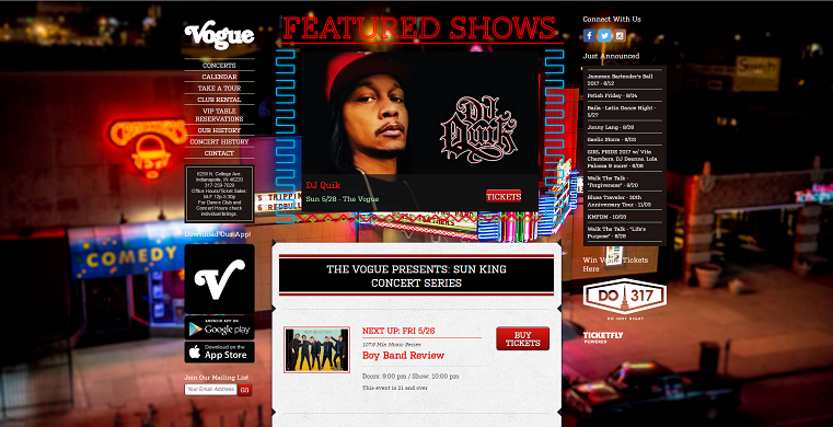
The Vogue has a web design I generally like. This venue in Broad Ripple has such a rich history, and the creator of this website realizes that. They dedicate an entire page to the history of the venue and showcasing the different awards it has won over the years. With a venue like this, history is really something to showcase and they do that well.
As for the shows, they do a nice job of easily laying out a full calendar as well as just highlighting newly announced shows. Whoever manages the site does a nice job of including write ups on each show. The Vogue brings in some obscure acts, so this a great way to help sell some of the less popular shows that people may know nothing about.
What The Vogue does that really sets it apart is the inclusion of a Google Maps visual tour. This is a brilliant idea that none of the other venues I looked at take advantage of. Being a general admission venue in a unique, historic building, this is a nice tool for helping visitors plan ahead and pick their spots ahead of time while showcasing the venue.
What I don’t like:
The home page is a little nauseating. It isn’t organized particularly well. While the calendar is on the homepage, it redundantly is also on a page all of its own. I ask myself “why?” since removing it from the homepage would assist in alleviating the clutter.
Also the background image, while neat, is slightly distracting and makes some of the text extremely hard to read.
Lessons: Identify what makes you or your product unique and focus on it. Try different tools to help set you apart.
Klipsch Music Center
What I like:
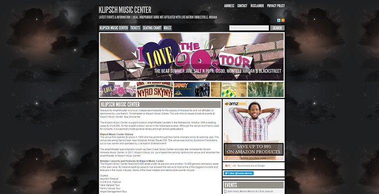
Ok, so you may have noticed right off the bat that this is not the official Klipsch Music Center website. The venue is owned by LiveNation who has their own very boilerplate page on the official LiveNation site. This one is operated by a good Samaritan trying to fight The Man. So, I guess kudos there.
This site does a nice job of giving you some of the history and highlights of this venue (again, something important with places like this). They also provide a seating map, which is surprisingly lacking from many other sites. None the less, a seating chart is valuable to provide, especially for newcomers to the venue.
What I don’t like:
Unfortunately, that’s really it for the nice things I have to say about it. This is an amateur website and it is fairly obvious.
There isn’t anything exciting or inventive about the site. The layout is really bland, there aren’t a whole lot of good resources outside of the seating chart and the event calendar is a bit of a mess with overlapping text and weird gaps.
I was also bummed out by the lack of pictures. It is such a unique venue, showcasing the product with pictures seems like a no-brainer. However, I only found two: one which was nice and one which was really bad quality.
And lets talk about the background. Someone please explain to me how space enters into this at all?! I think maybe they are trying to convey the night sky you can see from the lawn. However, it just comes off as weird to me.
Lesson: Your web design says a lot about you. If your website looks amateurish, I’m going to assume you’re an amateur. Take the time and effort to make make sure your site looks at least presentable.
White River State Park
What I like:
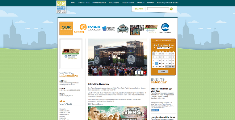
Of the six sites, this one definitely has my vote for best to look at and has a background I don’t completely hate! One common thread with all the other sites is the backgrounds are just dark and don’t really give off a feeling of fun. This one is light and cute with the green of the lawn with the Indy skyline in the background. They also do fun individual graphics for each show, which helps them stand out more as their own experience, rather than just a standard picture of the artist.
The website also showcases the other fun things to do in the area like the zoo and museums, a plus for me (although I wouldn’t put them at the very top). They also include some nice pictures of the venue so you can get an idea of the experience.
What I don’t like:
Unfortunately, this is just one page on the White River State Park website, so what you see is what you get.
There aren’t any other pages, information or additional resources on the venue. Despite having a nice face, the website is a little empty.
Lesson: Use custom graphics and smart, on-brand colors to help give your web design extra life.
With the first three websites in the books, I’m giving the early edge to White River State Park. Although it is lacking in deep content, it is visually appealing, easy to navigate and doesn’t force too much on you at once. But, will one of the remaining three have to overtake the top spot? Check back next week to find out!
While you wait, check out our handy guide below for more lessons about web design.


