It’s the time of the year when farm stands and farmers markets crop up on road sides and parking lots. Some are as simple as a few tables set with produce, others have permanent structures used year-round for community events and tastings.
What does a farmers market need in a website? What’s the biggest challenge for farmers market web design?
I think the biggest challenge to farmers market websites is finding the right amount of information, balancing market day visitor needs with content needed for broader growth and marketing goals. Visitors need quick answers to common requests (hours, location, vendors), and market organizations need a way to keep visitors in touch during breaks in the schedule.
To get a feel for farmers market web designs in general, I’ve gathered links to my personal favorite markets as well as markets across the U.S. (and a few from London!). I’ve assessed each on the following parameters.
Quick Access – hours and location in top third on mobile.
Photography – bright photos with a mix of close-ups and wide shots.
Blogging/Social Presence – active blog, maintained Facebook Page at least.
Location and Maps – updated area map, parking and directions.
Vendor Info for Visitors – full list of vendors with descriptions.
While regions vary and resources available vary, affecting what and how much each market can achieve online, those parameters are my must-haves for getting me out the door with empty, reusable grocery tote bags in-hand.
Let’s get started reviewing the markets!
There are two market categories for me. There’s the primarily seasonal markets with tents and folding tables. They specialize in farm-fresh produce that may change from week to week. Then there’s the year-round markets with permanent structures, often with community rooms and self-contained bakeries and restaurants.
I think the seasonal markets face the strongest challenge with their web designs, so that’s what I’ve focused on here.
Broad Ripple Farmers Market

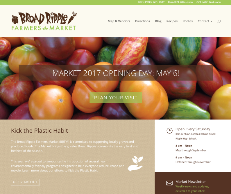
This is my local market. Such a fun place! Lots of breakfast options, baked goods and other people’s dogs. Made even more special because it disappears all winter. The website is info-packed and looks maintained, giving new visitors confidence.
Quick Access – hours and location at the tip-top and repeated often.
Photography – splashy homepage, plenty of photos on their blog.
Blogging/Social Presence – active blog, Facebook, Instagram, and email newsletter.
Location and Maps – fresh-looking vendor map, specific Directions page.
Vendor Info for Visitors – fully categorized list with vendor profiles.
Lexington Farmers Market

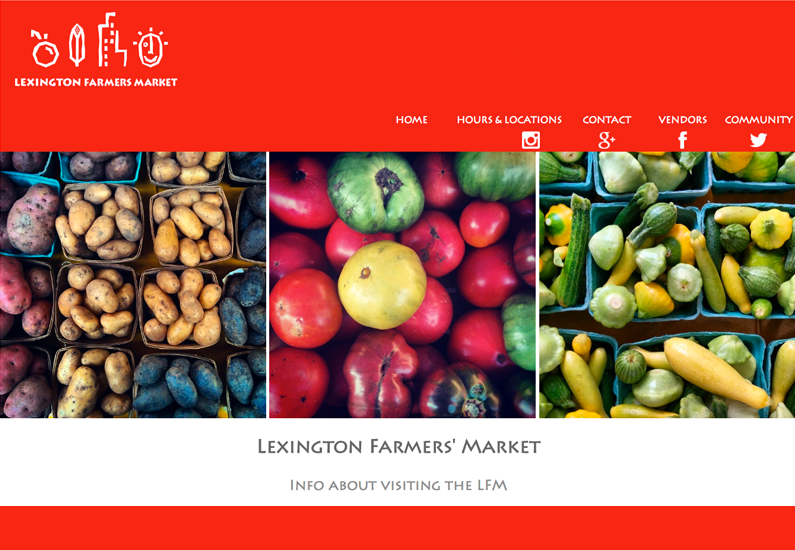
Never been to Lexington, but I’ve heard good things. Unfortunately, this market site leaves something to be desired. The information’s disorganized and the design needs some love. I’m not sold on making this market a destination.
Quick Access – hours and location is prominent in the navigation, but the actual page is confusing. Multiple locations and times are presented, but I’d like more info about what makes them distinct.
Photography – nice veggie pictures. But I need a wide-shot of the location to help me visualize what it’s like to shop there.
Blogging/Social Presence – a blog would help power year-round engagement. Facebook Page gives helpful updates about open times, but it’s just a clone of their Instagram.
Location and Maps – no maps. Confusing location information.
Vendor Info for Visitors – lengthy vendor listing, but it’s hard to skim and seems incomplete.
Brockley Market

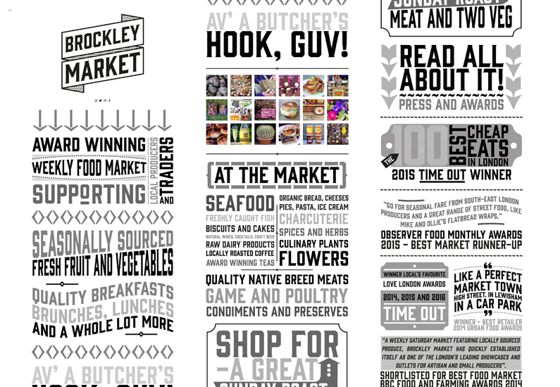
First thought: look at the amazing typography here. My screenshot intentionally condensed the über-long page into three sections so you can see more of the text. This homepage is composed of incredibly detailed typographic compositions. It’s very cool, very different and tells me the organizers are actively invested in attracting an audience (I’m guessing youthful, heavy-pocketed hipsters). With all of that though, the design does leave some essentials out in the cold.
Quick Access – the site depends on a hamburger menu to help visitors navigate. The cool typography actually blurs together a bit, making it hard to skim for locations, hours and date information. That stuff is in the Visiting section near the bottom. You’d totally miss it if you don’t use the hidden hamburger menu.
Photography – no photos, except an Instagram feed. But the typography does all the heavy lifting to give this market a hip, attractive brand.
Blogging/Social Presence – no blog, no Facebook page at the moment (!), but Instagram and Twitter are updated and active.
Location and Maps – there’s a hand-crafted map and location description (hard to spot among the other artsy sections). Since this market’s in the big city (London, England!), bonus points for the list of local Tube stations and bus lines.
Vendor Info for Visitors – unfortunately, there’s no list of specific vendor names. Just more of that fun typography describing what you’ll find. However, the Instagram does a great job highlighting the wares of specific vendors.
Tower Grove Farmers’ Market

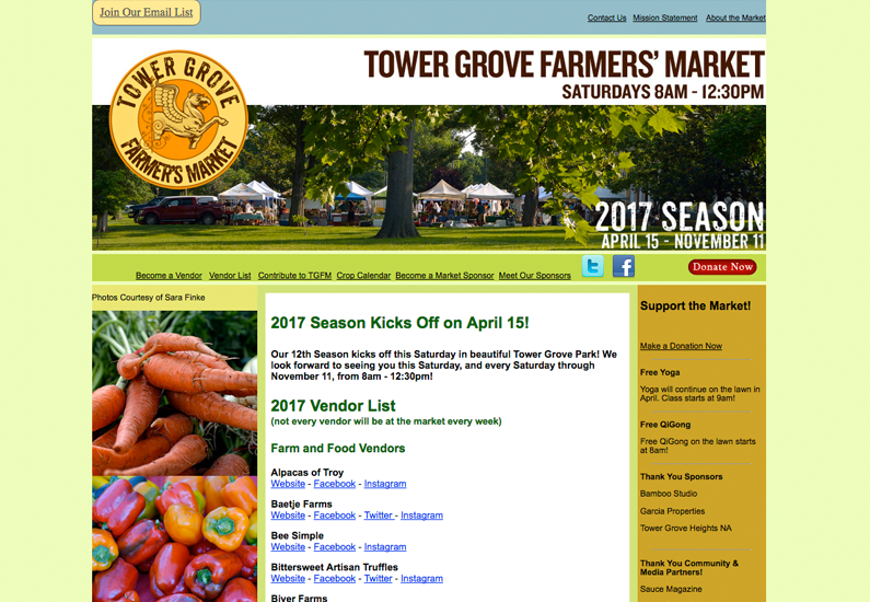
Ah yes, another classic market, this time in St. Louis. I’m immediately attracted to this place from the sun-dappled scene pictured on their homepage. Gorgeous, mature shade trees and white tent-tops everywhere.
Quick Access – times and date up-top. Big fan.
Photography – it’s the same set of images over and over again, but they work. Especially the establishing shot of the market in the park in summer.
Blogging/Social Presence – no blog, but they do have an email list signup. A blog would help power even more engagement with the email content. Facebook posting is a little sparse, but they’re tweeting all the time. Good job, friends.
Location and Maps – the name says it all. Tower Grove Farmer’s Market is in Tower Grove Park. Unfortunately, I still need to see a map and it’s buried on the About Us page. Rename that page Location and Map and we’re good to go.
Vendor Info for Visitors – the homepage here is devoted to the 2017 vendor list with links to their sites and social media. Would like some more organization here, but it does the trick.
Just looking at these sites (the great and the fixer-uppers both) makes me so excited for summer. I love the warmer weather that brings everyone outdoors and the farmers markets are full of visitors new and old.
It’s critical for the farmers market sites to serve their visitors with location, times, dates, maps and other travel information as soon as possible. Photography helps set the scene and gives visitors landmarks and confidence once they’ve seen what the place looks like. Blogging and social media keeps the engagement going, even when the market’s not running.
And while many visitors are probably satisfied discovering vendors without much research beforehand, the vendor info section motivates repeat customers when they know they’re favorite vendor is coming.

