The formula for simple, effective web design goes something like this: strong headline, compelling visual and call to action, repeat. Works great if you’re selling one thing or your message is quickly distilled.
What if you have several promotions or several audiences at once? Here’s where it helps to look at what others with similar challenges are doing. In this case, try looking at theatre company web design.
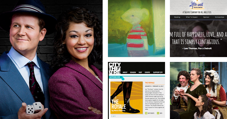
These groups ask a lot of their web design. Carry all the dates, times and cast member data, but with maximum visual impact (like movie posters). Oh, and also look clean and polished so new customers feel confident about buying tickets! Challenging. Let’s look at a few key lessons from ten theatre company web designs doing it right.
Organize Your Information
Busy companies may be promoting six or seven shows at once with acting classes, seminars and special events in between. Their marketing efforts are probably focused locally. Which means a lot of local TV, radio and print materials in addition to social media and digital.
All those TV and radio spots likely have call-to-actions (CTAs) that all end in “For tickets and more information visit our homepage.” That means the homepage has to rock.
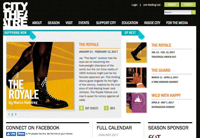
The City Theatre Company website is busy as heck but quite organized. Size indicates the relative importance of each info bite. Big Box = Now Playing & Current Promotions. Less Big, But Still Kind of Big = Pay Attention to These Too. Smaller = Everything Else.
Plus, everything’s laid out in a grid! Kind of like those special Christmas ornament storage boxes. Bonus points added because I’m into their house graphic design style. Super bold and abstract, but classy like Saul Bass movie titles.
Want to see another grid? Visit Labyrinth Theater Company at labtheater.org. That’s another company dealing well with info overload using size to focus attention on the current production with smaller boxes tiling out to contain the other CTAs.
And I have to show love to IRTlive.com. The new site isn’t as blocky as either City Theatre Company or Labyrinth, but works basically the same way. Fresh branding (check), classy photos (check), doing all the things awesomely (you bet).
Let The Actors Shine With Great Photos
All of the web designs featured so far do a great job organizing their homepage information, but I think they lack a certain joie de vivre. They lack people pictures. Which isn’t a deal breaker, photos of actors and shows aren’t always available. But when those pictures are awesome? Dang.
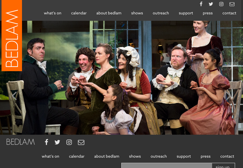
That’s the website for Bedlam. It’s almost a like a photographer’s portfolio of on-set pictures. But there’s no action buttons. When I look at it, I’m kind of impressed by the pictures and glad for their company that they have such good ones, but my eyes end up searching around for something to next.
Then I find it right there on the navigation bar. “What’s On” is the first item there, so it’s the main CTA by default. Thankfully, it’s also the best one. They should probably repeat the “What’s On” message somewhere else on the page for reinforcement.
Still, huzzah for compelling photography! theattictheaterco.com is another good example of theatre company web design using production photos.
Showcase Your Season
Some of the smaller theatre companies featured already don’t perform every weekend or maybe only once in a while. The CTAs there can be narrowly focused on one show. But larger theatre centers may need to promote 6 or 7 shows!
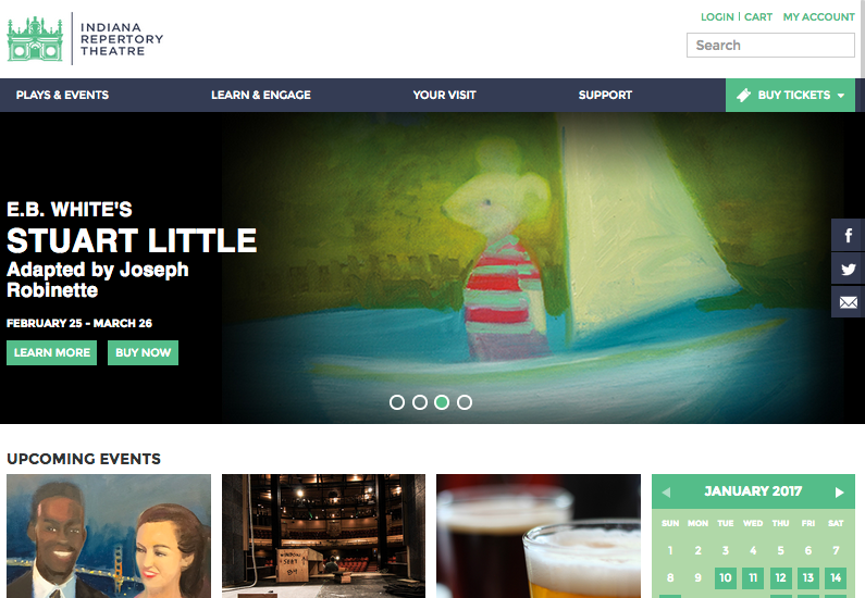
In that case, go ahead and feature the playbill art for all your shows. Keep it organized, of course, but no one will judge you. The Fort Wayne Civic Theatre website may not be über-pleasing to the eye but as a potential theatre patron, I’m immediately gratified with thumbnails of their current season shows. The Indianapolis Repertory Theatre pulls it off a little bitter.
Want another example with a slightly different approach? Michigan’s lovely Purple Rose Theatre is really intentional about their homepage content selection. The homepage primary CTA (See What’s On Stage) goes to an interior page with all the upcoming programs. Then, the second row is devoted solely to the main show they’re featuring now. I really love it when people prioritize their messages. Love it so much.
But what if you don’t have upcoming shows or public programs to promote?
Clearly State Your Value Proposition
Some theatre groups are just that, groups. They may teach classes or provide social activities, but they might not perform. They might do shows sometimes, but more often spread out across a wide range of creative mediums. In that case, just tell me why I should care about you.
In the case of 4th Wall Theatre Company, all I have to do is look at the videos and pictures of joyful, happy kids to know it’s a theatre program for people with special needs.
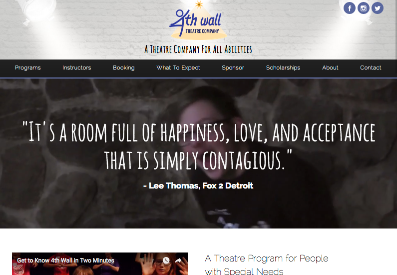
And if I didn’t get it from the pictures, they literally write “a theatre program for people with special needs” right on the homepage. That’s the value proposition and if you’re stuck for what do on your own homepage, just state that in the clearest terms possible and you’re gold.
PigPen Theatre Co. does a ton of different creative things. Their breakout thing right now is music. They’ve gotten some attention and press already, so they forego the introductions and head straight for a CTA button to download their new album. Of course, the background image behind the button is a handsome grid of company member headshots showing off their personalities. Talk about a value proposition. Don’t you want to click and hear what they sound like? I sure do.
Special Honors
Despite being called a festival, the Stratford Festival is North America’s largest classical repertory theatre company. I’m writing this in December 2016 and the site’s already updated with oodles of info about shows that don’t run until May!
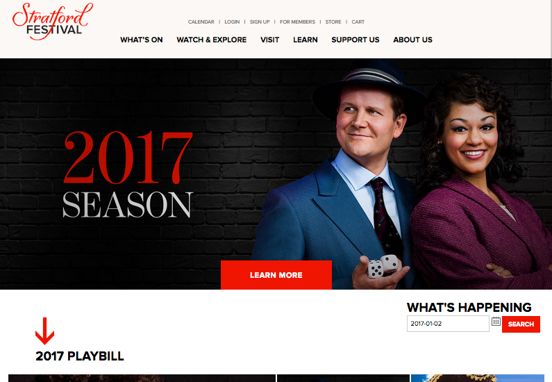
They even have gorgeous production photography featuring the actors in costume and complete logos and branding for every show! Sweeet.
Once More (With Feeling)
To review, the 4 things that make a great theatre company web design:
- Organize Your Information
- Let The Actors Shine With Great Photos
- Showcase Your Season
- Clearly State Your Value Proposition
And if I had to generalize these same four things to apply to all web design, they’d be much the same:
- Organize Your Information
- Use Great Photos
- Prioritize Your Main Message
- State Your Value Proposition
Next time you do a web design, take these tips to the table with your web designer. They’ll be sure to say Bravissimo!
