My husband and I just returned from a trip through Central Europe. In the span of two weeks, we were in three different countries, with three different currencies and three different languages. Neither my husband or I speak Czech, German or Hungarian but we managed to navigate bus, train and boat transportation with ease.
How did we do it? Almost everywhere we went, the signs included simple icons which conveyed their meaning at a glance.
Here are some of the most common. Can you guess what they mean?
If you get stuck just scroll to the bottom of this post.
As I sipped my espresso in a sidewalk cafe I thought about how this same strategy of simple, meaningful graphics applies to almost any business, even if you aren’t serving a global audience. Why? Because your brain can process images 60,000 times faster than it can process words. Whether you are running through a train station or surfing a website an image can convey an idea or an emotion in an instant.
When you add in the mobile element, simple images become even more important. While you can read text on a full-size screen, text gets really small on a phone screen. That’s why so many companies are moving away from text-based logos to icons.
When you are creating icons.
Keep the graphics simple. Web icons have come a long way in the last few years. Mostly they have become a lot simpler. Gone are shadows and multiple colors. The literal images have been boiled down to their simplest format.
Create a consistent style set. Standardize the line weight and style so they work together. Then use them consistently.
Test for meaning. Don’t assume your icon communicates what you want it to. Show it to people and see if they understand the meaning and intention behind the icons
Thinking about creating or updating your icons? – Let’s Chat
What the icons meant:
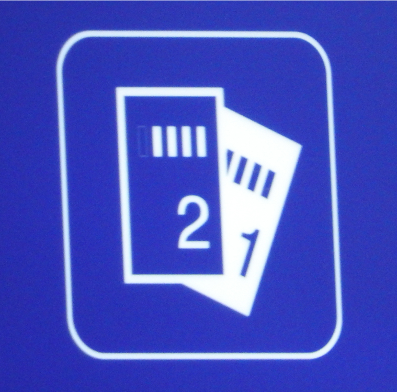
Tickets – This is used universally for admission and transportation tickets
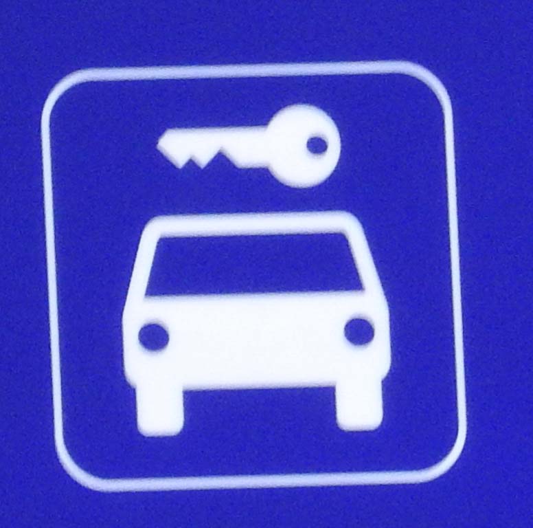
Parking – The key in this graphic is also used in conjunction with a suitcase for baggage claim.
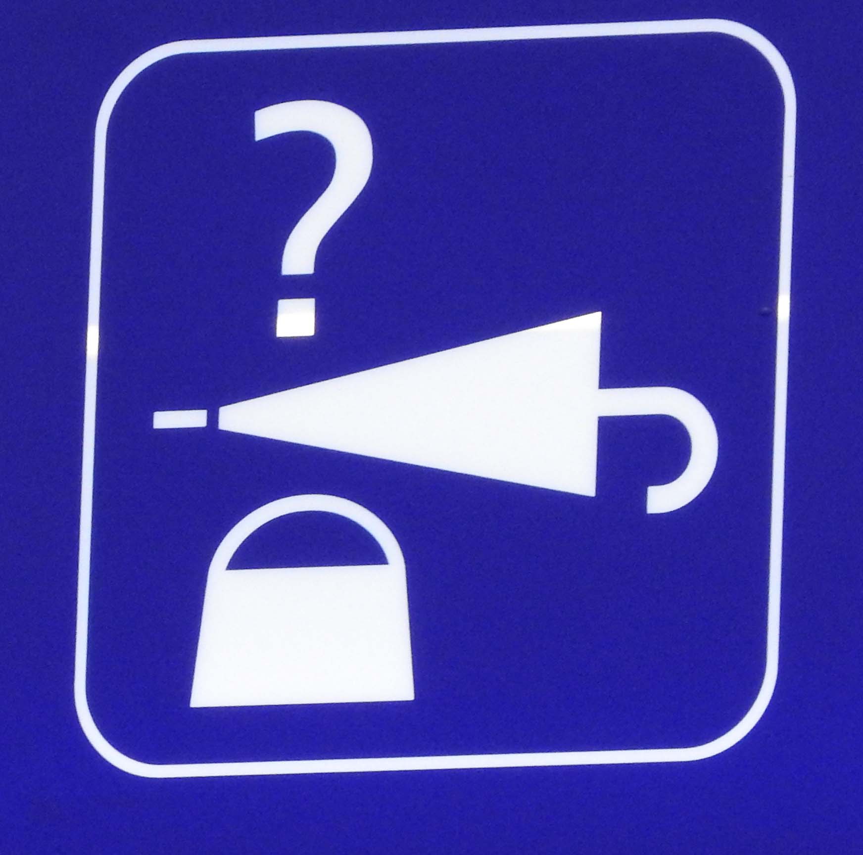
Lost and found – This one took me a minute to figure out Did you guess it right away?
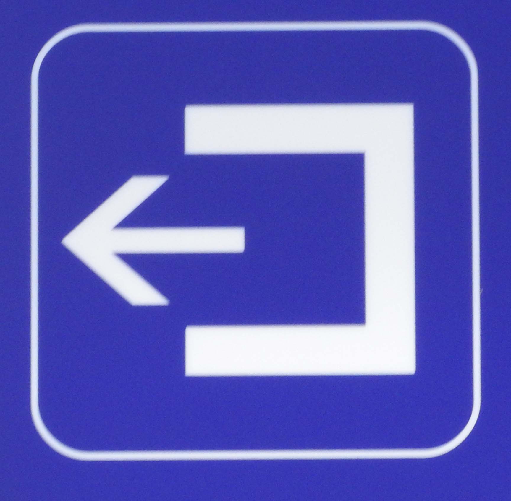
Exit this way – The most interesting thing about this icon is that it is rotated so the arrow points in the direction of the exit. It may point up at the foot of an escalator or left or right towards a door. It confused me a bit at first, but then I really appreciated how easy it was for me to find my way out.
Roundpeg is an Indianapolis graphic design firm.

