Would you rather pay $10.64 or $11.17?
Obviously. Brains are tricky things though. We like to believe we’re mostly in control of our decisions and are aware of how they’re influenced. Yet, when Uber raises its prices due to the demand of the moment, we are more willing to pay a surge price of 2.1% than 2% for a ride. Why? Some of us aren’t so great at math. When we see a surge price that isn’t easily divisible by a whole number, we shrug and take the hit. When it’s more obvious the price is double what we should be paying, it’s more offensive. (From Hidden Brain, Ep. 31 “This Is Your Brain On Uber”)
What does this have to do with calls to action? Similar subtleties are necessary for grabbing viewer’s attention and earning that all-important click.
Ready?

Do you know your brand?
Knowing your brand is essential and the baseline for legitimacy, especially on the Internet. “Branding” is so much more than your Facebook avatar and a font; it’s whether you answer the phone with “how may I help you?” or “hey how’s it goin?” For the purposes of this post, if you know what you do, why and have a solid concept of how that applies to graphic design (logos, colors, fonts) then you may proceed.

Do you know your audience?
More important than knowing your brand is knowing who likes what you do and why. This lets you position yourself to potential customers who haven’t discovered you yet. And trust us, your target market is smaller than the human race.
*Phew, you’ve made it past the basics. Now for actual designing.
A viewer is on your website. It’s nice that someone knows about you, but what would you like them to do about it? Pick out the main purpose for the page of your website. Just one. From there, it gets a little easier. You can define a hierarchy.
Heirarchy
Pick a button, any button.

This is 2016, which means
Older guides to designing calls to action advise smooth-talking your viewers. Tell them it will be quick, easy. Outline exactly what they should expect.
In this day and age, all of those things are customary. Visitors should know what they are getting into by what the design implies.
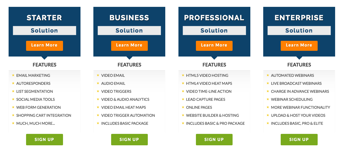
For example, a simple table that offers different options.

In this setup there are four different segments, 8 different things to click on. Way too many. The viewer should know enough from this display to commit if you’re offering a sign up. Except because of the way it’s designed, the “Learn More Button” sticks out like a sore thumb. If you want the viewer to sign up, make that button the most important either with color or size.
Another frustration with this design is I have to read all of the text to find out what I’m getting. The layout itself tells me nothing, other than I can probably assume that there’s more to be gained the further right I go. But I’d have to read to find out.
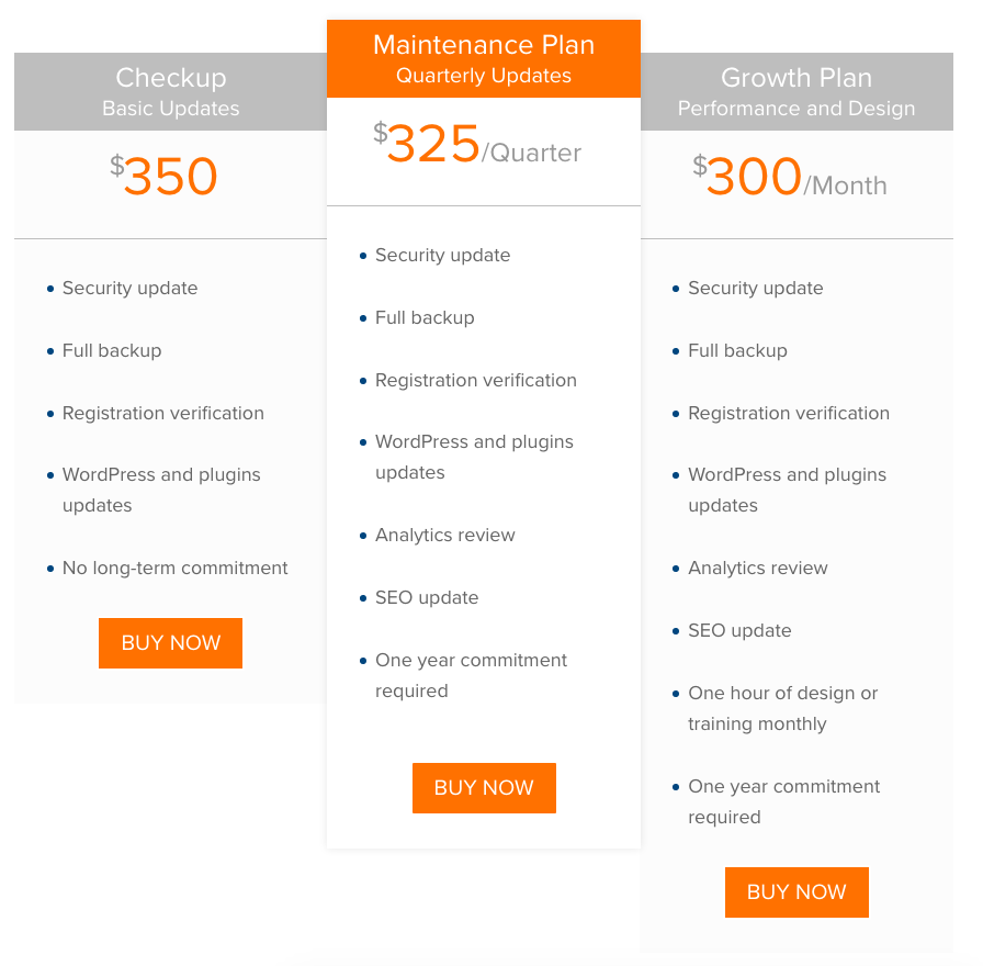
This example with a layout from our own page is a little better. Clearly I’m supposed to sign up for the median option, though it’s communicated I get more with the “Growth” option with the added lines of text. There’s only one option, to “BUY NOW.” However, the abundance of orange competes with each other. The buttons could stick out more.
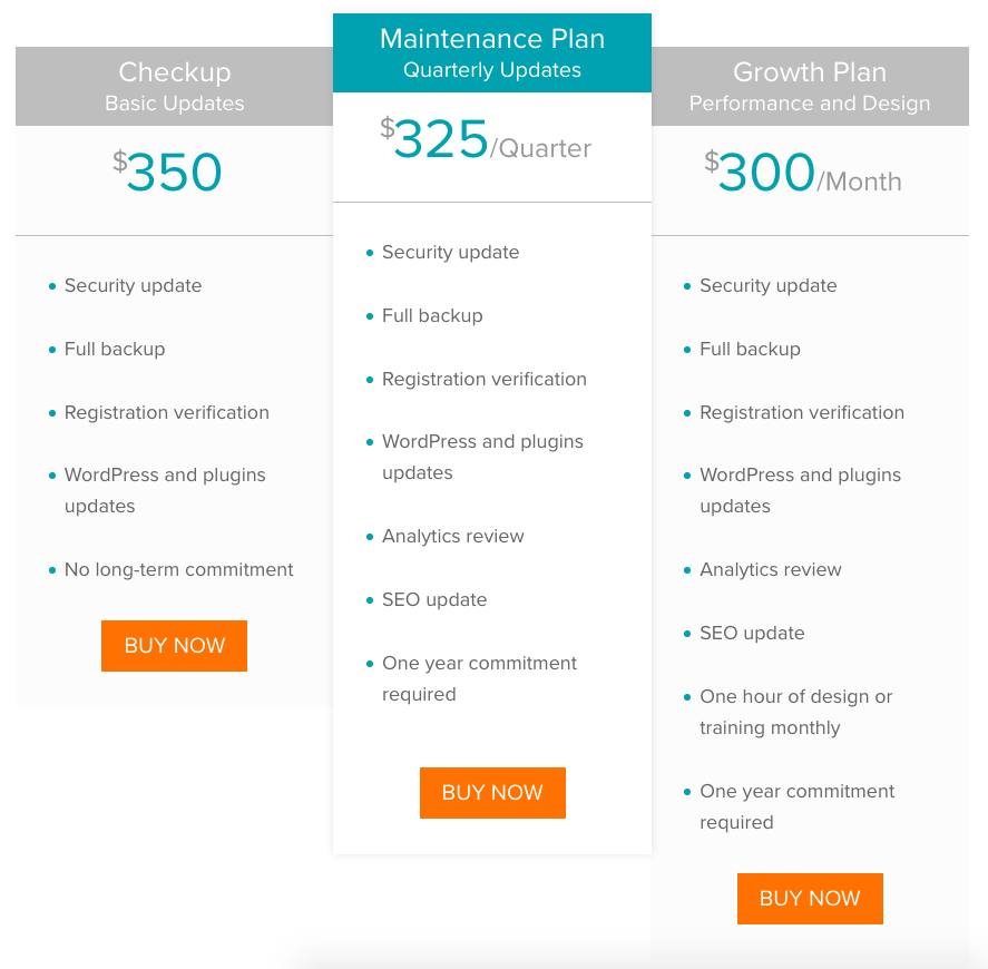
We changed the top elements to teal which is a little easier on the eyes, and you know exactly where you’re supposed to click.

Best way to win the CTA game? Keep your brand and your audience in mind.
Some users need an in-your-face CTA to guide them. What may look ungainly sometimes works really well, but does it may sacrifice your brand and if you’re trying to sell to a younger demographic or users who have an eye for design, pulling over-the-top stunts will discredit you immediately.
Knowing what you’re trying to accomplish and judiciously applying your brand to gain trust, as you guide your viewer where they need to go will win you all the points.
Roundpeg is an Indianapolis graphic design firm.


