I’ve been told no one will take me seriously until I’m 30, have a job, and preferably laden with the responsibility of a spouse and 2.5 children. As a self-aggrandizing sixteen-year-old, this is heartbreaking. As an adultalescent 20-something, it’s a bit of a relief. I’m savoring my meager five years before assimilation into respectable society. Or at least getting a better handle on returning my library books in a timely manner. A girl can dream.
Your logo has to build the same amount of trust with your audience. Given it can’t grow gray hair, how do you communicate confidence, experience and authority in the few seconds of attention it’s going to get?
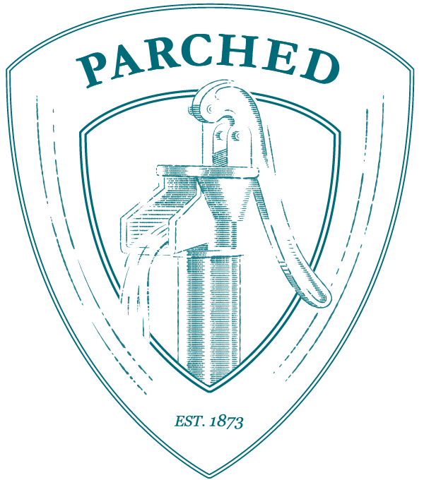
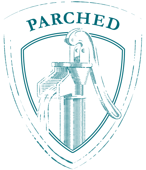
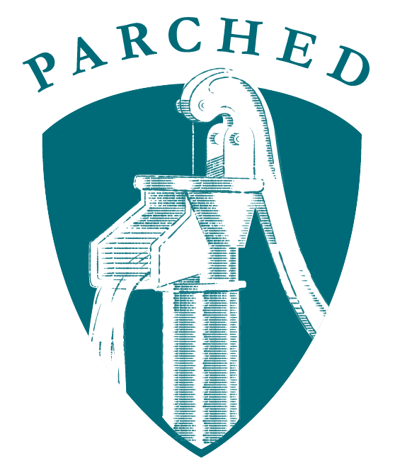
You could try to fake it. Design it to look like a hand-made woodcut Albrecht Durer himself chiseled. Lots of little details. Put it inside a shield to signify authority and protection and strong stuff. But not too strong so it doesn’t look like we stole it from a rugby team. Maybe like a salad dressing label?
That will get you about as far as an acne-ridden teenager with a fake ID. Any trust to be garnered from simply being yourself is lost by trying to be something else. Also, if it looks like a salad dressing label, that’s where your logo belongs. It’s the quintessence of your brand, who you are. It has to have five times the power of an elevator pitch in half a breath.
Not to say your logo needs to be overpowering. It’s better (if not best) to have something understated. The best, most effective marks are simple, timeless and legible at tiny sizes. Consider how your logo will look on the tiny app button on your smart phone. If you can tell what it is there, that’s an excellent sign you’re on the right track. A true test used to be faxing a logo several times over to assess legibility; if you can still find your fax machine, knock yourself out.

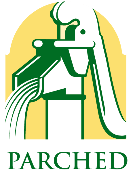
One more time.
Stripped-down, this could pass as a logo. Strong lines communicate clearly and will be legible at small sizes. The yellow background adds a little visual variety and lets the spout pop out, though the second color is an additional expense in the printing process. It’s also not trying to be too much; it’s a water pump, which in and of itself is a nod to history, hard work and sturdiness. If that is indeed what “Parched” is about. If not, back to the drawing board.
Your logo is just one piece of your overall brand. Put the rest of the pieces together with a brand kit – we’ll show you how.
Roundpeg, an Indianapolis graphic design firm also offers social media, web design and marketing strategy services.

