
Shaa-CHOP!
There’s a trend in web design you need to know about. Imagine your customers are a mix of commercial property owners and homeowners. Isn’t your message different for each of them?
Slice up your homepage and speak to both.
Design for More than One Call-To-Action
A simple, easy web design layout follows a familiar pattern. There’s one main message, splashed billboard-style across the top. Followed by three or four blurbs in a row just below it. Maybe another full-width call-to-action. Maybe some more blurbs. Works great when you sell one thing to one type of customer.
But you might have two or more groups you’re equally interested in talking to. Two or more groups your business depends on. How can you reflect this reality in your web design? You only have one homepage. Or do you?
Check out this screenshot of the old homepage for Crown Services. They provide healthcare staffing services, warehouse staffing, professional staffing and workers for light industrial and skilled work. Their web design’s audience is split in two: job seekers to place and employers to hire them. Who do you think this old homepage talked to?

Nobody. I can’t tell who the intended audience is. It’s shouting into the void and the void is not shouting back. There’s no immediate call to action. Employers and job seekers are interested in nearly the opposite information, but it’s all mixed together here. The old homepage didn’t even have one path, let alone two unique paths for each of their customer groups.
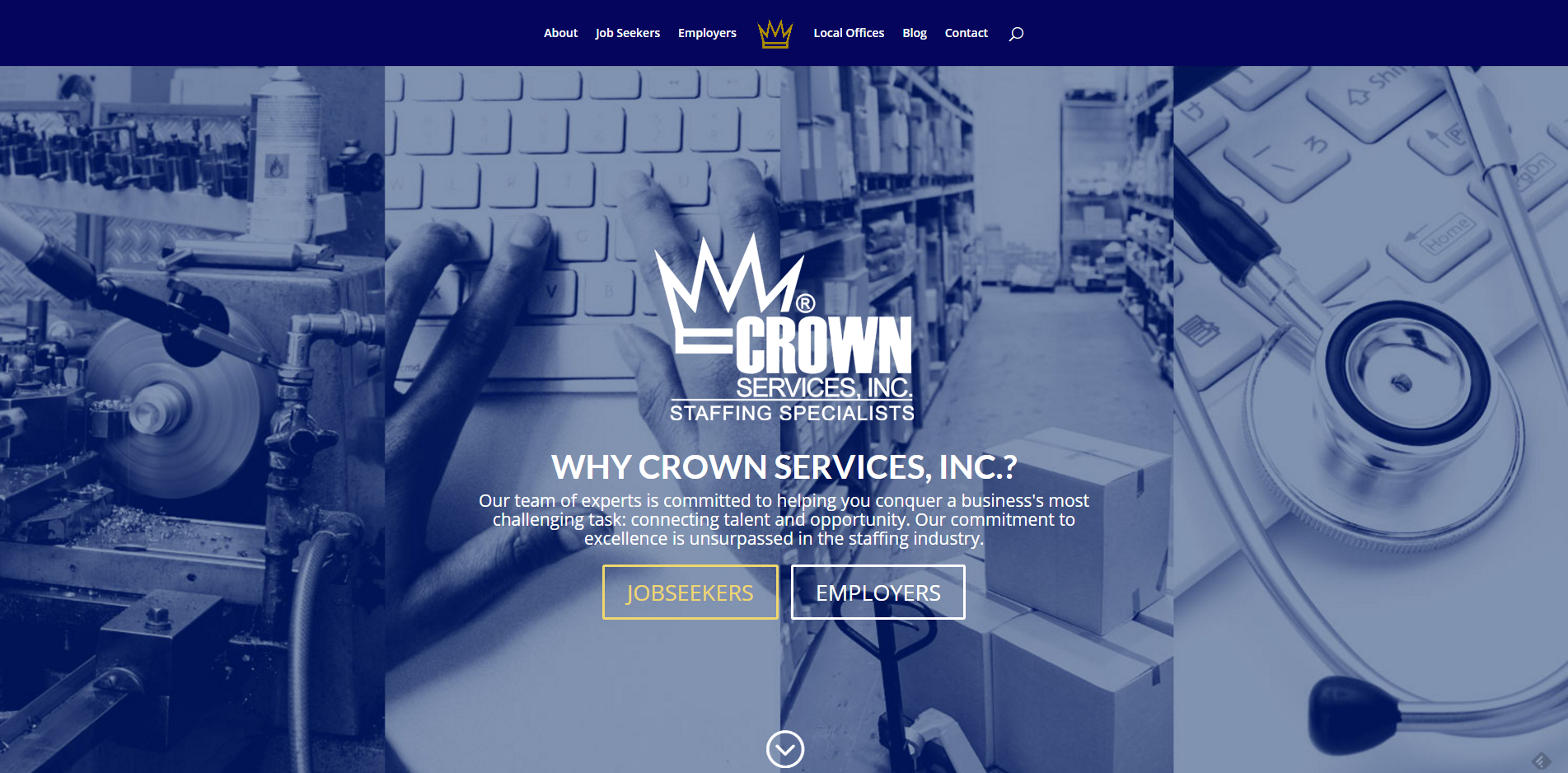
When Crown ordered a new web design, they needed to make it instantly easy for both job seekers and employers to find their landing page. So, Crown sliced the homepage, right down the middle.
Write Crystal Clear Calls to Action
On crownservices.com, the page begins with a brief introduction of the company and then lets visitors identify themselves. You’re either a job seeker or an employer. Nothing more nothing less, and nothing cute. Once you identify as an employer or a job seeker, you’re whisked off the homepage to a landing page designed specifically for you. And if you’re neither, or you’re just curious, they provide a subtle third option in the “scroll-down” prompt that reveals additional content.
The screenshot from above captures just the first portion of the page. Visit crownservices.com to see how the scroll-down button works.
The two identification buttons are linked to distinct landing pages that act like secondary homepages. They’re just as polished and “designed” as the regular homepage. But each one is definitely unique.
Another example using customer segmentation is Aflac.com. They link to four different customer landing pages with their main homepage.
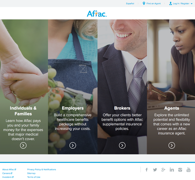
Create a Distinct Landing Page for Each Customer
With this web design approach, you sacrifice traditional ideas about the role of homepages in web design. If old-school homepages could talk, most would say “We’re so cool, let’s wow them with a splashy intro that’s all about Moi!”
Cut that right out. Customers don’t care about you, they care about them. Show you care about them as much as they do and get them off the homepage and directed to relevant information as quickly as possible. Give them their own homepage.
That means putting the same resources, if not more, into designing pages that only half, or a quarter of your total visitors might see. That’s ok. After all, every page on your site is an entry page.
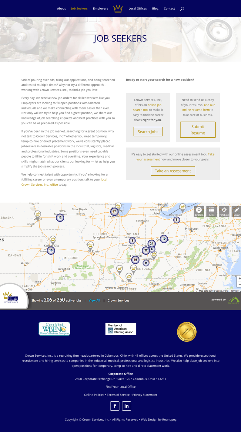
Crown Services created a fairly simple design for job seekers with a grid-based layout and obvious action buttons. It concludes with a compelling, interactive jobs map.
Aflac’s landing page has a little more going on, following the standard homepage layout (slider, blurb, blurb, blurb) exactly. It’s not the Aflac homepage, it’s the employers homepage. Each of the other three customer groups has different message slider content, different blurbs and different contact forms on their respective page.
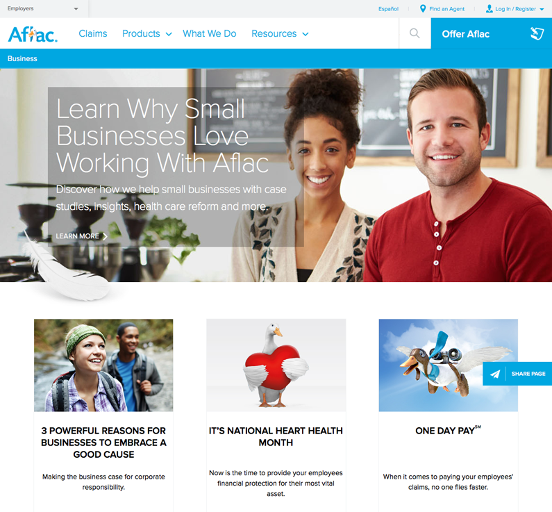
Both Aflac and Crown Services created web designs that show they care about their customers. They care enough to create a home for each one, filled with dedicated information and customized to immerse the customer in everything they care about and nothing else. Customers are led quickly to these pages by big, obvious call to action buttons on the main homepage.
This is a great approach for companies with multiple audiences online who need to serve and attract each one equally. Who does your business talk to? Can you define your target customer? If you’re thinking about a new web design, determine the audiences your website needs to consider and ask yourself if customer landing pages and a sliced up homepage make sense for you.
[su_web_audit]