It’s a struggle.
You have a website that not only looks good but is also easy to use. The content is informative and helpful, and your calls to action (CTA) are artfully placed and speak clearly. Yet for many websites, there’s another pesky addition: ads.
For the purpose of this post, ads are anything that distracts from the main content on a page. This can be a CTA in the footer that doesn’t directly generate revenue but doesn’t tie into the page’s content either. Essentially, a purposeful distraction. How do you make sure your ad isn’t ignored but also doesn’t detract from your page?
The Best — Hidden In Plain Sight
“Bad design shouts at you. Good design is the silent seller.” — Shane Meendering
What do people come to your website for? Thinking critically about ad placement is essential to ensuring those ads are seen without causing frustration. As a blog, viewers are coming to read. Putting a video that plays automatically would not only be jarring but could cause the reader to close the window entirely. Same goes for a pop up ad that covers the content.
The best ads are ones that don’t look like ads at all, and social websites have achieved this seamlessly.
Why It Works:
On Twitter and Pinterest, ads look like just another post rather than something to be avoided. If the ad is of genuine interest to you, you’ll read it just like another post. You may even click before realizing it’s an ad at all.
Why It Works:
For more copy-driven sites, putting a subtle banner in line with the text is an elegant solution. Your eyes naturally follow and can choose to read the ad without disrupting the flow of the text.
Permitted — Getting the Job Done
Sometimes there’s no avoiding it—an ad demands to be seen and can’t be camouflaged into the landscape of your otherwise beautiful website. When this happens, keep your end user in mind as well as how they view your website. Those YouTube ads are certainly annoying, but work because they fit the video format and require watching a few seconds before reaching the intended content.
So where should you put your ads?
Reader’s vision follows an f-pattern, meaning they scan your page from top to bottom, left to right. This is why logos are often in the top-left corner, where they’ll be seen first.
Why It Works:
This layout does an excellent job of placing ads purposely without being overly intrusive. The logo is seen first and directs the viewer to the ad below. Another ad is nestled within the article titles, again following the natural f-pattern flow.
Why It Works:
This ad is the easy way out and has no qualms standing in the way. Does it serve its purpose and demand to be read? Sure. However, ads like this need to be designed and styled carefully so they fit in with the page. If it sticks out like a sore thumb, it’ll be scrolled past without a second thought.

Why It Works:
Have I mentioned the f-pattern? On these pages, viewers see the content left to right and land on the ad at the end of the line. This is a better solution since the reader has the choice to linger on the ad or continue scanning the content.

The Absolute Worst — Just Don’t.
These ads are why advertising has a bad reputation. Oddly enough, while researching this topic I found smaller marketing sites to be the worst offenders, and wasn’t inspired to read a single ad let alone click. Avoid these advertising tactics if you want your ads to actually be seen.
Why It’s Appalling:
Not one, but two CTAs right from the start. When you want a viewer to do something, you have to be explicit. More often than not, when presented with two options a user will choose neither. Effectively the first two banners are wasted, especially with such a prominent image that grabs attention first.
Why It’s Appalling:
The point of your website is for viewers to see your content, establishing your expertise and earning the viewers trust. This may lead to action either through a download, signing up for your email or even calling.
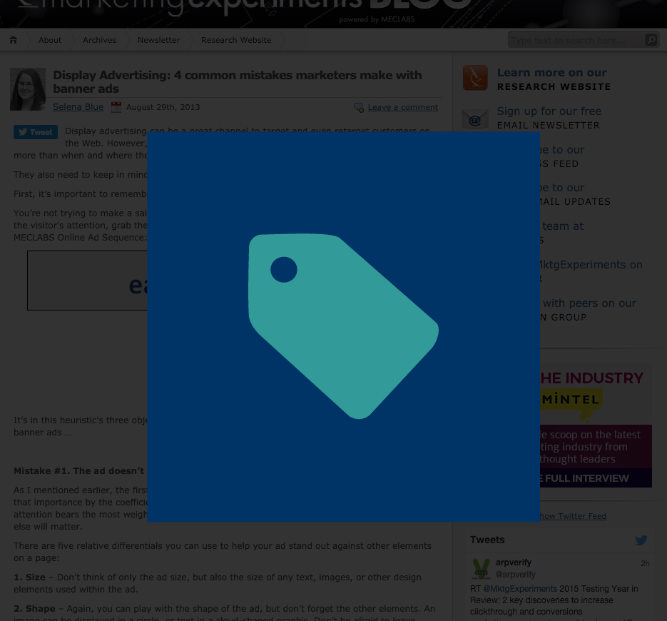
This ad pops up before you can see anything, asking for your trust from the very beginning. Why would I sign up for your newsletter if I don’t even know what you do? Or if it will be any good? Personally, unless I’m really interested in the content or it’s an established source, I close the window reflexively.
Why It’s Appalling:
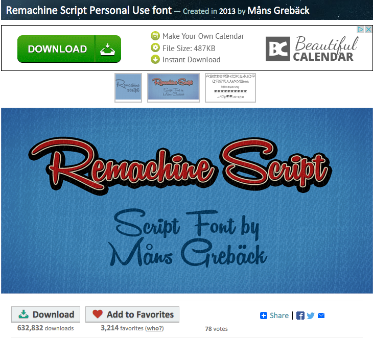
Dishonesty is not a wise marketing tactic. Lying frequently ends up in loss be it clients, friends or a job. Yet the Internet is riddled with false CTAs. This was the landing page after clicking “download font.” The bright green, all-caps button immediately grabs my attention, and yet the actual download button is nondescript and beneath the image. This ad is designed to trick you to click it so your chosen font will download. Instead another window will open with something entirely different. As a customer, you’ve just been lied to, you will probably leave this site, never to return.
Whether generating revenue or serving as a call to action, ads are a necessary evil. If you still aren’t sure what to do, google has a great resource for specific kinds of websites. With the right strategy and careful design, ads can draw attention without distracting and point the user in the right direction—exactly where you want them to go.
