The web design project for Crown Services presented our web design team with several challenges. The first was the fact that they serve two very different customers: job seekers and employers. While their brand is consistent in both types of interactions, the messaging and information they provide is very different.
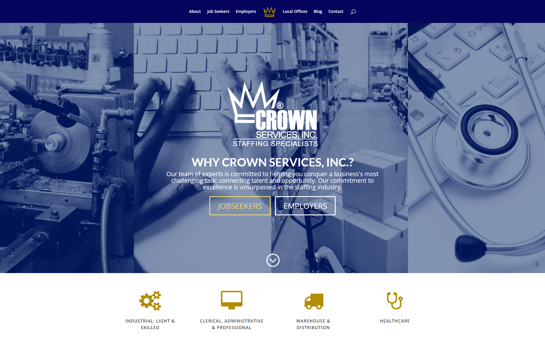
The primary call to action on the home page was designed to function like a traffic sign at a fork in the road, putting visitors on the right path to find the information they came for.

The next challenge was the wide range of industries Crown Services serves. There was no single image which would speak to everyone from medical personnel to office workers, to someone on a loading dock in a factory. Instead we used a composite image, with a subtle blue screen to tell the story and small colored icons underneath to support the images.
The same graphic is used throughout the site to give a sense of continuity to the pages. Using a lighter screen allowed us to place the full color logo and text on top of the image.

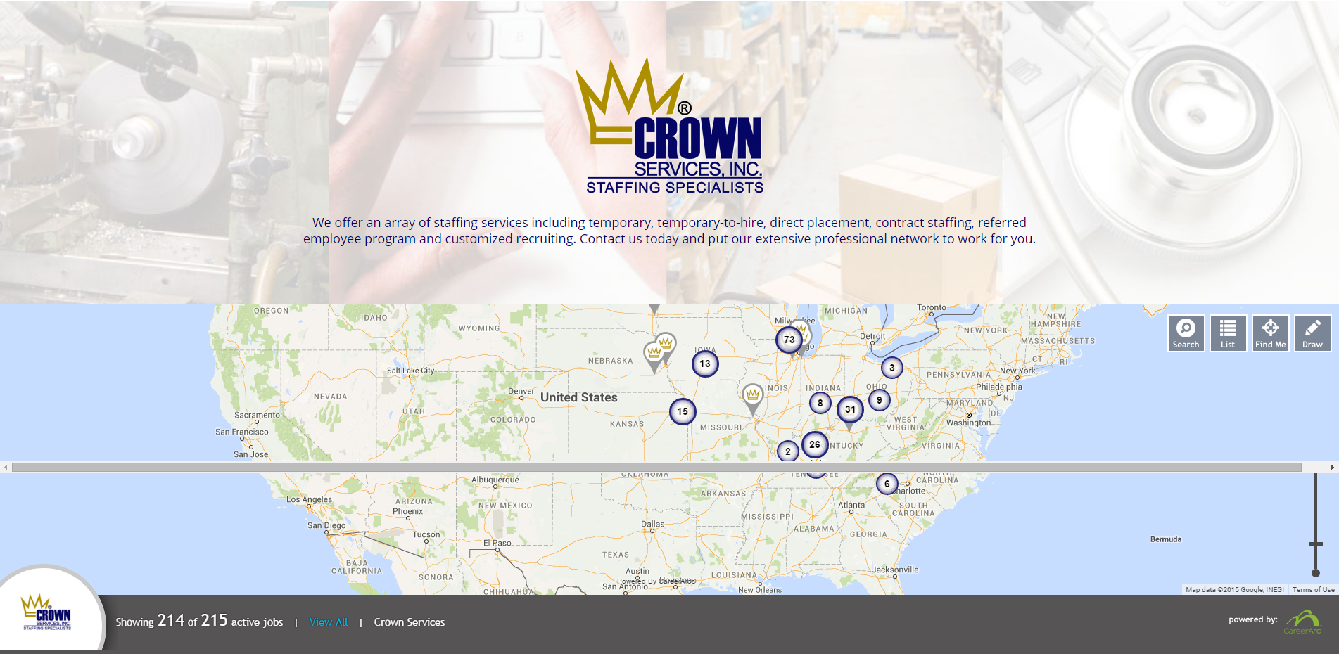
With offices throughout the Midwest, the map serves multiple functions communicating where their offices are located, as well as how many jobs are available.
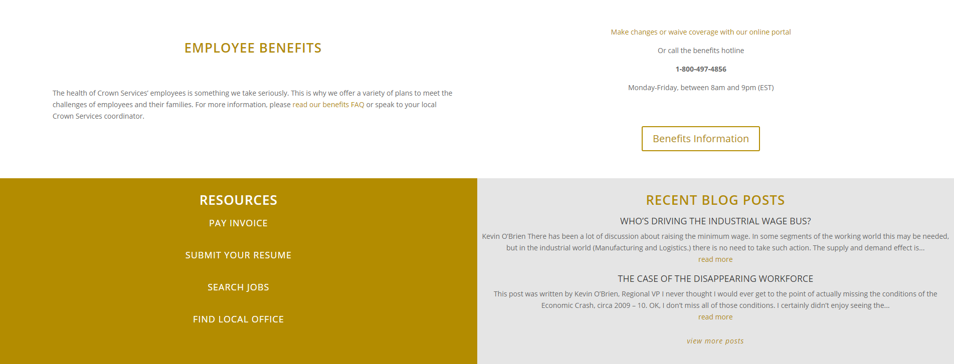
In addition to job listings, Crown Services offers a wide range of resources to clients and site visitors. We made room for all those tools on the bottom of the home page.

What our client, Karen Siravo said:

The Roundpeg team is creative and easy to work with. They were flexible and worked very well with our entire team to understand our business and what we are trying to accomplish.
The best way to put it is “They get us!”.
