What’s the website like for your favorite app? I mean, nobody downloads an app on their mobile device by going to a website first. You get it through a download platform like the App Store or Google Play. Your decision to download hinges on the landing page provided by that platform.
But apps still have websites. So who’s visiting those? Mobile app websites, what’s the point of you?
I found eight sites that should help us find out. Many of them share similar elements that make them work. But each has its own twist. And each one is a gorgeous example of responsive web design. All screenshots below are from an iPhone, but I considered how they looked on desktop as well.
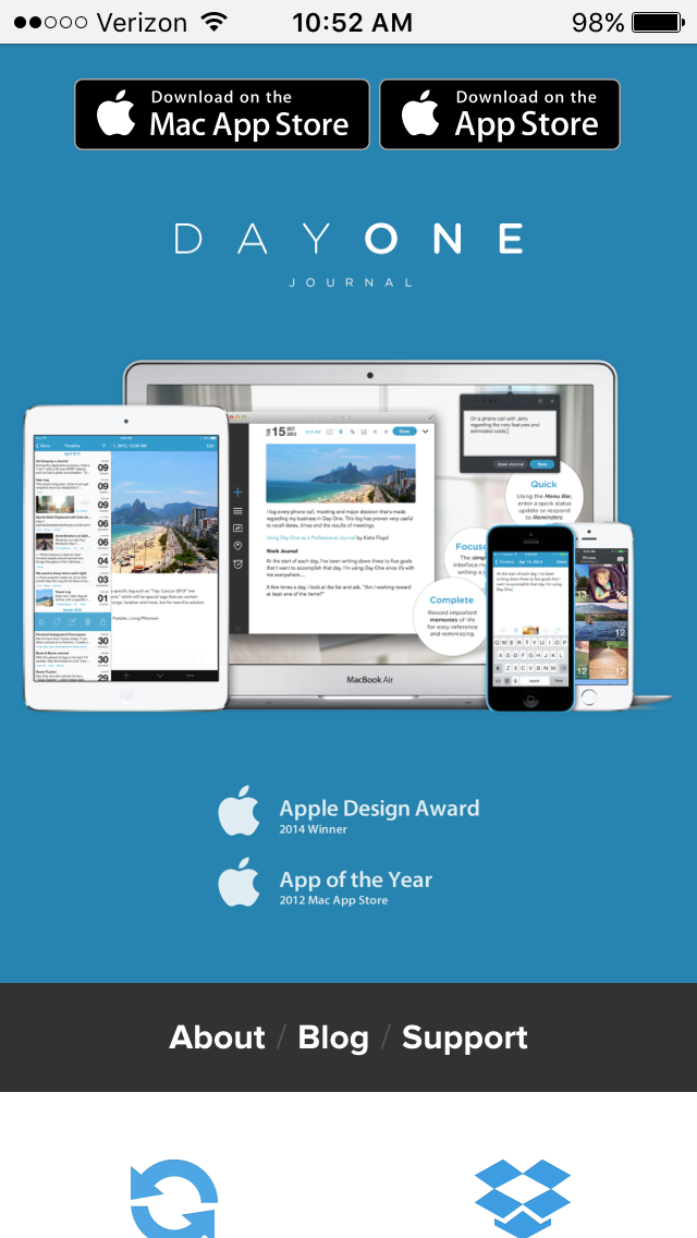
Day One
Journaling is so healthy. I feel great when I do it. Day One is like Evernote, but designed specifically for journallers.
The website is not my favorite, especially the over-large App Store badges at the very top. Every single app web site has a set of these hanging around, but do they have to be so large? Whatever.
I love how the first homepage image shows off the app’s greatest strength: its connectedness across all your Apple devices so you can journal on everything with the same experience. This expertly starts visitors off with a clear view of the number one reason they should use Day One.
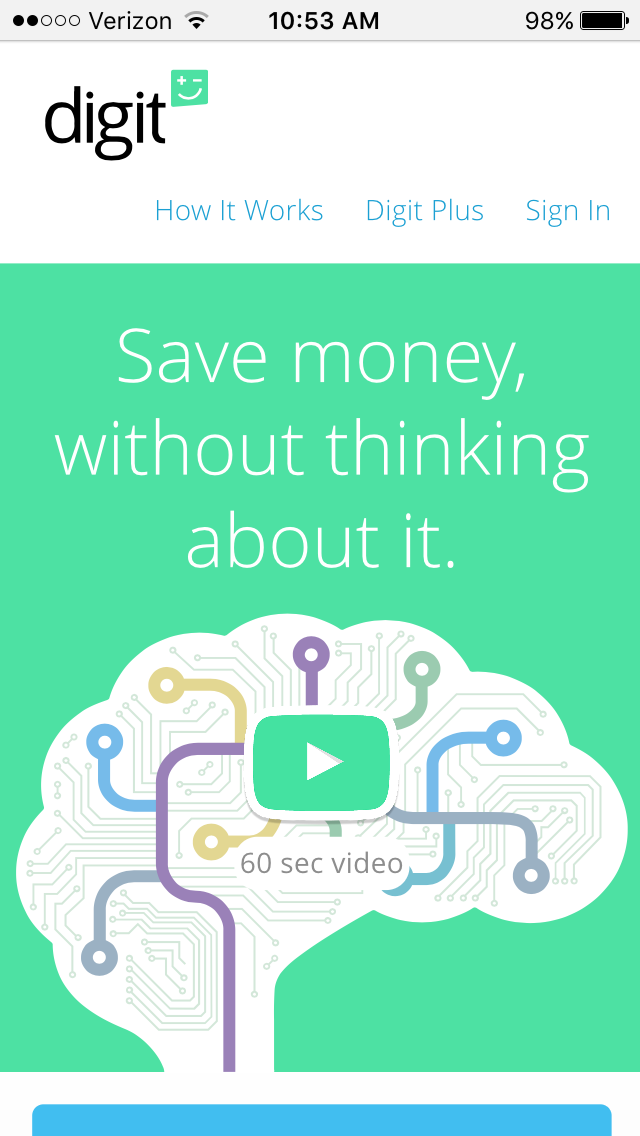
Digit
Ok, so Digit isn’t an app. It’s a savings account you manage exclusively through text messages. No app. But it’s a phone thing, so it counts.
First, that domain name. This company is so dedicated to simplicity, no way they’d settle for a domain longer than their name. But most of the .coms are taken. By choosing the .co extension, they got exactly what they wanted and sliced off an extra letter to boot. Bonus.
Second, that video is the cutest thing. And it communicates clearly, anticipates your objections and answers them all wonderfully. There’s other junk on the page that looks cool, too. But the video.
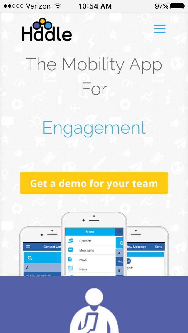
Hddle
Hddle’s this thing where employers can easily notify employees with important news where their employees live most. On their phones. Full disclosure: Roundpeg designed this site and I super enjoy it.
The home page is split into five sections. Yes, it’s one of those long form deals. First is a main message, backed up by three blurbs highlighting benefits of using the app. Then a quick form for requesting demos. Love the number counters that trigger mental questions like “What’s our engagement like?” and “We have a recognition program, right? Right?”
The grid of icons shows the main features at a glance, something common to many app websites, followed up by some social proof with logos of companies using the software.
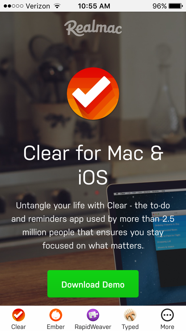
Clear
At this point, Clear is an oldie in the world of list-making. The app’s been out a while, but it’s my personal favorite for making grocery lists. Literally, the only thing I do with it, but I refuse to use any other app for that task. It’s an award-winner for the no-frills, no-buttons visuals and great sound design. Seriously, you want these sound effects.
The website’s similarly thoughtful, clean and polished. The slice-of-life homepage image is very pretty and shows all of the following benefits: the app’s availability on all your Mac devices, the app’s fresh looks, the app’s usefulness in the kitchen and the app is used by the type of person who drinks sparkling water and reads Jamie Oliver cookbooks, which is the type of person we all want to be, deep down, I know.
Manual
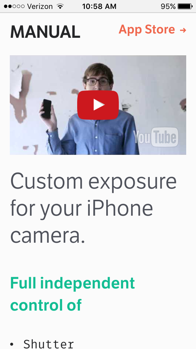
This guy. Did you watch the video? Like Digit, it’s cute to the super max. Our hero shows us the problem, identifies the solution (it’s the app!) and proceeds with a brief review of the app’s features. Pretty standard. Add sharp writing, a pretty girl, mumble a cuss word and it’s Wes Anderson.
And look, look down below the video, it’s a mono-spaced font! Is that an ironic Registered Trademark symbol? Gah, it’s so cool.
But our hipster friend can’t escape the “Available on the App Store” button. However unique or cool an app’s site is, the prevalence of these buttons is a reminder that most apps are discovered and downloaded somewhere else.
Sky Guide
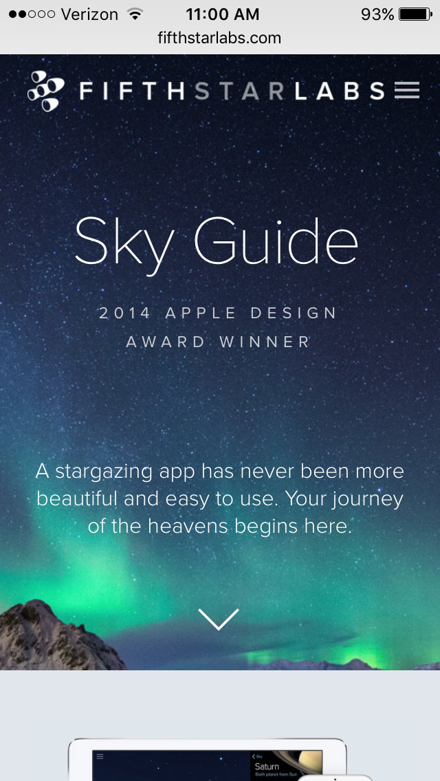
I see a lot of technology companies try this homepage style. White logo and navigation labels, screen-filling video background. Few handle it as well as the makers of Sky Guide. The design is completely minimal, letting the natural beauty of a night sky shine through.
It’s interesting to note the web designer assumed visitors will scroll. Each item fills the screen completely, with minimal prompting to continue or clues to keep going. Natural curiosity compels you to scroll until the end.
Snapchat
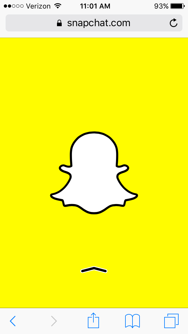
This website is literally just a full-screen Snapchat ghost that links to a download page.
What do we learn from checking out these websites? Priorities. Each of these companies has a single goal for their website. Download the app! While some used the site to display additional features and information, all start off with a crystal clear link to the app store. What’s your priority? Does your website make it clear?

