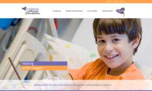
In the last few months we have built a number of websites for associations which serve children. The styling of these websites needed to be more than just pretty. As non-profit associations with a primary goal of fundraising, the dominant image had to ignite the emotions of the visitor.
On sites like these, a sweet smile draws a prospective donor in. How can you say no to these adorable children who need your help? The challenge is finding the perfect image. While we often shy away from stock photography in favor of more unique images, when it comes to images of children, stock photography is often our best avenue.
Why? Privacy issues top the list. While adults will often consent when asked to allow their likeness to be used in an advertisement or on your website, they are less willing to allow the use of their children’s images. One eye doctor we worked with solved the problem by photographing his own children wearing glasses. That worked great until they got too old to be featured in the advertising.
So for these two projects, we looked through photos the organizations had on hand. While we found some we felt would work well on interior pages, nothing was quite strong enough for the home page so we turned to iStock. As we searched for the perfect image we had two requirements: “relevance” and “on brand”.


Relevance
The image had to be more than cute, it had to help convey the important mission of each of these organizations. Childhood Leukemia Foundation provides gifts and necessary supplies for children hospitalized for cancer treatment. We wanted to show a happy child in a hospital setting. The challenge was to find an image which wasn’t too cheesy or too depressing. The little boy we choose looks sweet and hopeful. With freckles and slightly crooked teeth he looks like the boy next door, someone every parent could connect with.
In contrast the Indiana Diabetes Youth Foundation focuses their efforts on educating, encouraging and empowering children living with Type 1 diabetes. They want these children to live happy, active lives. For their featured image we looked for something with active, healthy looking children.
On Brand
This is often the hardest part of selecting a photo as we look past the image itself and focus on the colors. The perfect child wearing a red shirt would never have worked on the CLF site. The color would have clashed with the orange and purple. The blue and teal colors of DYFI was much easier to work with, but we still opted for an image which had yellow flowers and not green grass at the base. That allowed us to pull out the yellow of their logo to use as the call to action on the enrollment form.
In both cases, the images pull the message together. So as you start on your web redesign, stop and think about your primary image. Is it advancing your mission as it loads on the screen?
