As a designer, I love looking at websites and designs which give me that giddy feeling of what’s to come on the web in terms of web typography. I often see a really interesting font which will add a unique style to a design I am working on. Unfortunately it may not be right for the entire site, so much like the challenge of finding the perfect pair of shoes to match your new dress, is the challenge of finding the right font to pair with it in a particular design.
Manual searches and testing fonts together can be tedious and daunting to find just the right combination. Fortunately, you don’t have to start from scratch. There are some great tools to alleviate the headache that comes with pairing, sizing and adding weird characters into your website.
Picking the Right Font Pair
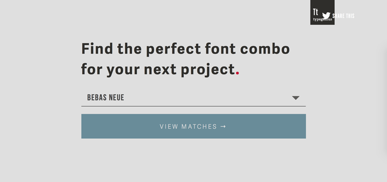
Coming up with a great web design relies heavily on pairing your fonts correctly. As complex as this task may seem, don’t try and reinvent the wheel every time you have a new project or client. Many designers pick a handful of fonts they enjoy using and stick to them. For example, if you choose a great header font and aren’t sure what might be a good body font Type Genius might be a great resource for you. In a nutshell, it’s as easy as it looks.

The intro screen invites you to enter the font you’d like to pair (or select from a drop down menu) and gives you a few screens of options. The only draw back to this option is the limited fonts you can select.
If you’re interested in just finding a larger selection of free fonts look through fontpair.co. Besides offering font-pairings of Google’s massive free web font library, it also allows you to download both fonts. Navigate through general categories to come up with a specific typeface combination. Be advised: Just like any free font site, you may be searching for a bit before you find a really great pair.
Choosing the Right Size Font
Sometimes finding the right size for your header, sub header or content can be intimidating. I even wrote a post about it awhile ago. If the size of your fonts isn’t proportional, it can really throw off your design. If you’re looking to save time, try out a tool like type-scale.com. Choose a scale for your typeface and you’ll be able to see a huge improvement with the the look and feel of your website.
If you don’t want to choose a scale by yourself, there are so many typography experts who have already figured out best practices for web typography. If you follow this guide put together by typecast.com, you’re on your way to good looking web typography without any work at all. You can even export the CSS style guide.
Including the Proper Characters
Typewolf’s typography cheat sheet is a great resource when you need funky characters. This is a great guide if you want to find HTML entities for an en dash (–) to a Numero (№), to a Fist/Index/Manicule (also known as the vintage finger pointing guy ☞). Besides the HTML, you can also look up keyboard shortcuts for both Mac and Windows.
Find New Inspiration
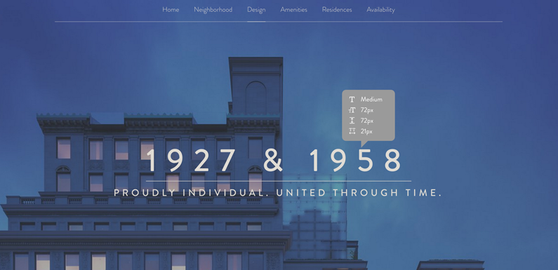
In order to get better at pairing fonts, I love to explore what fonts other websites are using. If you use Google Chrome or Safari, there’s a browser extension called Font Face Ninja. Basically, it allows you to hover over over a font on a website and see the font name, size, line height, letter-spacing. You can type in the browser using the selected font, and download it.

view site
Find Resources and Use Them
There are a ton of smart people in the world creating resources for web typography that should make you faster and more productive as a designer. Take advantage of new tools that help you create great stuff in less time and share with those around you.
Have you considered how certain elements of your website affect your traffic? Learn more in the webinar below.

