Calls to Action (CTA) on your website come in many shapes and sizes but they’re actually really simple: they guide the visitor through the next steps and turn a visitor into a customer. If you’re working on a web project, an important part of the process is coming up with logical CTA’s that are going to make your website successful.
The Main Call To Action
Think about the most important objective of your website and how you want that to impact your business. What’s your end goal? Do you want to sell a product, fill seats at a seminar or recruit donors? Whatever your answer is, this should be your main Call to Action. Where does your main CTA go and what makes it successful?
Smack your visitor in the face with it…but don’t be annoying. Just think of a main Call to Action as the first bit of text you see when you get to a website, giving you directions about what to buy, download or try.
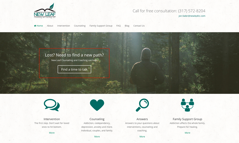
Make your words direct and compelling. It can be really hard to narrow down web copy but trust me, this might be your first and last chance to keep a potential customer’s attention. Choose a short (keyword: brief) to-the-point snippet of text. It can be a little overwhelming narrowing down the big idea to your single message, but in order to make it work – choose wisely. If you’re questioning if you have a great Call to Action analyze the words you’re using. For example, “Find a time to talk” is a lot less bland than “Learn More.” Feel free to get creative.
Make the button noticeable. This seems like it would be common sense, but with so many options for customizing buttons, sometimes we forget the end goal of a button is to be clicked. Don’t compromise function for aesthetics. There are plenty of creative ideas out there for eye catching buttons but remember to keep it simple. And, if you want to do something a little fancier remember to avoid busy background images or small text.
Arrange your composition (think about the balance). Planning ahead can save a lot of time when designing a Call to Action. Appropriately utilized blank space is a key component in a well-planned CTA. For example, if you have a great image that seems “heavier” on one side, the “lighter” side may be the perfect place for your CTA. Check out the site below, we found a great image has a lot of visual interest on the right side making the left side perfect for a balancing Call to Action.

Secondary Calls to Action
Just because you have one large Call to Action on your site doesn’t mean you’re finished yet. Sprinkling CTAs across your site will lure a potential customer further into the meat and potatoes of your site. The general rule is to include one on each page. This seems like a lot until you consider secondary business goals. If you’re a non-profit you may want to first provide information about services. But you also have other important goals like connecting with potential donors, spreading awareness and recruiting volunteers.
Use the Sidebar effectively
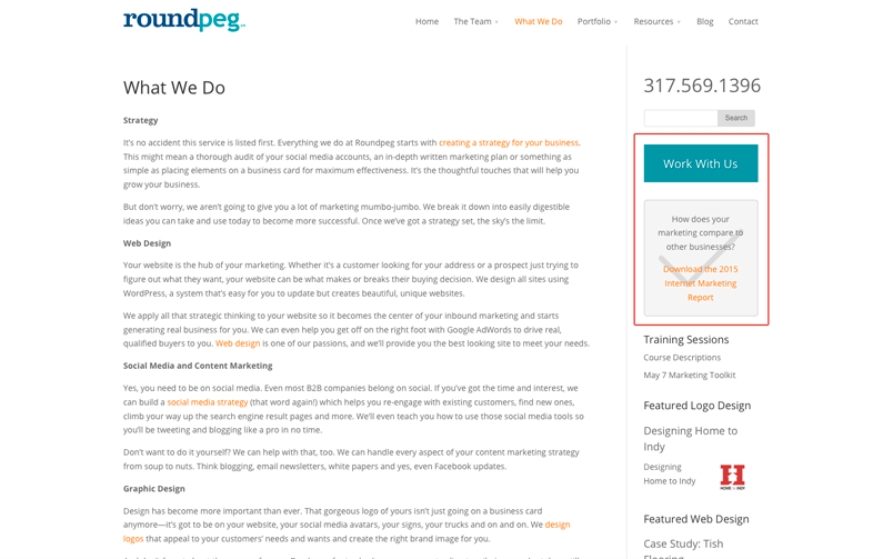
Even though not all sidebars are created equal, they can be extremely useful for reiterating important information and a Call to Action. I included an example of our site below. Our sidebar is a good example of including a button you’re already seen (work with us) and also introducing a helpful download.

Promote downloads below blogposts
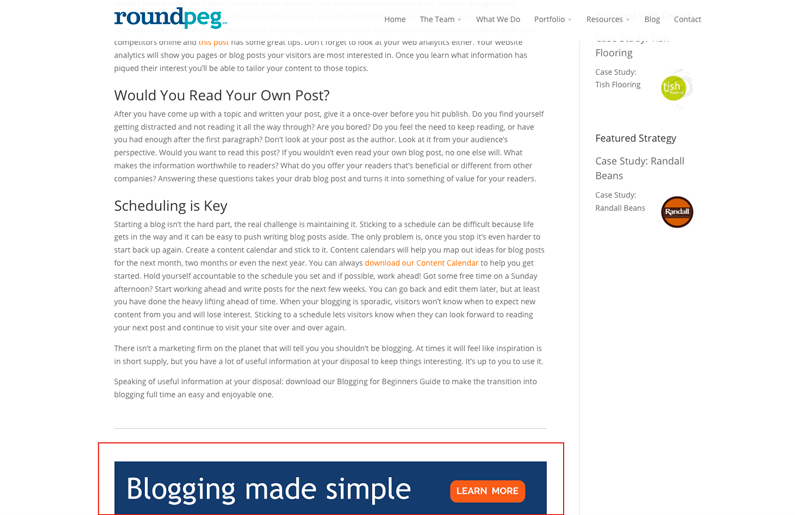
If your blog reader is interested enough to read an entire post on a specific subject, provide a useful CTA at the end that links to a landing page. Providing helpful downloads will engage your customer and potentially win over their business.

Call to Action buttons come in all shapes and sizes and are located throughout your site. If you know what’s important to your business, you can easily figure out how to construct the perfect CTA.
