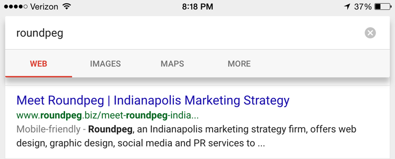
It’s the end of an era for small business web design. On April 21st, 2015 Google will rank mobile-friendly websites higher than others in mobile searches. You will absolutely, positively lose website visitors and potential sales with a site that fails their standard.
Google has demoted non-mobile friendly sites for a while already though. No change there. April’s new algorithm change keeps the old punishments and expands the original rules to reward sites which are mobile friendly. The reward comes in the form of higher rankings and a special label next to your website name.
All of this in the name of improving the Internet for you and me. It’s better living through Google.
Clearly marked mobile-friendly sites let you know what sites work on your device, making research on smaller screens more efficient. No more frustration when a site won’t load or looks broken. You won’t even care about the old, bad sites when the mobile-friendly ones are presented first. As we all know from experience, page two of Google is rarely worth looking at.
The April 21st update makes page one even more useful and improves the overall user experience. And when Google gets more useful, it gets more users. Which means it can sell ads on mobile search at higher prices. Pretty smart. But before Google can make more money from selling you ads, it needs you to redesign your website to be mobile-friendly. Funny old world, innit?
Take the Mobile Friendly Test
Google’s definition of mobile-friendly is pretty strict. No middle-ground. Well, maybe a little bit, but we’ll get to that. The short story is you’re either mobile-friendly by Google’s test or you’re not.
Want to know right now if you need to fix or redesign your website? Check out the automatic testing tool at google.com/webmasters/tools/mobile-friendly. Just put in your URL and Google will check out your site to see if it passes.
Go ahead, check it out for yourself. What’d you get?
Green means your site’s good to go for now. Red means you’ve got work to do.
The Path to Mobile Friendship
I said earlier there’s no wiggle-room in mobile friendliness. Meaning, you’re mobile friendly and you earn the special label or you’re not. There’s no kinda-sorta level where you get points for trying. So, what does it really mean to be mobile friendly?
Here’s what Google says:
Mobile-friendly sites “load and display correctly on mobile devices so visitors can have the best user experience.”
This statement’s pretty loose on the details. However, they’ve previously listed a smattering of web design details that improve user experience on mobile. These include automatically sizing text and images to be easily viewed without zooming or horizontal scrolling, avoiding Flash and making wide room between links so users tap the right one.
It comes down to user experience (UX). Google’s algorithm updates show their interest in improving the user experience across the Web.
Check out their guide to Home Page and Navigation Principles for an easy read on essential UX for mobile. Read Keep Calls to Action Front and Center for a side-by-side comparison of a mobile friendly page and one that looks like it’s designed for mobile but fails pretty hard.
While only Google knows exactly how the test runs and the test only has two results, you have a little room when it comes to how you serve up a great user experience.

Get Your Own Mobile-friendly Label
There are three mobile configurations Google recognizes. You can choose responsive web design, dynamic URL serving and separate URLs. Mobile responsive design is Google’s recommendation. It’s also my recommendation, Roundpeg’s recommendation and it should be the recommendation of every web designer you meet.
This configuration makes your site mobile friendly by using the exact same text, images and code desktop users get. The only difference is the layout. Your website goes from a horizontal orientation to vertical to match up-down scrolling behavior of most smartphone users. This is the truest and best foundation for a mobile-friendly website.
Dynamic serving keeps the same URL for all of your pages, but the website detects the user’s device and delivers different code and content designed specifically for that screen. Websites with separate URLs for mobile often use addresses like m.businessname.com.
These last two configurations bum me out because they create alternate content and alternate designs for mobile devices. This makes SEO optimization a mess, makes your content hard to maintain and simply seems outdated. However, mobile-only pages may represent a more cost effective way to get mobile-friendly for some businesses.
Choose the mobile configuration that makes sense for you. Mobile responsive design is the best, but it often requires re-designing your website from the ground up. If your budget requires you to settle for one of the other two, you’ll be ok. However, you must budget now to go true mobile responsive as soon as you can with a design that meets Google’s mobile-friendly UX guidelines.
Three Tasks Before April 21st
- Take the mobile-friendly test.
- If your site is not mobile-friendly now, make a plan to get there. Contact a web designer. Talk about your preferred mobile configuration.
- Woe betide you if you persist in mobile unfriendliness. Take action on your plan!
