 It seems like just yesterday when everyone used Internet Explorer and had basically the same size monitor. It was easier to design web sites back then. Sure the technology was cumbersome, but once you had a site up and working it looked essentially the same for everyone.
Unfortunately, that isn’t how the internet works today. Your visitors are using a range of browsers and devices when they visit your website the expectation is that it will look good and function correctly whether they are viewing it from their phone, table, laptop or desktop. They aren’t going to hang around trying to figure out why it doesn’t. They hit the back button and head off to another website to find the information they are seeking, and you miss an opportunity to make a sale.
So how do you avoid disappointing prospective customers?
Test your site on all major browsers
 The days of Internet Explorer dominance are long gone. Introduced in 2008, Google’s Chrome browser is now firmly in the lead with just under a 50 percent share.
Firefox, which was most popular, now represents about 20% percent of the browser market. Internet Explorer, with the launch of IE 11, has recovered slightly and now represents about 1/4 of all web traffic. Although representing only a small portion of total traffic, there are a strong core of Safari and Opera users. Each of these browsers will display your website slightly differently. This is especially true with older versions of Internet Explorer.
We can always tell when the design and functions weren’t tested on all browsers before launch. Pictures don’t line up, buttons are in weird places and critical information disappears completely. As you make changes to your website, take the time to look at it using each of the major browsing tools so you can see what your visitors see.
Test your site on different devices.
Today’s desktop monitors may be as small as 800 x 600 pixel displays or as large as 1680 x 1020. Then, to make things more complicated your customers aren’t just hoping on line from their desk at home. They are using tablets, smart phones and notebooks from coffee shops and couches. They are also surfing the web on smart TVs and through video game consoles.
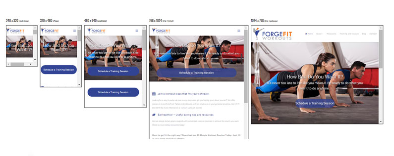
Each of these devices will display your website slightly differently. Look at the what happens to a website we designed for personal trainer Marcia Erne on different devices. It automatically adjusts to the view’s screen because it was designed to do that.
This is what is called a responsive design. The website is built to respond to each device (desktop, laptop, tablet or phone) and deliver the website in the right format. A responsive website will adjust to screens of any size, landscape or portrait, so visitors find what they came for.
Does your website looks the way it’s supposed to on all devices? If your site is more than two years old, odds are it isn’t completely responsive. More than five, it probably isn’t responsive at all. Stop stalling. It’s time to upgrade.
I know you don’t want to hear this, but the pace of change is not going to slow down. Hardware will continue to improve and change, and as a result, the software you use to run your website will need to continue to grow and change too. Fortunately, there are software tools which have done a good job of keeping up with technology.
We typically recommend WordPress because it allows us to build a robust, professional site that’s easy to maintain, making it an ideal tool for small business owners. Additionally, WordPress developers have stayed ahead of the design curve, offering many great responsive design options. And, once a site is built on the WordPress foundation, content and graphics easily transition with each upgrade.
Not sure if your website is keeping up? Take our web site quiz.


