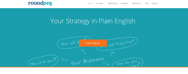
Just over a year ago, I wrote a blog post entitled I didn’t want to change our website. I wrote about how I loved our old website, but I knew it was time to update. Although the site still looked good, it didn’t include many of the features we were routinely building into sites for our clients so it was hard to point to the site as the best example of our work.
We used the web redesign as an opportunity to revisit our branding and update our look. We eliminated the grey background and added orange to our color palette. The result was a fresh, clean, mobile responsive site which I loved. But these days a year is a long time in the life of a web design company and just a few months after the launch I became restless. While I loved the look, I was frustrated by the lack of flexibility on some of the interior pages.
As we work on sites for clients, we routinely explore lots of new tools and features. We have done some really interesting web design work and I wanted to bring some of that innovation to our site. Fortunately, our website is built in WordPress so swapping the theme didn’t require rebuilding a lot of our existing content. I could have the new features on my wish list, without a complete overhaul.
And so about a week ago, we launched another version of our website. If you are a regular visitor to Roundpeg.biz, you are probably confused by that comment because the site looks almost the same. That’s because this year our update focused primarily on function, not form. We love the style of the site, but wanted to take advantage of the latest improvements in mobile responsive technology. The new sites displays better than ever on tablets and smartphones.
So what else is new on our website?
The new home page is just a little wider, filling the screen. The visual at the top of the page is now more than a decorative element with a strong call to action. The tone is still causal and customer focused. We kept the friendly “hello” as our first button greeting visitors and making them feel welcome. We cleaned up the offer at the bottom of the page with a clear submission form which encourages visitors to subscribe to our newsletter.
While the home page improvements are nice, my favorite improvement is the new structure of the case studies. Using the Divi page builder, we are able to build a completely unique page for each of these important stories. The visual impact is stronger as soon as you land on the page, and the counter on some of the cases really reinforces the quantitative results we bring to customers.
The other change is the ability to create unique or very simple layouts for landing pages. Downloads and special offers are an integral part of our marketing strategy and it is vitally important for our landing pages to be interesting and compelling to visitors. Being able to build custom pages and move elements around easily will allow us to test and tweak, making small refinements over time.
And that’s about it. What we learned this year is that not every update needs to be a complete overhaul of the website or a major shift in direction. These little changes give us a website we really love. Over the next few months we will build more case studies, a new meet the team page and enhance our portfolio. Shifting our mindset to small improvements will keep the site current.
So as you look at your website, do you need a complete overhaul? Maybe not. But if your site is a year or two old maybe a small refresh is what’s best for you. Take our short web audit to find out.


